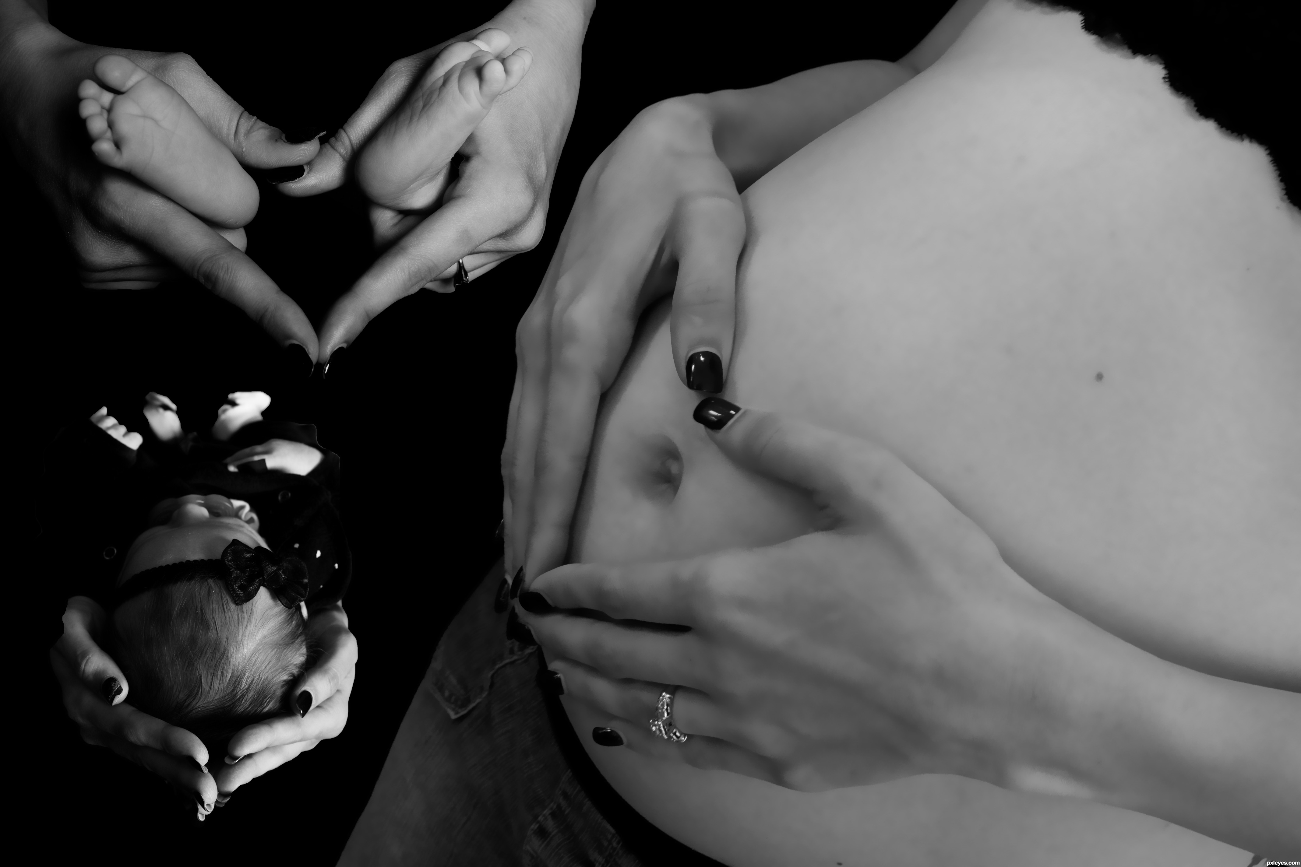
This is my first PS.Yea it might be the easiest way to do things with the black background but I'm learning more and more each time I try. Someday I'll have the real program and take some classes. Hope you enjoy. (5 years and 3461 days ago)
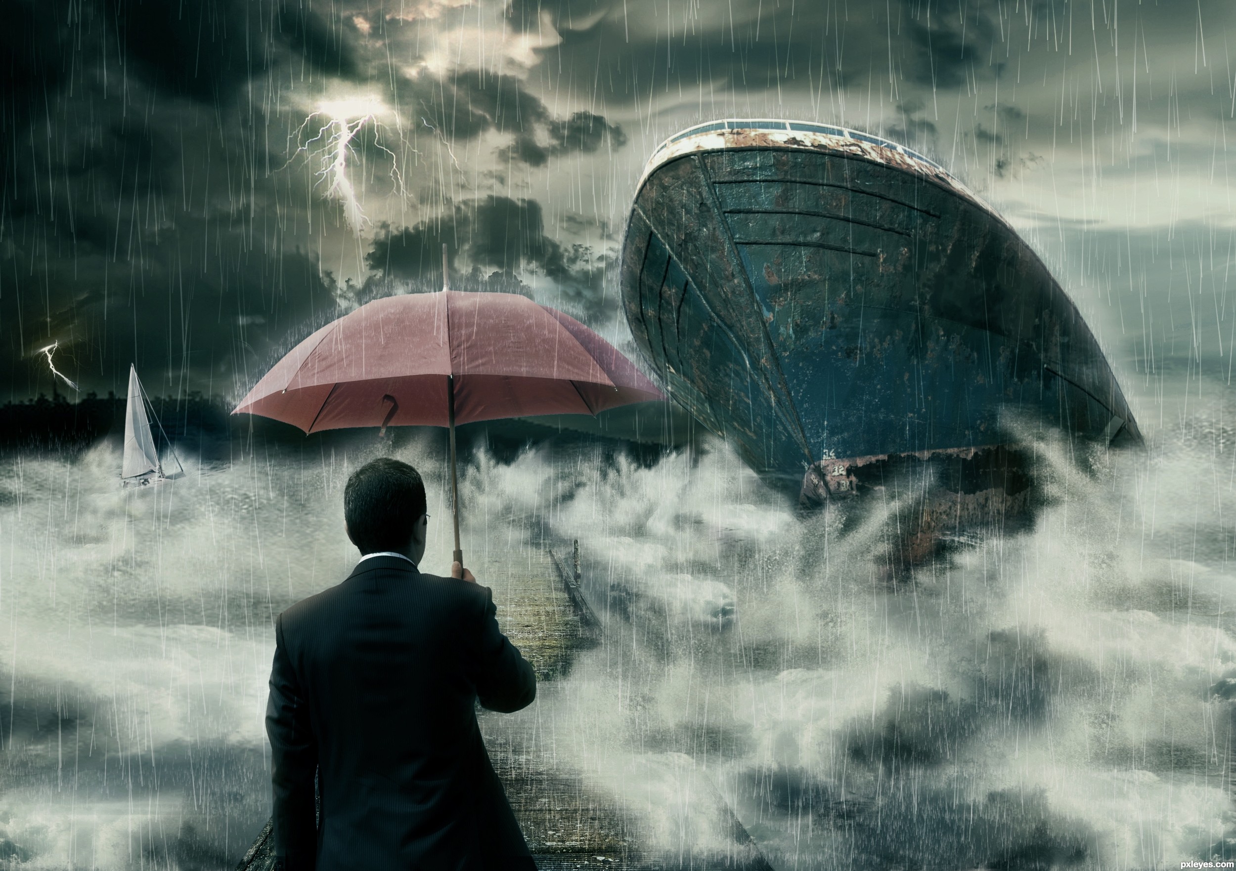
Basic techniques are used. Here I like to thanks MarcelTH for the wonderful sky pic and michaelaw for small boat. (5 years and 3503 days ago)
Great rain effects 
Really nice...
Best of luck my friend!
Thanks Adhir and Ponti... I'm so happy to receive a comment from a artist like yoU!
Two boats with identical damage? One would be enough, and improve the composition. The one at left is not necessary.
Well you're right. But I can't imagine the composition with only one damage. So I replace left one with different boat.
Very nice contrast, movement, and lighting. Well done.
Nice idea, well executed! GL! 
oOo scary! And that guy is crazy, why isn't he running for his life?!?!?! lol. Very creative idea, and nicely done!
Howdie stranger!
If you want to rate this picture or participate in this contest, just:
LOGIN HERE or REGISTER FOR FREE
(5 years and 3529 days ago)
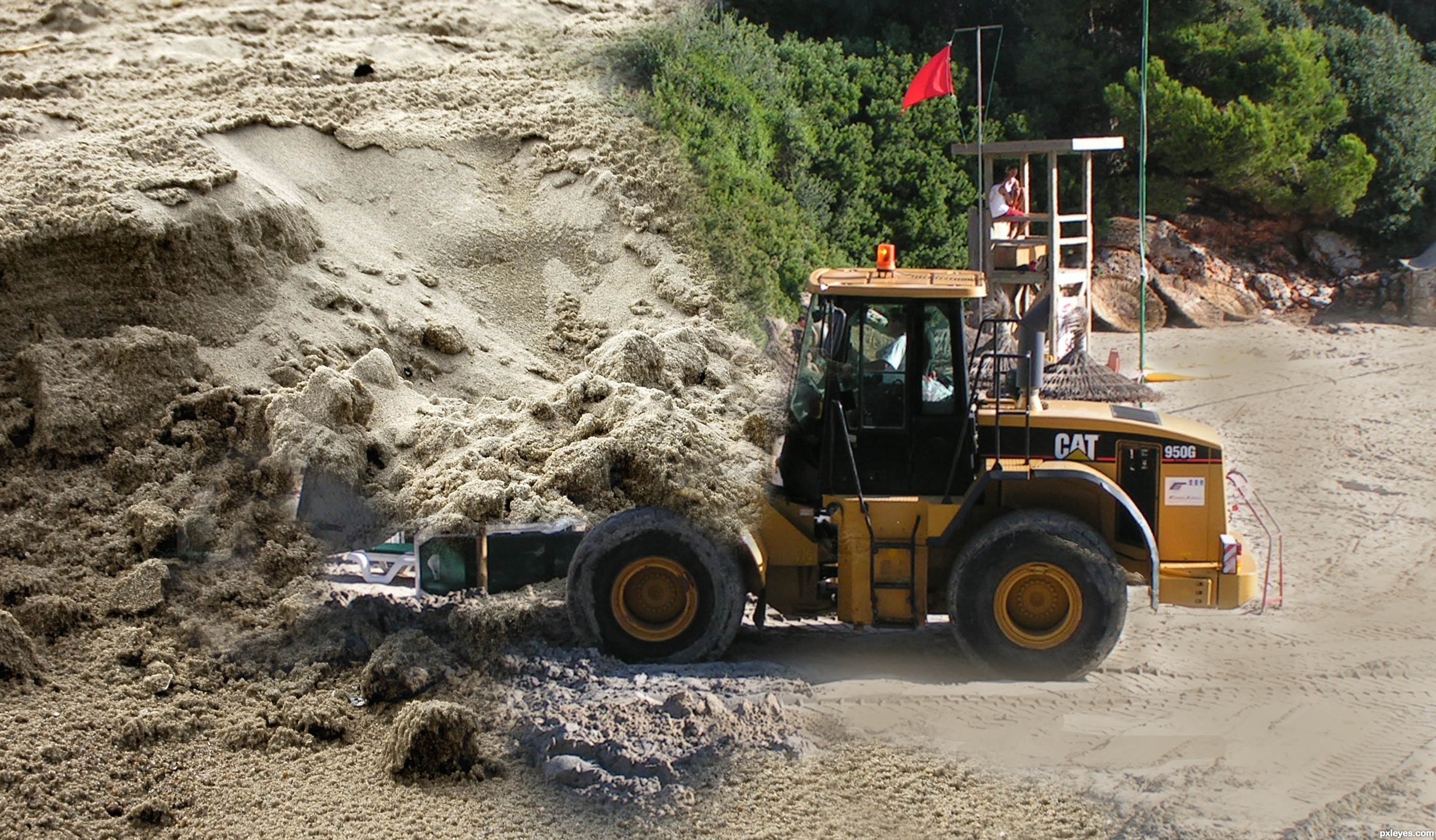
nice idea -- masking needs work as there are parts of the background of the loader image showing through and the edge of the bucket should have a defined line
Howdie stranger!
If you want to rate this picture or participate in this contest, just:
LOGIN HERE or REGISTER FOR FREE
(soft pop music in the background)
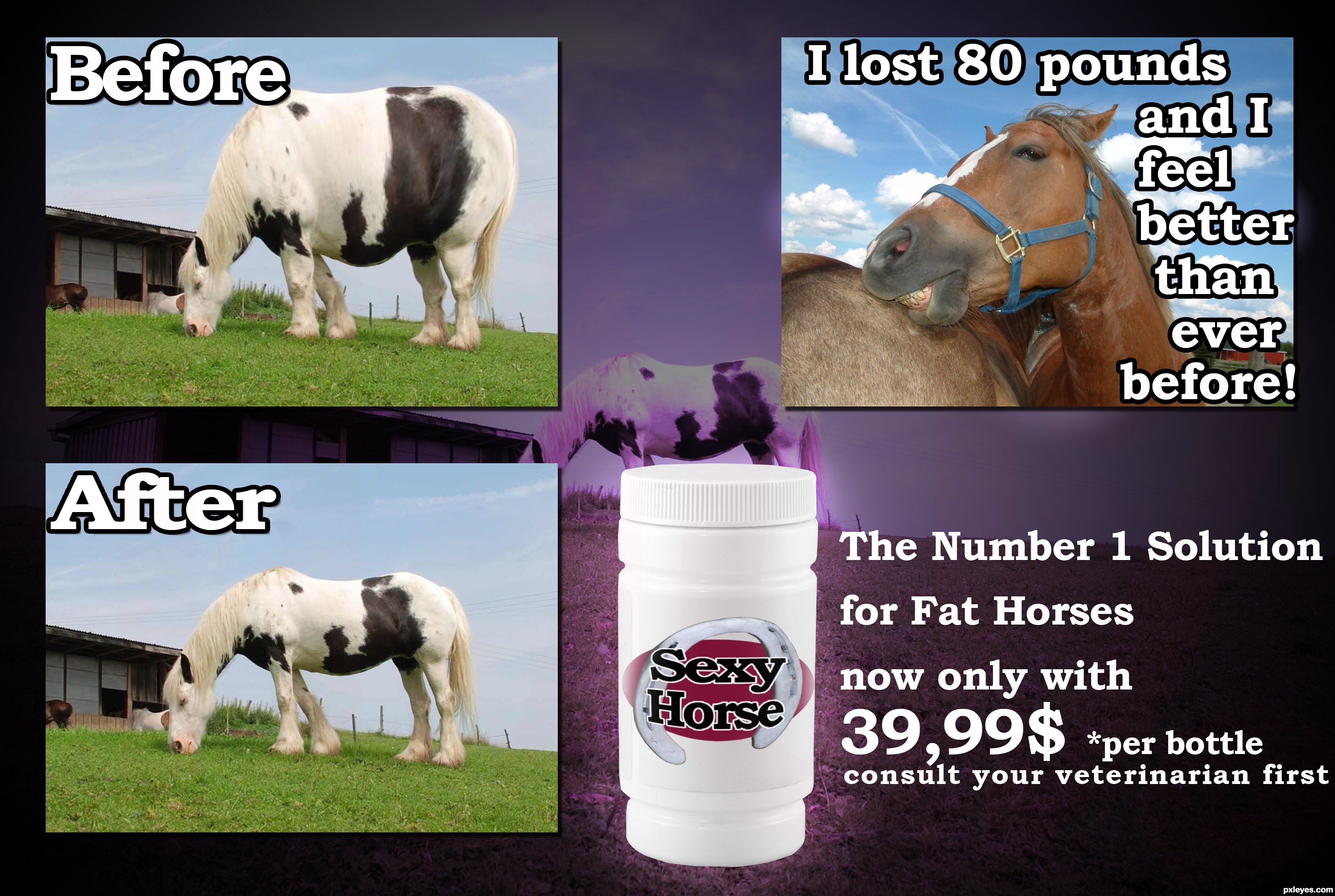
Are you a horse?
Do you have a few extra pounds you need to lose?
You tried everything and no results?
Don't worry Sexy Horse diet pills will help you to get the great body you always wanted.With just 39,99 $ you get one + one FREE bottle.If you call us now you 'll get a FREE pair of horseshoes. (5 years and 3538 days ago)
Cute Idea author... one suggestion would be to put all the text in white and use BLACK STROKE 3 - 10 PXLs (see what effect it has on the drop shadow) the split color doesn't work on the 80 pound text) Also try to keep all the fonts at the same size... (Before and After should be the same size as the font on the right... (Unless you are offering information text boxes.. like in a newspaper.. then the font would have to be shrunk to look like newspaper text) ... also center the text on the bottle and sphereize it vertical so it wraps around the bottle (adding a nice label shape oval etc.. is always fun..
You have a great base and I'm sure more peeps will be along to help more, I'm just giving you some suggestions to start.. great IDEA!!! good luck
EDIT: MUCH IMPROVED.. can only get better!!!
Thanks Drivenslush.I think it looks better now.
Funny idea and nice fix. Good tips from Drivenslush. My only suggestion is to bring the label down just a little and it should curve a bit to match the bottle shape. Love the before image... looks like a horsapottomus!
The "testimonial" should not cover the body of the horse. You have a lot of "empty space" with the sky.
I lost 80 pounds, and I
................feel better than
....................ever
...................before!
(the dots are the horse outline)
would be a more "dynamic" text placement.
Also, the "Before" and "After" should be placed better on top of each image, not straddling them and the background
Thanks for the tips spaceranger and MossyB. I appreciate that you helped.
Oh and horsapottomus describes perfectly and funny the before image.
Nice refinements, looks really good! 
=))..awesome
lol good idea made me lauph. good job
Oh wow. lots of nice comments.
Thank you people
funny, good job
Great idea and nice improvements ... it is a wonderful concept. Your creativity and willingness to learn is impressive. Bravo!!!

Lol great humor! I love your description! haha
funny...gl
Howdie stranger!
If you want to rate this picture or participate in this contest, just:
LOGIN HERE or REGISTER FOR FREE
Thanks to michaelaw (5 years and 3577 days ago)
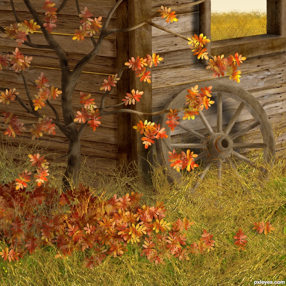
this is very pretty. one complaint....the contents of the window should be different because it looks like the "outside" is in.
The outside *is* in, or rather, the back wall has fallen, exposing the back fields.
very nice , congrats!
it so realistic..i'm lovin it
juste wawwwwwwwwwwwww
it is amzing and very sweet and very heard work
I knew this had to be you. Great work, absolutely stunning.
wonderful creation author... a LOT of hard work here
Lovely work. Wheel needs a better shadow.
superb work!! love the colors
Splendid image that makes us travel to a cold Autumn day in the field. Beautiful...
wonderful .........
It's really good chop.
Congrats!
Congrats! Great chop
thank you for not fixing the sky through the window.. hehehe.. congrats angel
Congrats!!
congrats
Congratulations, Cheryl!
I somehow missed this one ... lovely work and congratulations!!!!
Congrats
Howdie stranger!
If you want to rate this picture or participate in this contest, just:
LOGIN HERE or REGISTER FOR FREE
Photography and photoshop contests
We are a community of people with
a passion for photography, graphics and art in general.
Every day new photoshop
and photography contests are posted to compete in. We also have one weekly drawing contest
and one weekly 3D contest!
Participation is 100% free!
Just
register and get
started!
Good luck!
© 2015 Pxleyes.com. All rights reserved.


very very interesting,neat and positive entry...well done author
Cool! Nicely done on B/W. Try shifting the pregnant woman more to right, invert baby vertically and swap placement with hands holding baby legs. It would seem the legs of same baby. A little of skin reduced and more black introduced wouldn't influence the message.. Just a thought.. Welcome to the world of pxleyes.
um... yea.. I see what you are saying but have NO idea how to do that. This was about as far as I can go at this point.. .lol But I really love the idea... I think... unless it will seem like she is giving birth through her belly button? Either way thank you for the awesome feedback
Great start to your PS entries. You did a good job blending, and cutting. Keep playing !
GL
JB
A nice collage.
Howdie stranger!
If you want to rate this picture or participate in this contest, just:
LOGIN HERE or REGISTER FOR FREE