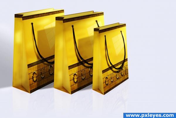
only source and PS (5 years and 3914 days ago)
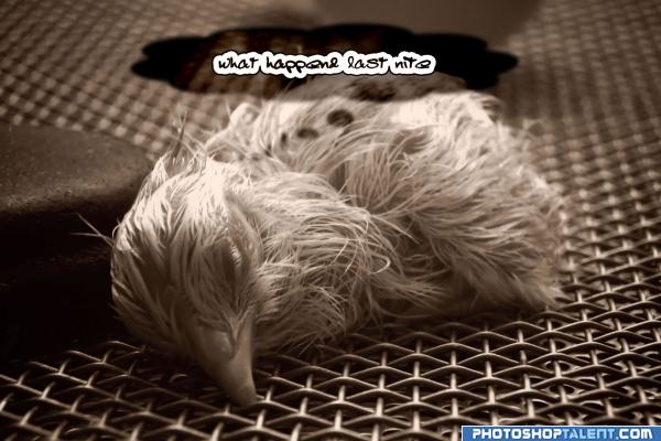
OK READ THIS FIRST
This is just an entry as a joke was the first thing that came to mind. poor thing looks dead to the world, and im sure some of us have felt that THE MORNING AFTER!!! and probly looked like that too. but if by some miracle this wins the contest LMFAO!! i would have to say everyone has a great sense of humor LMAO.
I am going to do a serious one later when i have more time, spent about 10min on this one.
All source image. Verbal SBS right here.
1. made clouds using the custom shape tool and picked the clouds, filled it with filter>clouds
2. blurred it
3. applied Linear Burn for the cloud effect blending
4. added the text (5 years and 3922 days ago)
lol ;.)
Author... it wouldn't take much for you to take a picture of a toilet and replace the black thing next to the chick.. it would make your message a zillion times more powerful as well as funny IMHO..hehehe
just addindg text is not enough
GolemAura > id have to agree but if you ever had one of those days, and woke up in a wide open area such as that what would you be thinkin other than where the eph am i? LOL, To Everyone Else> i know txt is not enough, this was a fun thing, im planning on elaborating and making a full SBS on my second idea, this was my orignal cuz it was screaming hangover. besides did you not read what i put ABOVE
lol 
omg... she is tooo young for this! 
not much work... gl
Howdie stranger!
If you want to rate this picture or participate in this contest, just:
LOGIN HERE or REGISTER FOR FREE
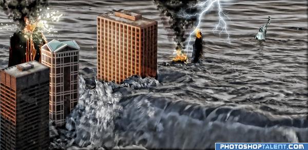
It took me 3 days to complete this image)) including figuring out What to do and How to do it... Pretty satisfied with the result.
I Do like comments and hi res views) Thank you! (5 years and 3929 days ago)
Hahaha - i started one just like it.. I ended up trashing it! Could not get the right feel to pull it off to my liking.. You really need to be sure of your perspective. The buildings should all be on the same angle from our viewpoint. The two outer ones are close but the on in the middle needs to be rotated more. A bit more time on your edges also would help. 
good idea
ohhhhh cool.
haha awesome, perspective is totally off but doesnt matter its comical the way it is.
Yeah, I know perspective... but the ground is kinda shaking and the buildings are dancing around... Anyway I like it the way it is now)
theres different light source on the buildings and water, goodluck 
Howdie stranger!
If you want to rate this picture or participate in this contest, just:
LOGIN HERE or REGISTER FOR FREE
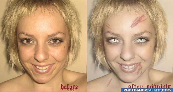
this is how I look after midnight :)))) (5 years and 3932 days ago)
Oh please. (Making fart fanning way gesture) 
Where's the SBS?
u look much improved in the before image
Source link? or is this you author?? Which is then not really anon..
scary
read contest description again
This is not the aim of the contest.
OMG!!!
???
off theme !!!!!
scary....
i actually like it, but off theme..
Howdie stranger!
If you want to rate this picture or participate in this contest, just:
LOGIN HERE or REGISTER FOR FREE
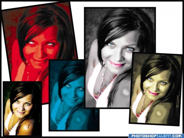
mask different tones and colorize (5 years and 3935 days ago)
Obviously, beauty is in the eye of the beholder.
color change is quite different.. odd to choose dark olive tones.. almost pea soup green.. but it's your choice I guess.. definitely different
EDIT: WOWZERS.. you jumped through the hoops didn't cha.. LOL.. good job!!!!!
thanks probably u where rigth abot the tone.
looks much better in the before version
Interesting idea good luck!
good luck
good job
which is before? which is after?
simple but pretty good

original image has got number 1 in sholder is the left dow side
Good Luck 
the original looks the best
Howdie stranger!
If you want to rate this picture or participate in this contest, just:
LOGIN HERE or REGISTER FOR FREE
nice adaptation
Shadows are wrong...they should start from the front edge of the bags...
great job!
Howdie stranger!
If you want to rate this picture or participate in this contest, just:
LOGIN HERE or REGISTER FOR FREE