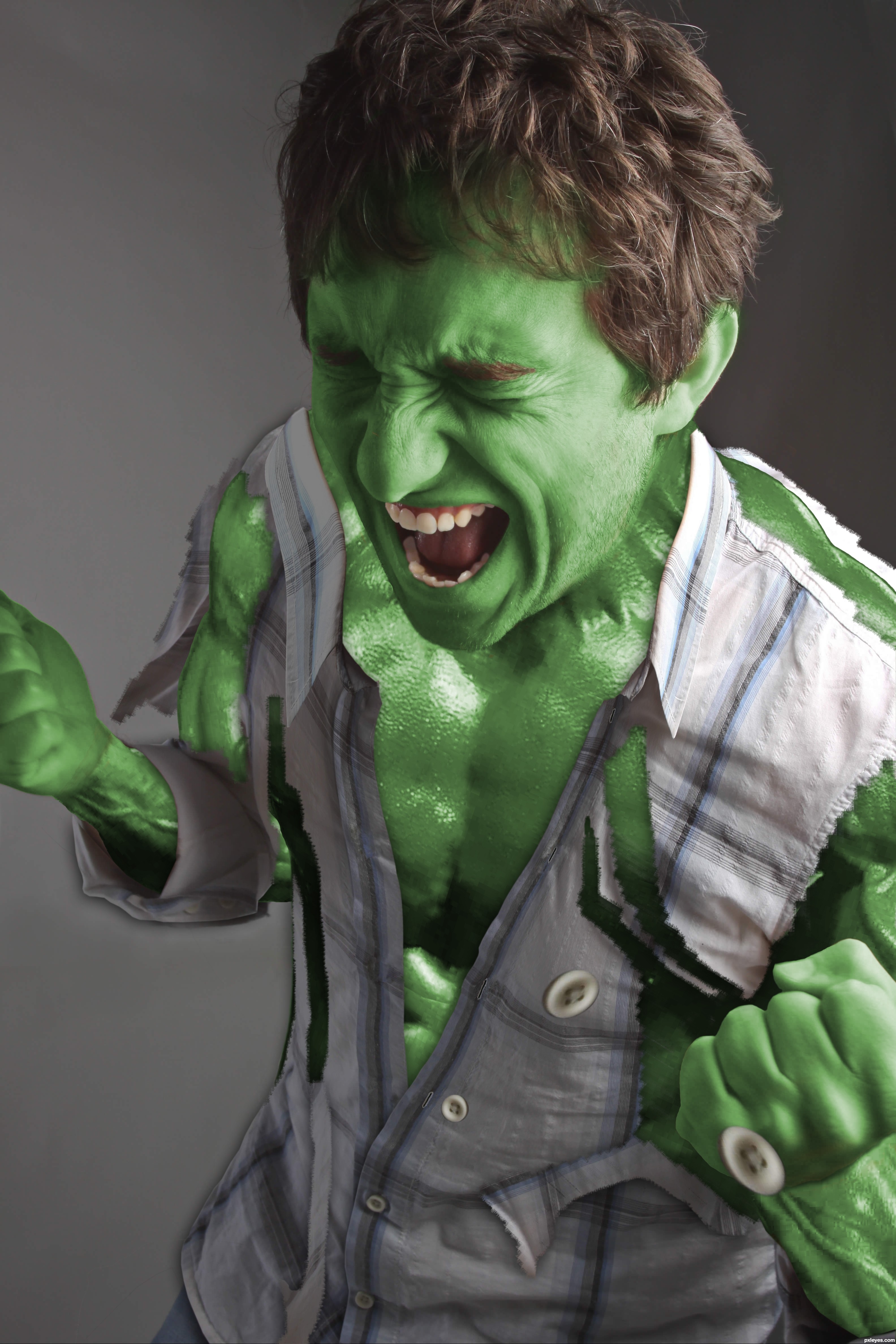
...and this was my favorite shirt!
(I've just seen there's another "Hulk" on the contest. But I've spent many hours doing this and I don't want to just throw it away... hope it's ok to post it) (5 years and 3332 days ago)
1 Source:
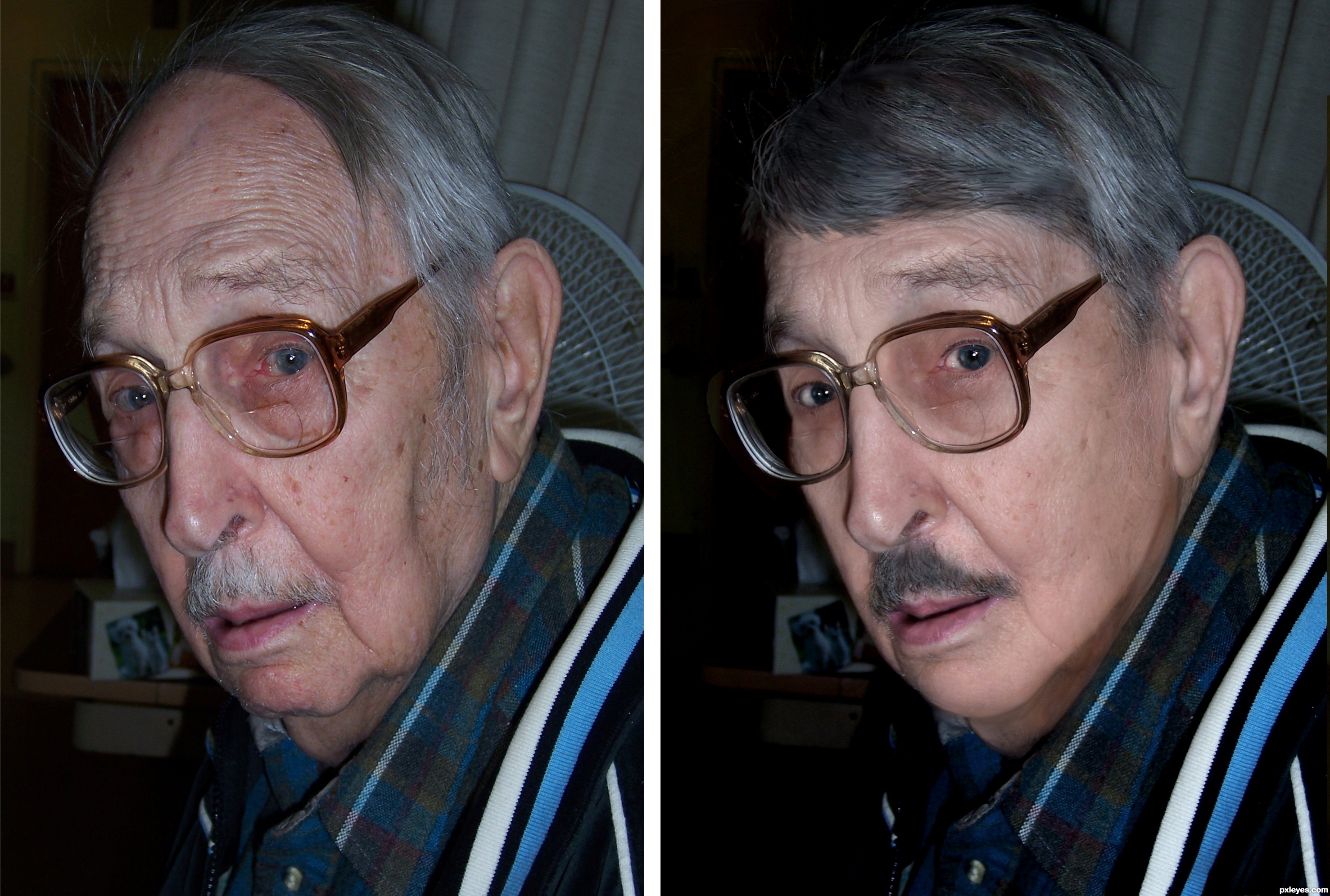
thanks to Chris Corwin for the photo
simply took the original photo and airbrushed the lines out, and reshaped sagging features.
then applied the photo over again and reduced opacity, airbrushed again and repeat till done. (5 years and 3346 days ago)
Really nice work here...GL author! 
thanks ,cmyk46
SBS would be nice to see how you did the hair.
Ichappell, the hair is all hand drawn and painted.
wonderful work!
Really well done, author. One thing that would really make him look younger is smaller glasses. As for what you've done...it's great!
cool work author...gl
great job on the hair I find that can be the hardest
Nice work, very convincing.
Howdie stranger!
If you want to rate this picture or participate in this contest, just:
LOGIN HERE or REGISTER FOR FREE
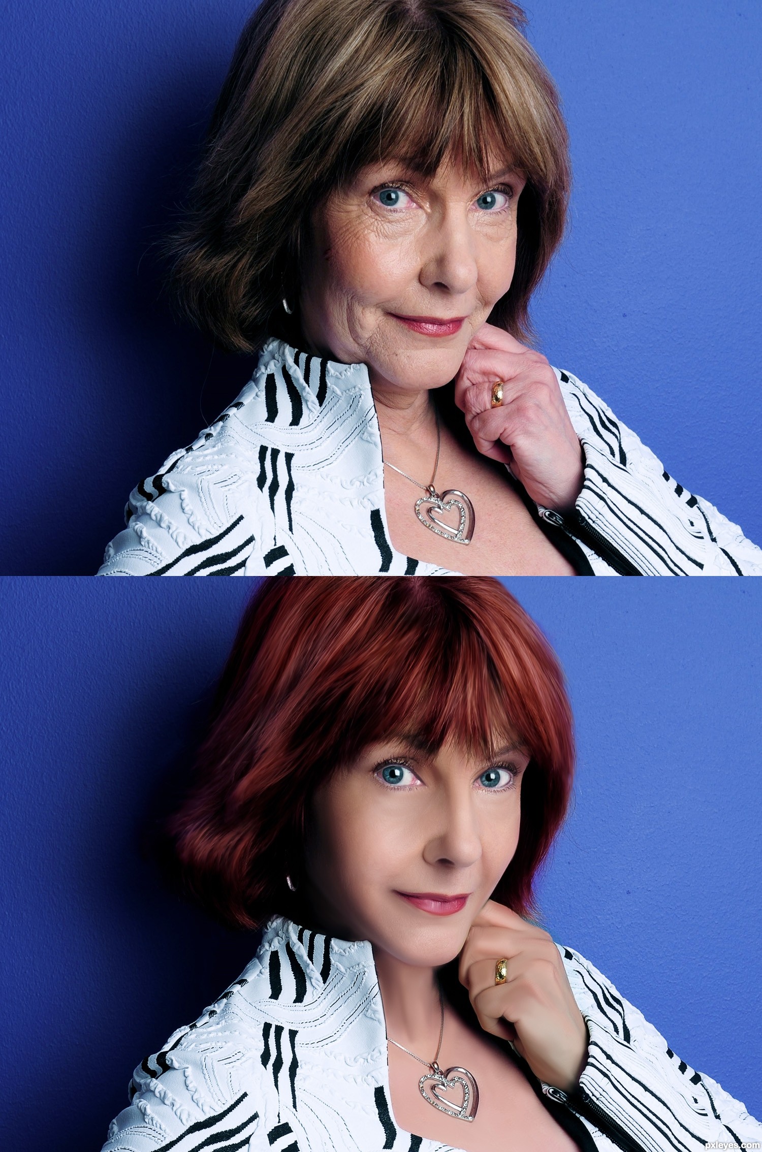
Because I flatten the layers by mistake I cant provide step by step layers, but I will describe the process.
For all this I used a graphic table.First on a duplicate layer use liquify tool to make changes on the face contour.
Duplicate that layer then adjust the color with selective colors and make a selection around the hand and with curves get rid of the reddish color.
Then I used healing spot tool to get rid of big wrinkle and to uniform the colors on the face a little.(you can use in this step noise/dust and scratches is useful too in this cases ).
Then with a soft brush opacity pressure sensitive I used the mixer brush (cs5) on moist light mix settings, but you can use the smudge tools as well if you don't have cs5 with short strokes and 30,50 strength.
Then I make a mask and I paint with black to bring the pores on chicks nose...
On other layer I colorize the hair in soft light , I draw the line on eyes the eyelashes and with dodge and burn tool enhanced the eyes colors.
Thats it, hope it was useful!
(5 years and 3349 days ago)
Super work author!! GL
Beautiful!
thank you guys 
Excellent work...would love to see SBS also.
right on target!
The first entry usually isn't the best [generally because it's too quick], but this may be the exception that proves the rule. A high standard has clearly been established.
The 'before' model's fashion choice was perhaps not exactly age-appropriate (if one were judgmental), but the 'after' model rocks it!
looks a little too fake for me..great job though most people dont have those skills!
Looks nice, but I agree with CrystleClear that it's slightly too fake. I always do my healing / clone stamping on it's own layer, then lower the opacity to 80-90%. That way the original skin details and lighting shine through.
guys first of all thanks, yes I agree with blazer and crystel is a little overdone but in this case (very much amount of wrinkles) the face had a very small intact texture so I had to do again the skin, the mistake is the pores and the ligtining on face , I have one week to improve this, thank you very much for yours feedback!
well done!!!
look at hi res,....really great..!
SBS, please..?
D*mn great job mate !!
Good luck 
She's fit before the makeover
Great retouching..Good luck author
Fantastic work authos, very well executed, gl
If I took my grandmother to glamour shots.... this would be the result, well this is probably, like 200X better, great job author! Maybe get a part-time job re-doing people's grandmas...... wait does that sound right? Anyway, Super Job author!
Edit: Add SBS and this is a Fav.... for sure!
this is great! Yes, I would add some pores to her skin though to make it REALLY great because it does look a bit fake.
Pores are needed badly, looks a bit like plastic this way.
Thank you all for your feedback I made a change needed on the pores and I provide on description the process.
WOW  Great one!
Now you got it , could be a winner.
Top entry author...One of the best in the competition for sure...High marks from me...best of luck
great work author, gl
thank you all for your comments
I may have an entry in here ..and I have to give u top marks ,,lovely work
Fabulous, the lady looks like a super model on the manipulated picture
wow, pretty nice
Great work, very true to life.
Congrats for your first place, Nanaris!
Congratulations
Congrats, beautifully done
thank you all so much!
Congrats!!
Congrats on first Place Win
Congrats, great job!
Amazing! Great work
Howdie stranger!
If you want to rate this picture or participate in this contest, just:
LOGIN HERE or REGISTER FOR FREE
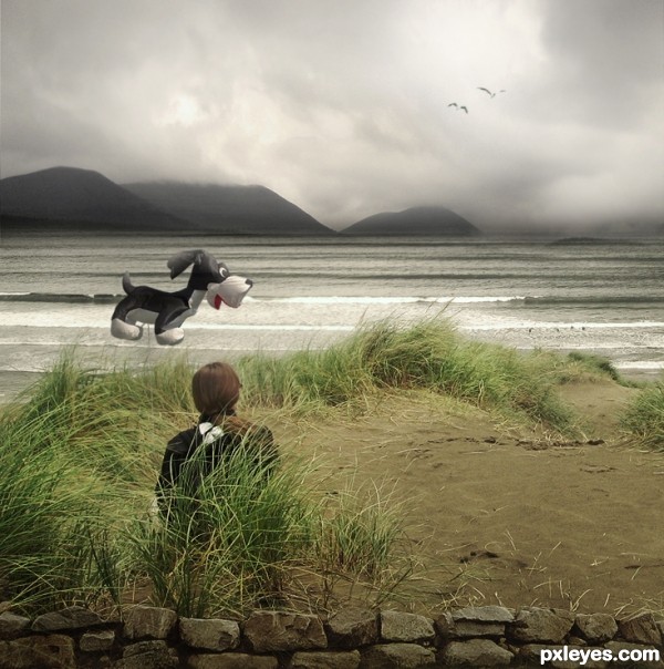
Special thanks to Lies Meirlaen for the BG: http://www.sxc.hu/profile/liesie (5 years and 3349 days ago)
it may be my eyes.. but the string is confusing the image.. to me it looks like the dog is far far away, floating over the water... but the string reels it in and makes it seem like we should think the dog balloon is sitting right next to the human subject.. and it doesn't work.. if you made the string's perspective running out to the water... a very difficult proposition but it can be achieved...(lots of shear for wiggle and perspective for dof) I just feel like the dog is chasing the birdies but the string/leash doesn't look right..
sorry.. it's a great image, but it's visually confusing.. if you describe what you were trying to achieve I think that will help.. good LUCK!! and great job
I guess I did not know very well what to do and can not tell if it's still good! Thanks
nice one...fantastic blend...gl
Howdie stranger!
If you want to rate this picture or participate in this contest, just:
LOGIN HERE or REGISTER FOR FREE
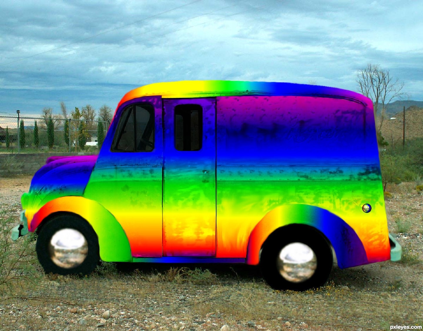
Spec Thanks to Cobalt123 for use of this picture found on flickr photo sharing.com (5 years and 3383 days ago)
Now THAT's a rainbow LOL, great job author
Howdie stranger!
If you want to rate this picture or participate in this contest, just:
LOGIN HERE or REGISTER FOR FREE
Photography and photoshop contests
We are a community of people with
a passion for photography, graphics and art in general.
Every day new photoshop
and photography contests are posted to compete in. We also have one weekly drawing contest
and one weekly 3D contest!
Participation is 100% free!
Just
register and get
started!
Good luck!
© 2015 Pxleyes.com. All rights reserved.


Great idea for the source image!! Perhaps darken the wrists and abdomen area a bit to give some variation to the green tone. The areas added look kind of pixelated like it was enlarged or something. One other suggestion would be to use the 'scatter' and 'angle' setting on whatever brush you're using on the rips and tears of the shirt. This will help randomize the brush shape more. Nice job author and GL.
Thanks for your suggestions Pixelkid!
Great idea for this! Good work.
Thanks pearlie!
Howdie stranger!
If you want to rate this picture or participate in this contest, just:
LOGIN HERE or REGISTER FOR FREE