Photoshop Pictures: Ago


results 1 - 5 of 6

Once ago - created by elemare


Once ago
Favs: 0SBS: 14Hi-resRank: 3/10Score: 62.5% (25)11386 views

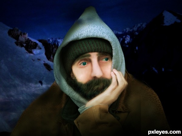
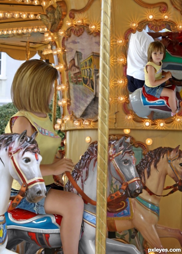
The picture of the girl in the carousel mirror inspired this piece. I wondered what it would be like for a woman to see herself having fun as a little girl again.

To bring the idea to reality, this required building the woman from the little girl's body. Lots of warp, smudge to paint, and color overlays to change the horse and saddle colors.

*Update* hand redone. (No suitable stock found; had to re-draw. SBS updated.) (5 years and 3065 days ago)

2 Sources:

avatar MossyB
MossyB says:

Great concept, you have only one major flaw - the hand. It is opposite the reflection, and is still too "baby" like in appearance, not a grown woman's hand.

You can probably find some stock image of a woman's left hand that you can insert into the image.

Other than that, nice work!

avatar Chuck
Chuck says:

I agree with MossyB I was thinking the same when I looked at it before I saw comment Nice though

author says:

Reworked the hand. I, too, had a vague problem with the "chubby" hand, but you two defined it for me, thanks so much!

As for the position of the arm and hand, I don't understand your comment, MossyB - it is the other (right) arm, not the one (left) reflected in the mirror...

Thank you!

avatar Drivenslush

excellent work!!! and a LOT of it ... LOL

avatar aheman
aheman says:

hand can be smaller a little, rather big now

simply like this image... great work!

avatar Bitmap
Bitmap says:

Very Nice Work .... the idea is good
I guess that the edges of the waoman's hair is a little obvious ...
and the her chest must be a little smaller or a little rounder ...
but the rest is very very nice ....
I voted Good on this one

avatar Glockman
Glockman says:

good work on this one, well done.

avatar arca
arca says:

Wonderful concept and great work!

avatar nilknarfsoive

congrats!

avatar lordymail
lordymail says:

Congrats!

Howdie stranger!
If you want to rate this picture or participate in this contest, just:

LOGIN HERE or REGISTER FOR FREE


Several years ago - created by neeraj55


Several years ago
Favs: 0SBS: 7Hi-resRank: 10/10Score: 51.8% (0)5921 views

(5 years and 3367 days ago)

1 Source:

avatar erathion
erathion says:

excellent work author...well done

Howdie stranger!
If you want to rate this picture or participate in this contest, just:

LOGIN HERE or REGISTER FOR FREE


Long Ago - created by Chuck


Long Ago
Favs: 0SBS: 7Hi-resRank: 10/10Score: 52.5% (0)5058 views

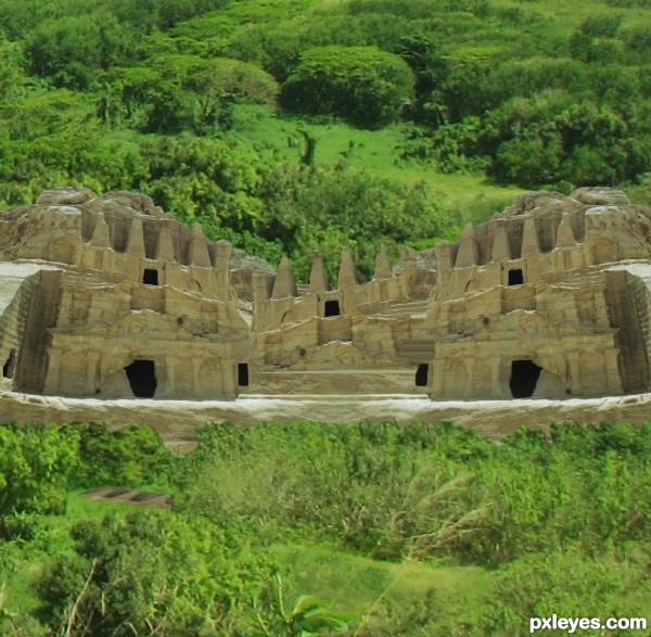
Spec Thanks to JakeRome
for his picture Green Forest
found on Flickr photo sharing.com & jakerome photostream (5 years and 3387 days ago)

1 Source:

avatar neeraj55
neeraj55 says:

coooll image i like it . g l

avatar Tuckinator

cool.

avatar silencer32

good idea

avatar erathion
erathion says:

nice idea and cool colors but demand more work...its always hard to separate trees,bushes and similar objects from background...use this tutorial as a guideline for masking a trees http://www.pxleyes.com/tutorial/photoshop/1272/How-To-Mask-A-Tree-In-3-Minutes.html...For your entry,bottom part of the bushes is to sharp,when u do things like this,u could use smudge tool after to add some curves branches and that kind of stuff..sorry for my nagging but i hope this is gonna help u in the future...best of luck

author says:

Hey Thanks erathion for info and thanks everyone else for coments

Howdie stranger!
If you want to rate this picture or participate in this contest, just:

LOGIN HERE or REGISTER FOR FREE


Yesterday or 33 years ago? - created by wlado


Yesterday or 33 years ago?
Favs: 0SBS: 6Hi-resRank: 10/10Score: 57% (0)12726 views

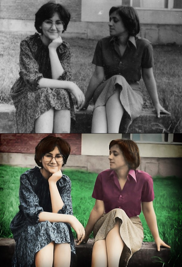
This is a photo of my mum and her best friend taken 33 years ago while they were still in high school. The photo is really small, I'd say as an average business card, so it was really hard getting it to look sharp. I used a special technique for making the edges look normal (since sharpening filters know to make that strange blurry glow on some places), check out the SBS. I also used some other images from flickr for facial parts and parts that were to small to be sharpened with filters (eyebrows, glasses, nose....), it's all listed in the sources.

Hope you like it. =) My mum sure did, she even made me some cookies :D
(5 years and 3612 days ago)

4 Sources:

avatar chaplain
chaplain says:

Well done. My favorite part is the look on the face of the girl on the left. She looking at the other girl as if to say, "Don't move. There's a huge bee on your shoulder" while girl 1 is blissfully unaware of the impending stingage. Great job. I'm looking forward to the SBS cause the edges are fantastic. The left eye of the girl with glasses looks like it's half closed. Not sure but it's the one point I see that looks a little unnatural.

avatar ponti55
ponti55 says:

Very nice work! In my opinion however, the skin and especially the grass looks very unnatural, i'm really no good at this type of thing so i wouldn;t know what to suggest, perhaps some different shades of green around the grass.

author says:

Thanks for the comments guys! Glad you like it =) The SBS will come during the day, I planned to finish it about now, but something came up, I really really have to go now.... Doesn't matter anyway if I lose a bit of reputation, just hope they don't expell it. =)

author says:

Oh, and about the grass and the skin.... Yeah, the skin really looks kinda... 'painted' in some parts, probably due to sharpening filters... I'll make sure I fix it.... =) However, I do like that the grass is blurred, kinda looks out of focus, and I really like the effect =) About the eye, hmmmm, it kinda does look half-closed.... Tho I didn't mess with her eyes, couldn't match any I found only with my mum's (the one without glasses)

avatar kayaklovergirl

the grass is surreal, its cool

author says:

Thanks all, I added the SBS. =)

author says:

An update.... I fixed the skin, and I did some touch-ups to the hair. =) Hope everyhting is OK now =)

avatar jawshoewhah
jawshoewhah [banned] says:

You missed a lot of scratches that could have easily been fixed.

author says:

Wuuuuuuuuuut?! Where?! O.O I can't see what you mean.... I just can't see what you're aiming at? Have you looked at the SBS?

avatar adeincyprus

imo, there are still a number of areas that could be a lot better. the heads and hair on both ladies could be much better, in hi res you can see this...your mother, the one with glasses, her face needs some more work, her nose is not finished well........her arms also look like prosthetics, especially the left one, they lack definition.....imo

author says:

Hmmm, some parts could be better, but only if I used external sources for those parts, since they are to blurry. You must understand that the photo is not bigger than an average business card. I tried to do my best here, edges are much sharper, you must admit, but some things just can't be sharper. Besides, TBH, I think this is maybe the only entry which has cleaner outcome than the original. Most of others are just colouring and scratch-removing and simple usage of filters.... Some are even blurrier than the original.Considering the original, the outcome is great IMHO.

avatar freejay
freejay says:

Ummmm....nice work on your entry, but your last comment wasnt true .....Other entries did come out cleaner and sharper.... besides that, you shouldnt be putting down other entries to try and make yours look better.

author says:

TBH, I see only 3-4 entries in this contests which are cleaner sharper than the original. Others are just colouring and scratch-removing. I'm sorry for maybe putting down the other entries, I was just pissed off by the fact that I spent hours manually making the edges sharp and clean and even using outside sources to bring up the detail on faces etc and then somebody says that it's scratchy and blurry etc. I mean, maybe it is, but compared to the starting photo it's much better. peace

avatar chakra1985

great

avatar freejay
freejay says:

Well i thought this should of made top 4 at least.....i have to say that the results are very dissapointing and just dont seem right.

Howdie stranger!
If you want to rate this picture or participate in this contest, just:

LOGIN HERE or REGISTER FOR FREE


long time ago.... - created by martDart


long time ago....
Favs: 0SBS: 6Hi-resRank: 10/10Score: 49.7% (0)7472 views

(5 years and 3752 days ago)

avatar OliviasArts

just looks like filter works sorry...

avatar SHIPLEYGIRL

very nice i like it

avatar k5683
k5683 says:

neat

avatar Tuckinator

cool

avatar Steve1972
Steve1972 says:

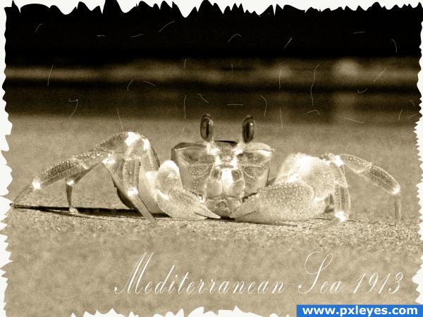
vintage postcard, love the idea

Howdie stranger!
If you want to rate this picture or participate in this contest, just:

LOGIN HERE or REGISTER FOR FREE