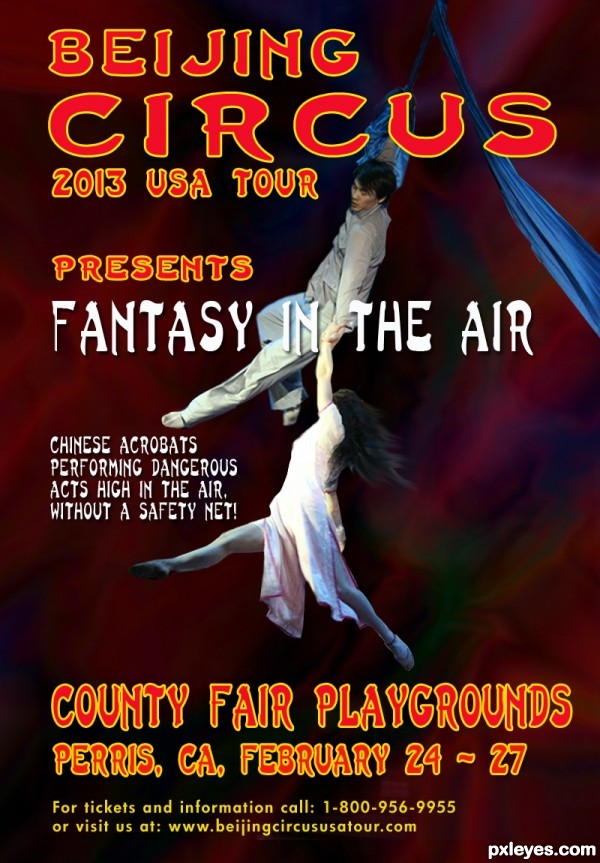
Thanks to eviltomthai from flickr, for the pic of the Chinese acrobats and D Griebeling also from flickr, for the pic of the Chinese background.
Typography are fonts from PS.
UPDATE: I really appreciate your comments and your suggestions. I just wasn't sure about the Chinese background. I thought at the end that it was so busy, and I decided to use a simple colorful background that goes with the text colors and image. No more changes will be made. (5 years and 2619 days ago)






Good poster author, but shouldn't it be "Beijing"...or is that how they spell it where you live? GL!
See, I told you Bob, my spelling is bad!!!! (C-), but thanks to you, I will know how to spell it right..I think, I am the only one who spells Beijing wrong here where we live.....!
The description mentions that photo manipulation as well as the typography is important, I see your attempt at typography but no photo manipulation at all. Maybe have a second chance on this and do something with the source?
Sorry if I sound harsh author, but I know you are talented and can make awesome stuff.
You're right Rob...will try to manipulate the image I have now...You do not sound harsh...This is the only way I will learn. Thanks for suggestion.
Certainly not bad, but a few things about the typography. You used blue text on blue background. Although the text has a lighter blue you stil may want to give it a more contrasting color (or maybe white). Other thing, since it's about a Chinese circus (or only acrobats?), is it an idea to give the whole poster a more asian atmosphere/typography (but of course keep it readable) instead of the typical western-american font? Good luck!
Thanks Waz. I am working in a photomanipulation as you mention on the rules. Will redo the text too...probably tomorrow, kind of late here now. Comment appreciated.
UPDATE: Made some changes to the original entry. Cropped the original source, and placed over a new background. I used a Chinese font ( Last Ninja ) for the Typography. Hope it fills the contest suggestions.
If this were my image I'd desaturate the background a lot...right now all the colors are competing for my attention.
Thanks again Bob. Background desaturated and motion blurred it a little more. The font is (Last Ninja). The bottom is Futura HV
Heyhey, quite a make over, author! Only thing left is that I might lower the block of text from county fair till the web address. Not too low, but imo it't covering the photo a bit too much. Good luck!
Thanks again Waz....made some changes to text.
Much better author, I like your make over
Thanks again Rob.
I feel that the blur is overdone because i cant see the beautiful picture from the stock
Thanks for comment Guiltss, for me the background is blurred because it gives the feel of movement..You can imagine the speed the acrobats are moving...?
I understand what you try to achieve here is motion blur. As a photographer that have shot many moving things (including this kind of act in a circus) theres no need to have a drastic motion blur because the performers doesnt move as fast as racing cars, what you need is motion blur in some part of the body to make it looks more realistic
Thanks again Guiltss...You are right, I brought the background back, and blurred it just a little. I also blurred the right side of the acrobats.... suggestion appreciated.
It is so much better Author nicely done
Now I can't see anything against the background. It's all white on white, black on black. You had it right earlier.
Thanks Bob. I am following your (Yours and others)suggestions...what can I do now? Blur more? Desaturate more? etc...Tell me, I will do it...I am here to learn.
Just think color contrast.
Much improved from your original! Everything pops more. Good luck author!
Thanks Tnaylor.
Howdie stranger!
If you want to rate this picture or participate in this contest, just:
LOGIN HERE or REGISTER FOR FREE