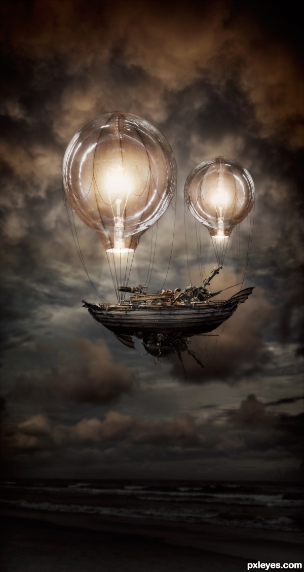
My first thought for this contest was to wake a lightbulb balloon! This just seemed like a very steam punk-ish thing to do so I ran with that :) (5 years and 3224 days ago)
(5 years and 3232 days ago)
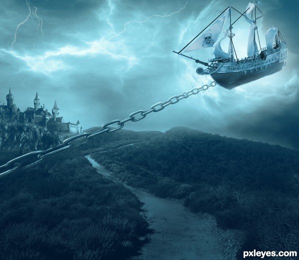
under the rope should not be shadow, and should be seen attached to the boat if it is an idea, everything else is ok ,although perhaps a bit to fill the picture with something IMO .
GL
It's a little to monochromatic, and the square window at the bottom is placed strangely on the building, although the values are excellent, with the fine details in the shadows still visible.
I agree with Vexycon, the rope looks like a flat cardboard cutout stuck on, with that dark edge on the bottom, and no curvature shading and highlights.
thx for the comments peeps, got rid of the rope, replaced it for a chain, looks better imo 
Much better with the chain.
wow..........!
Dramatic and evocative. You've turned the Black Pearl (source 2) into the Gray Pearl which is a bit bland. I think greater contrast on the hull and whiter sails would be more compelling.
The chain works as a concept. I think it needs a lot more links, however, so the link at the hull is appropriately small. The stretched near links not to mention the circular link near the hull are odd. Furthermore, I would expect a towing chain to be perpendicular to the masts (when towing through the air) and in line with the bow-to-stern center line of the ship (unless a turn is being made).
I think I would just eliminate the chain and brighten (and bring forward a tad [thinking Rule of Thirds]?) the upper-right corner so it is clearly the focus of the image. Because we can't see what is pulling the chain, it doesn't add a whole lot of explanation for the air ship.
And the big, square window on the house creates a distracting, fairy-tale feel (to expand on MossyB's original observation).
My fav !
Wow... nice colors & nice concept.. all d best author.. 
This is awesome!!!! 
Instant fav!
in your face pirates .................. love it and fav it
thx peeps for all the compliments!
Well i know ur all voted and fav my formel pic but it was removed for some of the images i used, i changed it although i had little time i hope u all still like it and thx for the votes and fav in the earlier image..
Great....
So so much love it .....
very nice work...
great
beautiful work author
I love castles,ships and art,got all in one,great design ! 
Stunning 
Congrats, terrific work 
Congratulations! 
Nice Job Congrats on your Win
Howdie stranger!
If you want to rate this picture or participate in this contest, just:
LOGIN HERE or REGISTER FOR FREE
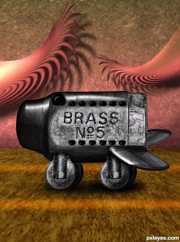
all source (5 years and 3240 days ago)
great work author ( G.W.A ) hehehe
Very cute, author! 
Beautiful work as always author!
Howdie stranger!
If you want to rate this picture or participate in this contest, just:
LOGIN HERE or REGISTER FOR FREE
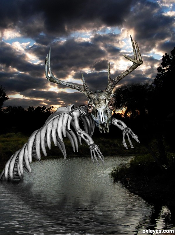
my own pictures combined with source (5 years and 3333 days ago)
I really like this!
Wow, one of your best, good job 
Seems as though there are other sources like the eyes and other bones. Might want to list those, interesting character. Try and blend it into the background photo more, he seems way too light for the light in the area...it would be way more creepy if you had to look at it twice to be sure it was fake...IMO
Titan, Please check the SBS (eyeroll)
Woooooooooooooow!
His eyes fascinated me...............wooooooooow!.............GL!
Ok i see the SBS, my bad for not seeing the other sources, other comments still stand though.

Really like this one!  Good luck!
Congrats 
Congratulations! 
You sir, are just "Too Tough To Tame" WTG! Grats
Congrats!!! 
Howdie stranger!
If you want to rate this picture or participate in this contest, just:
LOGIN HERE or REGISTER FOR FREE
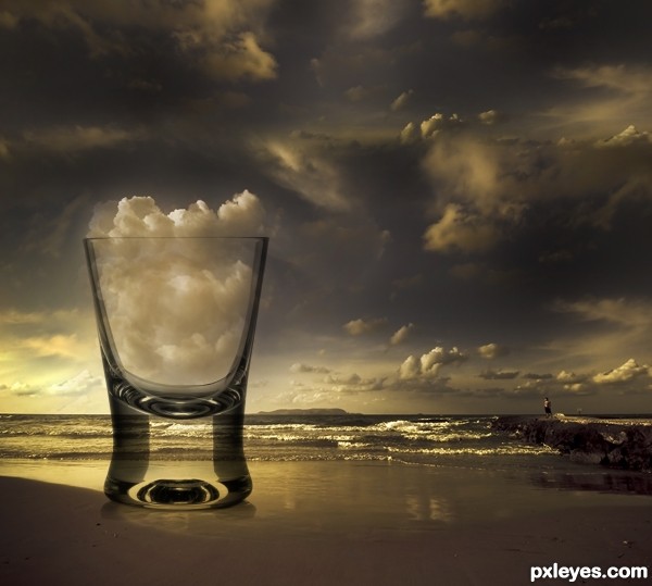
http://www.bing.com/images/search?q=magritte&view=detail&id=B784EBFF207BA5380FFD4703CF769A3F12970238&first=241&FORM=IDFRIR (5 years and 3391 days ago)
Cheers! Nice chop.
Fantastico the ambiance, the treatment given in the image and realism, we do not know if the cloud mean decreased or increased if the cup! GL
I think I can handle that shot!
Nice interpretation, I like the colors too (in fact the deep colors reminded me more to Dali than Magritte). What you may want to reconsider is the transparancy of the glass. Right now the background is pretty well visible, like you'd look through a normal window. This makes the glass itself kinda flat, one-dimensional. I think because of the roundness and thickness of the glass the background behind should be more distorted. How exactly? No clue, but maybe this image can be a good inspiration http://www.50prime365.com/days/03262005.jpg. Good luck!
great piece of work...very neat and very effective...well done
very very nice work
Great work!
Howdie stranger!
If you want to rate this picture or participate in this contest, just:
LOGIN HERE or REGISTER FOR FREE
maybe a winner....great
What a cool idea! The heat from the bulb provides the lift! Great image, very fun. I'd love to see the sky full of these!
Oh thanks!!! and Mossy great idea, I might mess around with putting some smaller ones in the background when I have some time
Perfect!...
That would be cool, but I meant I'd love to see the "Real World" sky full of these!
If you add more to your image, just don't "cookie cutter" use the same one, okay? Better to leave it be than detract with clones...
~M
Wonderful work! This just yelled "fav fav" to me!
very steam punk... woo hoo... excellent work!
Stunning work
absolutely awesomme ...
...
Very fun and creative steampunk approach to this contest.
I don't get the mixture of taut cables (clearly supporting the gondola hanging from the balloons) and flaccid cables between the balloons and the gondola. And the small balloon's connection point to the gondola is very odd.
The horizon line of the balloon bottoms is down (albeit different horizon lines for each balloon) while that of the gondola is up.
Notwithstanding the title on source 4, I find the ship more wreck than steampunk.
Fantastic work author, my fav !
Wonderful work!
Thanks everyone for the wonderful comments its like getting a little present each time I see I have a new one
amazing work..!!
wow this is great author gl
good work man
Great job,instant fav.Good luck author
great image!
Impressive work, very well done.
Congratulations on a very well deserved win!
Congrats Robert awesome work
Cingrantulations beauitiful work
THANK YOU EVERYONE!
Congrats!!
Congrats, great mood!
Howdie stranger!
If you want to rate this picture or participate in this contest, just:
LOGIN HERE or REGISTER FOR FREE