From Wikipedia:
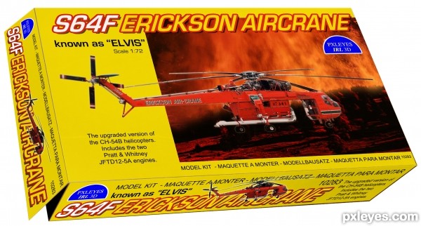
"The Aircrane can be fitted with a 2,650-gallon (~10,000 litre) fixed retardant tank to assist in the control of bush fires, and it has proved itself admirably in this role.
Erickson gives each of its S-64s an individual name, the best-known being "Elvis", used in fighting fires in Australia." (5 years and 3570 days ago)


nice
wowzers! this is a very very cool idea and image author! one thing though, the perspective of the lettering is leaning to one side so it looks like its raised to me, maybe make it aligned with the side of the box...just my opinion and this is still very cool indeed
Thanks for nice comments!
@Tuckinator: I was struggling with the text, but I figured since it´s leaned that way on the original print (sts) it will follows when the whole box is leaned? Bad explained - but I can´t find how to do it better.
All you need to do is to skew the text. Its an option if you go under the transform drop down box. Good luck!
this looks real... well done
Nice Packaging.

Chalty - I know how to do it by that means, but not how it actually would look like? I´m thinking that the shadow of the letters that are printed can´t be moved...if you have the box standing straight the printed texture is leaned that way with the shadowing. Then when you rotate the box the text and shadow would still be the same?
Therefor it appears a kind of wierd optical illusion. IMO...
Nicely executed, it's very realistic!...

And to say the truth, the first time I saw the image I also thought it had something wrong with the typing on the lid, but I realized the letters were inclined.
oooh, dont worry about it author, its a very cool image
very nice work ,good luck
Coool idea.. nd it seems very realistic.......
smart idea super execution,......second to none,.....really smart...
skillfully done and very realistic work!!
@ author, I at no means meant your picture looked off or anything. If anything the text just looks italicized, which looks perfectly fine. I just thought you were having trouble making it look unitalicized. If that makes sense. Regardless nice entry, good luck!
Don´t worry chalty, I knew what you meant, and I also saw the problem but it seems it has to be this illusion cause printed stuff don´t change - I think, but I am actually still not sure...I have to play around with a box and a camera one day just to figure it out - and then I let pxleyes know
So now I tested with a camera. It´s not a timeconsuming effort, but it gives us a hint of what happens when leaned text with effects is forced into another angle (sts) Look in the SBS, I put the two photos there. When the contest is over I might start a thread in the forum regarding this. It´s very interesting actually.
Cool!
Howdie stranger!
If you want to rate this picture or participate in this contest, just:
LOGIN HERE or REGISTER FOR FREE