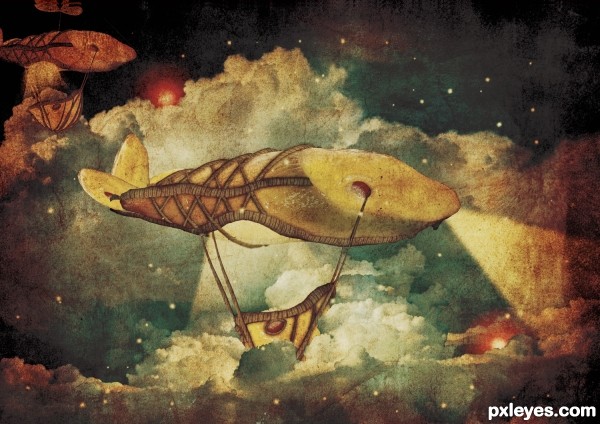
copied the niagra falls, free transform, flip horizontal (5 years and 2947 days ago)
- 1: source1
- 2: source2
- 3: source3
- 4: source4
- 5: source5
- 6: used right source
- 7: source7
- 8: thx to foureyestock

copied the niagra falls, free transform, flip horizontal (5 years and 2947 days ago)

(5 years and 3548 days ago)
Stars wouldn't be shinning through heavy clouds, but good idea, mood & color! 
Pretty cool design. If you could blend the tail section a bit better and soften the edges of clouds covering the 'basket' it would look much better. I would also reduce the glow on the head just a tiny bit (around the breathing hole), so it would look more like the rest of the picture. Looks like a picture for a story book, very nice work.
Nice old painting mood. I agree with CMYK about the stars. It's a very good entry, though. 
This is Great!
I really like the feel of this piece. Nice job.
It really looks like an old time illustration from those wonderful musty picture books at a small town library... simply awesome author
NICE ! GL
very very nice!
yes i knew it was u u have a unique style!!
it is very very nice ,good luck
nice idea. Well done.
Fabulous work author...best of luck
Very nice work author 

fabulous work author, gud luck
very nice job
This has such an awesome story feel to it. Very nice treatment. And your SBS is really well done as well. This is one of my favorites = )
Absolutely fantastic!!! I love the uniqueness of it and how you have taken a technique and made it all your own  Definitely a fave and high vote from me
congrats!
Looks good.
Wow cool! Very dream-like. Are you an illustrator? If not, you should be! I could totally see this in a children's book! Great job!
Unique entry! Colors look like a book illustration.GL
Congrats for your second place.
congrats for your second winning.....
Congrats on 2nd place! 
Congrats! for 2nd 
Congrats!!! 
Howdie stranger!
If you want to rate this picture or participate in this contest, just:
LOGIN HERE or REGISTER FOR FREE
Great job!
fantastic, love it
This is a very nice image. My only suggestion would be to work on the perspective of the chain. It should be tiny by the time it reaches the airship. Because it gets no smaller and lacks a vanishing point, it leaves me with the impression that it is right beside the object on the ground and nearly the same size. I haven't done a lot with the vanishing point tool, but I think it could be of benefit here. Good luck!
thx for ur comments folks, and pingenvy i changed the perspective of the chain, hope it looks better now ;p
Very cool art work.
It reminds me the movie "Up" where the whole house is flying and the anchor is the only way to attach the house with the ground Having ship comparison also adds the feeling of the vastness of the plain - thumbs up
Congrats with a spot in the next round
Good luck on the next round!
Congrats
Howdie stranger!
If you want to rate this picture or participate in this contest, just:
LOGIN HERE or REGISTER FOR FREE