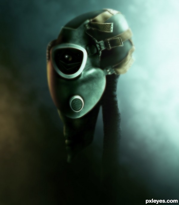
Friend or foe? (5 years and 3520 days ago)
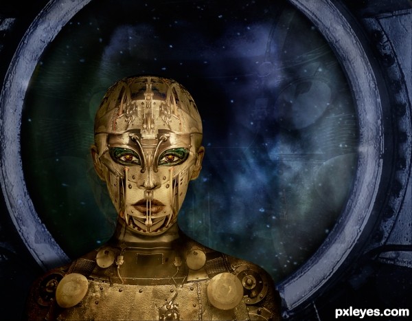
Humanoids could not withstand the radiation and long term loneliness of deep space travel. So she had chosen to lose her humanity. It was the only way she could own the stars.
Mostly source with a few clouds photos of my own and thanks to faestock for the model. (5 years and 3522 days ago)
cool work
looks great, love it 
great job building the model -- high res is worth the look to really see the effert.
wonderful stuff..... and perfect use of source High marks and fav from me.... 
bravo, good luck!
wonderful use of the source and an excellent sbs  well done
Fantastic work! Especially love the work on her eyes. 
Beau travail !! I like it.
Wonderful just wonderful! I love the scenario love the "gingerbread" detail! There's a touch of Fritz Lang (Metropolis)here as well. 
What everyone else said! 

Really nicely done! Good luck!
Wonderful creation and the SBS is OUTSTANDING!!!!
Oh my wow! A LOT of work went into this one, I can tell. Very nicely done and very creative. Great SBS too 
Very good entry.
Awesome SBS as always, and really cool art work = )
this is just mind blowing and explicit work
Very beautiful, amazing work!
Absolute winner...Perfect entry author...
great ......... 
Just fantastic. What an excellent use of source..
Congrats, Arca, awesome chop!! 
Congrats for a well deserved first place. Lovely entry!
Very well done, congrats on first place!
Thank you all so much for the votes, wonderful comments and favs!
congrats on first place 
Congratulations....great work.
Congratulations! Very well done 
Congrats Arca, awesome work 
Wow, wonderful, I though it was from Spaceranger, that's not your usual style, but still fantastic. Congrats Arca on your win and the high score!!!!
Congrats!! I love it!
well deserved 1st pace with a great score..... Congrats... 
congrats!! 
congrats!
Congrats Arc...Perfect work,one of my favorite favorites....well done
Congrats ! So amazing !!
I missed the contest, but saw this on the front page. Beautiful work! So much patience, so much detail. This is going into my favs. Congratulations on placing first!
Howdie stranger!
If you want to rate this picture or participate in this contest, just:
LOGIN HERE or REGISTER FOR FREE
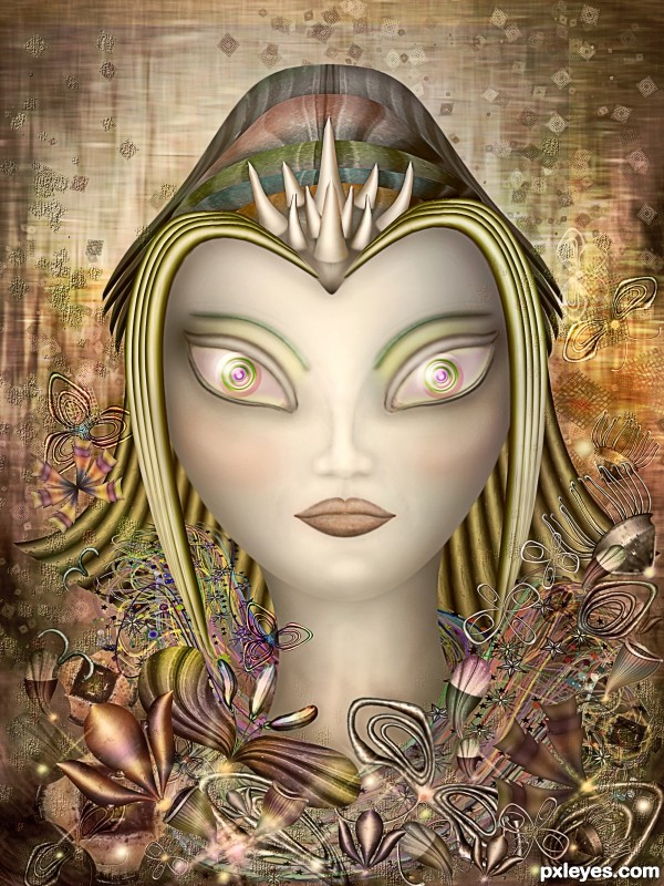
Only the source image is used (5 years and 3570 days ago)
and.........the winner is.........................LOLs, really great this one is,.....just congrats in advance........how could you always this much great? 

just lovely 
Wonderful creation.........Masterpiece artwork.
Beautiful. Love the metallic feel and the sophisticated color palette. Among its many charms is the fact that it's not a simplistic, perfectly symmetrical/mirror image entry.
Very nice entry,totally in your style author...I like the influence of the Russian art in your entry's...well done
Another Beautiful work 
great work 
Very nice entry
Superb work. Top3 sure
Many thanks to all for the nice comments and favs 
Lovely and awesome... great use of the textures in the original photo... to make this wonder abstract.... we should have an abstract category were you don't recongnize the original but alot of great work has gone into making an amazing work.
Loved this one! Just missed out......
Howdie stranger!
If you want to rate this picture or participate in this contest, just:
LOGIN HERE or REGISTER FOR FREE
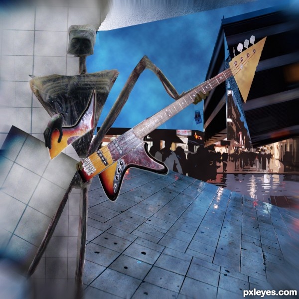
Tried to do a different approach than just dividing a photo in rectangles....
the full title should have been: 'Extraterrestrial homesick blues', but the site won't let me enter that as title.
I am not quite satisfied with the results, so suggestions are welcome. (5 years and 3613 days ago)
Nice, it's quite different. I like the background, it shows how you can be among a crowd and feel alone... 
Like the concept. The not-so-cubist extraterrestrial is not at all that clear without looking at the SBS. Cubism is largely suggestive in any event, so the alien needs to be much stronger IMO and readily identifiable as such as it's deconstructed. The guitar is merely split apart while I think of cubism as partial duplicates overlapping at differing angles.
Dan, Thanks for your comments. You are right in that the alien should have been stronger and more clearly deconstructed. I tried a more analytical approach, rather than just random overlapping rectangles. I think, that is what the early cubists tried to accomplish: showing more aspects of the same subject in a single image.
very cool!
Howdie stranger!
If you want to rate this picture or participate in this contest, just:
LOGIN HERE or REGISTER FOR FREE
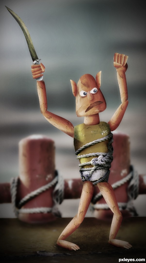
Only source used
(5 years and 3614 days ago)
love the expression cool
cool
Another Alien.....? Where is the other? (You mean...............) what ever... Nice job... 
Kind of a jagged chop but it's a nice effect if you're going for a cartoonish look. Hehe, nice work!
super...
More than an alien, it reminds me those mythical characters (like warriors of Ancient Greece, for example). Nice for a child book illustration! 
For this kind of style, very good entry. At least this is showing some work done and something (a lot) from the original source. Good job, author..
hahahahaha...funny creature author...best of luck
Cool!...good entry.
awesome!
Wow, this alien looks primitive, which tribe he comes from 

Howdie stranger!
If you want to rate this picture or participate in this contest, just:
LOGIN HERE or REGISTER FOR FREE
Good transformation of the source, good mood & color.
I like this a bunch, the title took me a second to get, but it's very clever, and I like how you did the dof here, well done = )
I really like this...Well I really like aliens hehe. This is really very well made, and love the mood of the image. Nice imagination.
Very very cool !
 !
!
tight!
Fantastic Work!
The mood of this work is awesome. Well done and nice transformation of the source. good luck!
Nice alien
very very good work author...with perfect mood...well done
Very dark!! GL
Congrats for a great third place!
congrats...
Congrats...,
Congrats!!
Howdie stranger!
If you want to rate this picture or participate in this contest, just:
LOGIN HERE or REGISTER FOR FREE