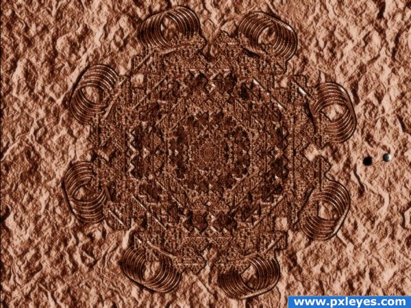
Who needs crops. :) This one lasts longer. Everything was created in photoshop, no outside sources. (5 years and 3808 days ago)
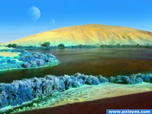
A planet similar to Earth. No outside source images used. (5 years and 3809 days ago)
nice 
Thank you

Howdie stranger!
If you want to rate this picture or participate in this contest, just:
LOGIN HERE or REGISTER FOR FREE
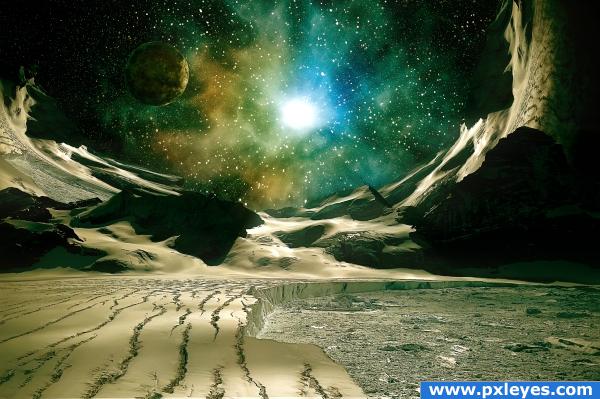
Most of the image was painted in photoshop. The rest were from the original image. There are no outside sources. (5 years and 3822 days ago)
nice
beautiful!!!!!
very nice colors 
Very nice composition....
Love this!!!
Simply the best..!!!Gongrats.
nice!
Great Job!
brilliant work author, enjoyed the tut but still a bit lost lol
Really beautiful. Good work. My fav!
Great xDDDDDD i love it!
Great Author Great...........Very nice composiion and eye catching colours....G/L.
looks great
very nice 
great entry,gl
Congrats, really nice work 
Congrats for your first place, Artist!
Congrats
Congratulations for 1st
Howdie stranger!
If you want to rate this picture or participate in this contest, just:
LOGIN HERE or REGISTER FOR FREE
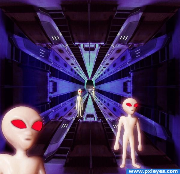
Enjoyed working on this, tried a few different techniques for me....learn't alot hope you like my effort...Ty
Previous entry was disqualified due to a source being ineligible ..... Thanks to EvanMugford for explaining why (5 years and 3893 days ago)
Source link or SBS now?
Who are you the local mafia ?..lol....Give me chance both have been provided 
btw CMYK46.... thanks for pointing out the source link, I have had it explained why it was inadmissible ..Ty
YW author, and good luck! 

Nice idea, bit scaring, aliens 
good job
cool
ty all .....for the positive comments 
Wow! The sweeties are back 
Howdie stranger!
If you want to rate this picture or participate in this contest, just:
LOGIN HERE or REGISTER FOR FREE
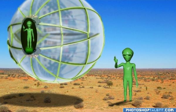
They've landed in Texas! (5 years and 3943 days ago)
i like it but the alien head is looking good but the body is not try to fix that and the shadow is to small..good luck!

and the photos are copyright i think
the shadow of spaceship should have lower opacity  GL
GL
i think the two aliens should be a bit more different.. and i think the shadow should be a bit more transparent. other than that, it's a very creative entry
All the photo's are from the wikimedia commons, to RGB, but thank you for the rest of the advice. To Kid, I'm workin' on draft #2.
Aliens are okay to use, but probably not the desert...look around and you'll find something else. Shadow of your ship says light source is straight up, so you should fix the alien's shadow. Good luck...
It's filed under a creative commons attribution 2.0 license, and the username who posted it is tensaibuta on flickr. Here's the license, http://creativecommons.org/licenses/by/2.0/.
idea is good. spaceship need more finish & alien's shadow to be corrected
the shadows need to be fixed a little 
Howdie stranger!
If you want to rate this picture or participate in this contest, just:
LOGIN HERE or REGISTER FOR FREE
Seems a lot of work here, very good.
very nice.like it. gl.
gl
very artistic
very good
Howdie stranger!
If you want to rate this picture or participate in this contest, just:
LOGIN HERE or REGISTER FOR FREE