(5 years and 3233 days ago)
source (5 years and 3234 days ago)
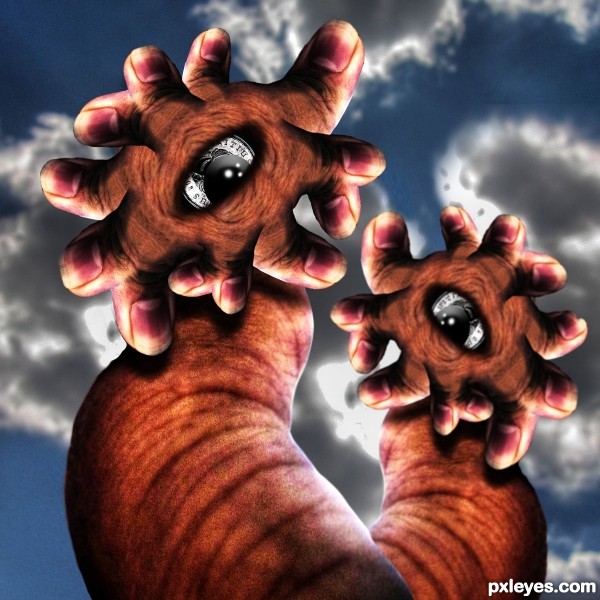
wow...this look so freaky and so cool....good luck author


Howdie stranger!
If you want to rate this picture or participate in this contest, just:
LOGIN HERE or REGISTER FOR FREE
Thanks to sir chalky, Killian Tuor, Don Coyote, memoossa and marshalgon (5 years and 3244 days ago)
amazing 
Fantastic and the SBS is really good too! Best of Luck
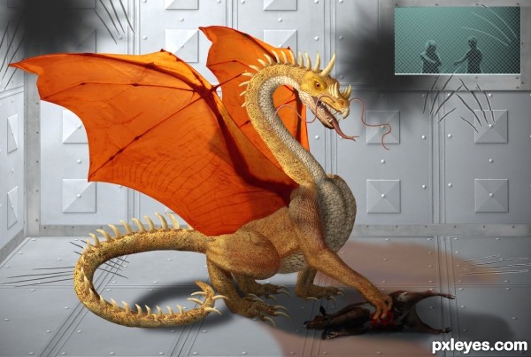
Not so cute anymore is he! Great work but I think I like him when he was a little guy better ... if I was going to have one of my own he was just sooo cute when he was young!  )
)
Amazing work and a SUPER SBS!!! 
IMO the people in the background take away from the dragon, which is beautifully rendered. With a nicely done creature like that, you don't need a story line or backup characters. Regardless, nice work and good score!
This is great and really well done. One small suggestion though...it seems the blood is a bit too bright for where it is. I realize that you don't want to lose it if you go too dark, but perhaps lighten the dead creature a bit. If you could add some cyan or black to the reds of the blood...it will help deepen it. I guess what I'm trying to say is a deeper, darker red for the blood would make this great entry really complete in my book.  !
!
EDIT: Looks 
Thank you, pixelkid. I didn't know and hadn't even thought about adding cyan to red to darken it. Seems counter intuitive somehow.  Anyway, I made the changes and it does look better. Thanks again!
you've toiled much! nice result!!!
Fantastic work! I like the claw marks on the walls.
wow! This is amazing. Love how sharp and detailed it is 
Congratulations!
Thank you for your votes and comments. 
Hi, congratulation...
Congrats on the 3rd place on a very tough contest.., super fav from me
Congrats!!
Howdie stranger!
If you want to rate this picture or participate in this contest, just:
LOGIN HERE or REGISTER FOR FREE
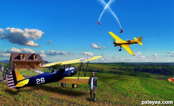
All My Rowdy Friends are Coming Over Tonight. Hank Williams Jr. A Steven Tyler rendition can be found here.http://www.youtube.com/watch?v=34sSPFQBn5k&feature=related
This is a basic cut and paste. Color corrections made to each source and some shadow work done. Thanks to my friend for providing a photograph of hers. The source was sent to me as a PNG file from her. (5 years and 3253 days ago)
awesome! just one thing, IMO I think you should reduce the opacity of the shadow under the big plane... 
Wahhhhhhhhhhhhhhhh.. I want that house in the background dammit (great job)
SlushMan, I'll sell it to ya! Thats my party pad way back in the woods. 


Very nice work and what a lovely spot ... can I have a little corner in the back somewhere ... something overlooking the valley! Great Chop (I do agree about the shadow but I probably wouldn't have noticed it had I not read KingRa's comment) 
Fantastic work author...great blend and very nice positive overall look...well done
Those sure are some wild and crazy friends you got, author, and one more gittin' ready to join the air show.
Great bright colors on a clear flyin' day in your 'hood! Nice chop. 
This is good! Nice stock with convincing blending.
nice second,congrats
Congratulations! Thought this would be up there 
Congrats!!
congratulation...
Well done, sir. Srry I missed it earlier.
Well done, sir. Sorry I missed it earlier.
Howdie stranger!
If you want to rate this picture or participate in this contest, just:
LOGIN HERE or REGISTER FOR FREE
~Simon and Garfunkel
I'll take your part
When darkness comes
And pain is all around
Like a bridge over troubled water
I will lay me down
Like a bridge over troubled water
I will lay me down
(5 years and 3254 days ago)
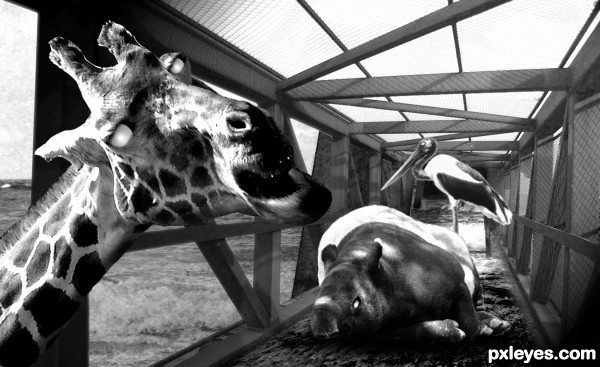
great idea, and the giraffe is priceless 
very sad but effective image author...best of luck
The giraffe is creeping me out 
Zombie giraffe! Run!
Howdie stranger!
If you want to rate this picture or participate in this contest, just:
LOGIN HERE or REGISTER FOR FREE
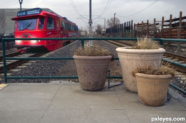
Trust me on this, the scaling is wrong. You might want to jut make the janitors a little bigger. But maybe it only looks weird to me because I took the photo.
Oh attaching some power lines to the train would be a nice touch. GL!
Try to work a little bit on the shadow, specially under the feet of the men and also on the color of them, it doesn't make real. Good luck author !
i agree about shadows...also there is a light sources conflict...i am trying to give some good advice but this sources have totally different light issues...maybe u could crop this sky and try with some other that suits more...
Thanks all everyone Here is a redo hope it covers what you said I changed a few things I didn't see before Let me know what you think
That's better with scaling but yeah shadows are needed. IMO, janitors with brooms waiting for the train like this look a little strange because they are practically running into each other. Maybe space them apart a little. Oh the train looks good on the left but the one on the right looks weird, since it's coming in the same direction. Just stick with the train on the left. GL!
Thanks jawshoewhah I took the clean up guys out and redid added lights shadows ect.
made it simple I though they were standing around b...s...ing but you may be right to knock them out
Simple but effective. GL!
Thanks jawshoewhah
Howdie stranger!
If you want to rate this picture or participate in this contest, just:
LOGIN HERE or REGISTER FOR FREE