(5 years and 3476 days ago)
1 Source:
(5 years and 3503 days ago)
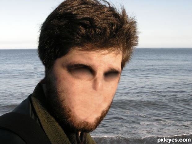
its all about feeling? I would suggest a different title as there is nothing in the image to express feeling something. maybe make the same picture with a full length image of a man and show his hands feeling something awful that one wouldn't normally touch if able to see 
goodluck.
Have to completely disagree with you Keiley. I think this you are taking the word 'feeling' to literally, not the emotional aspect of feeling which is (I think) the intended message. Nice job author.
thank you
was actually thinking about just the skin
anoly being able to feel with your skin
you don't just feel with your hands
Nice one, can the author do a How-to SBS?
ofcourse
will post it tommorow
Very nice work with the eyes author...gl
I think you may have obliterated too many senses here....
I agree with Bob.
Good luck author... interesting entry.
And BTW, there's no high res image.
This is freaking me out too lol. Nice work.
Howdie stranger!
If you want to rate this picture or participate in this contest, just:
LOGIN HERE or REGISTER FOR FREE
(5 years and 3514 days ago)
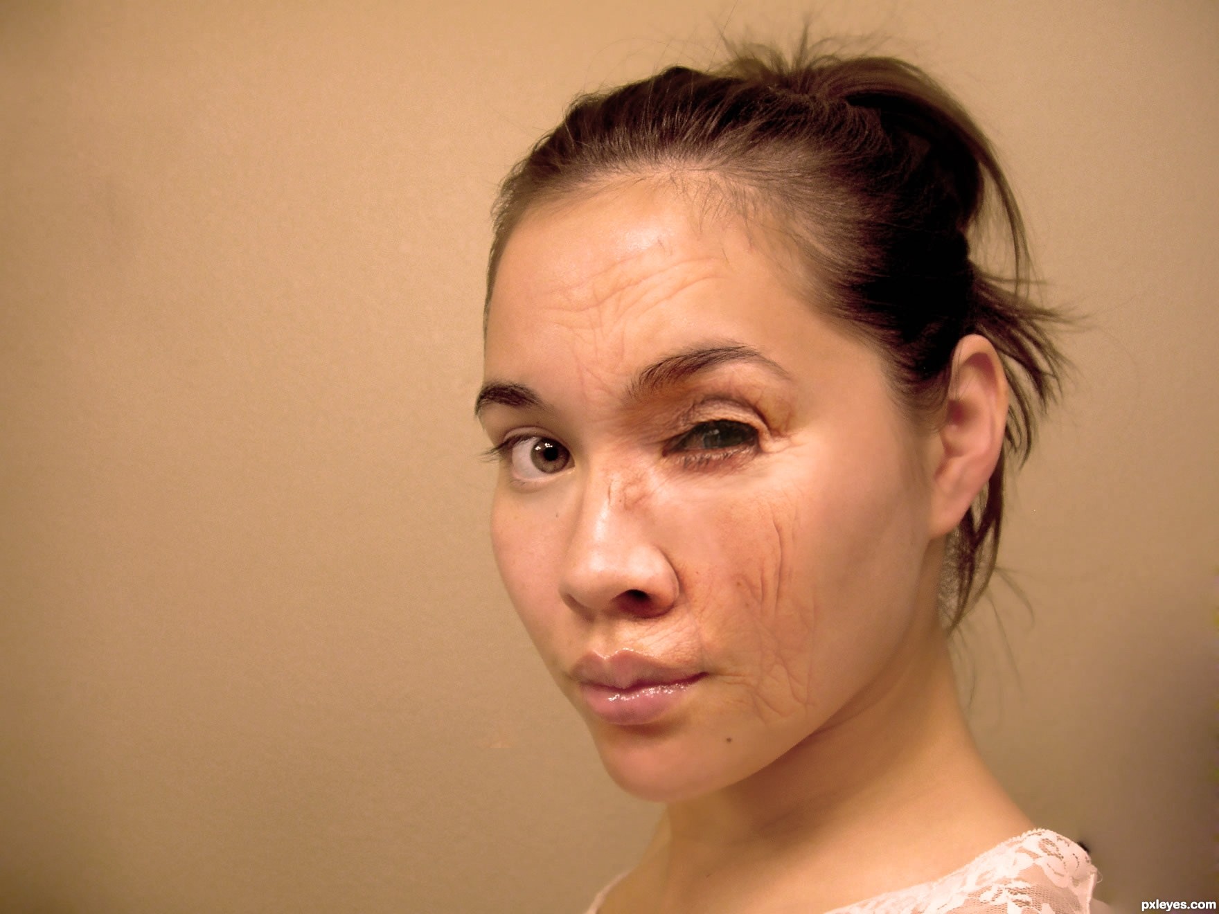
Oh you were going for old. I think it looks more like she got burned. It is a really good effect, I just see it more as burnt than old age, especially since it is only on one side. That's just my opinion
I see what you mean... If you look at the source it makes sense...or maybe i should change the title.. Thanks
Nice effect. Kinda reminds me of a poster for violence against women. Good Luck!
Not enough incorporation of the old face source. You've left so much smooth skin at the temple, cheek, ear, and neck areas that she just looks like she had a bad run in with a brick wall, not that she's aging. Remove the forehead wrinkles, and paint in some bruising and you can change the title to "after the fight."
Howdie stranger!
If you want to rate this picture or participate in this contest, just:
LOGIN HERE or REGISTER FOR FREE
I replacing my entry because of my spelling mistake & doing some changes.
(5 years and 3547 days ago)
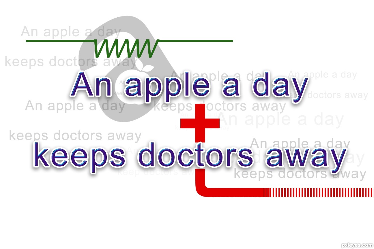
No images, nothing as decoration and no textures
Author, this is a good image. Donarkz has some sort of a problem.
what problem? the lifeline symbol.. is that a shape? i have a shape in my design too and it got remove. thats my problem.
Thanks CMYK46 & thanks Donarkz for the comments.
Here is some explanation for the life line , there is no symbol it is just created from ww letters.
I really like this. But your SBS doesn't provide any support to your assertion that you created the 'life line' from double W's. [BTW a third-person singular subject {he, she, it/'apple'} almost always requires a present-tense verb that ends in 'S' {the opposite of plural nouns!}, so it should really be 'keeps.']
Thanks DanLundberg, for the suggestion. I will do the changes. Thanks !
It actually looks like a medical ad...lol. NICE ONE
Howdie stranger!
If you want to rate this picture or participate in this contest, just:
LOGIN HERE or REGISTER FOR FREE
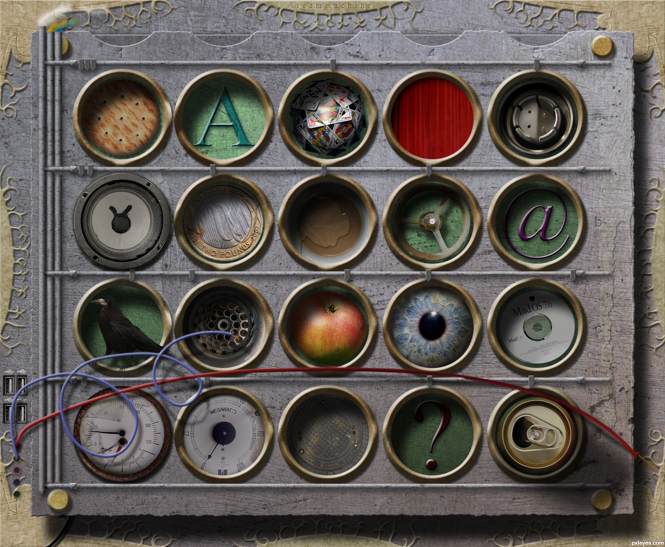
The lastest addition to your computer would be a USB Steammachine which you could hang on the wall. You can order anything from your lazy chair just by putting your finger in the designated hole and it will be scan your fingerprint so the system knows who ordered it. Ofcourse the background images can be replaced by anything you want!
Some objects are on top of the wholes because they are part of the system.
>> more sources in the SBS. (5 years and 3588 days ago)
That would be a really useful tool! A bit bad for our health tho xD nice idea.
Btw is it me or you forgot to add some shadows on the buttons? The majority has an intense shadow from up-left and some have a really thin shadow, since the buttons seem all equal to me (their shape) i guess the amount of shadows should be very similar to all of them.
Thanks Akassa, somehow there's things we overlook while being busy. Added the shadow 
A special tool for busy couch-potatos! 
Very cool...
good composition and nice idea, good luck!
Congrats
Congrats on a well deserved first place!
Congrats Rob a very interesting work
Congrats Rob...
congrats rob, nice entry
Congrats! Rob. Very nice work and well deserved.
congrats Rob
Congratulations, Rob!
Congrats!!
Thanks for the congrats all!
Howdie stranger!
If you want to rate this picture or participate in this contest, just:
LOGIN HERE or REGISTER FOR FREE
Photography and photoshop contests
We are a community of people with
a passion for photography, graphics and art in general.
Every day new photoshop
and photography contests are posted to compete in. We also have one weekly drawing contest
and one weekly 3D contest!
Participation is 100% free!
Just
register and get
started!
Good luck!
© 2015 Pxleyes.com. All rights reserved.


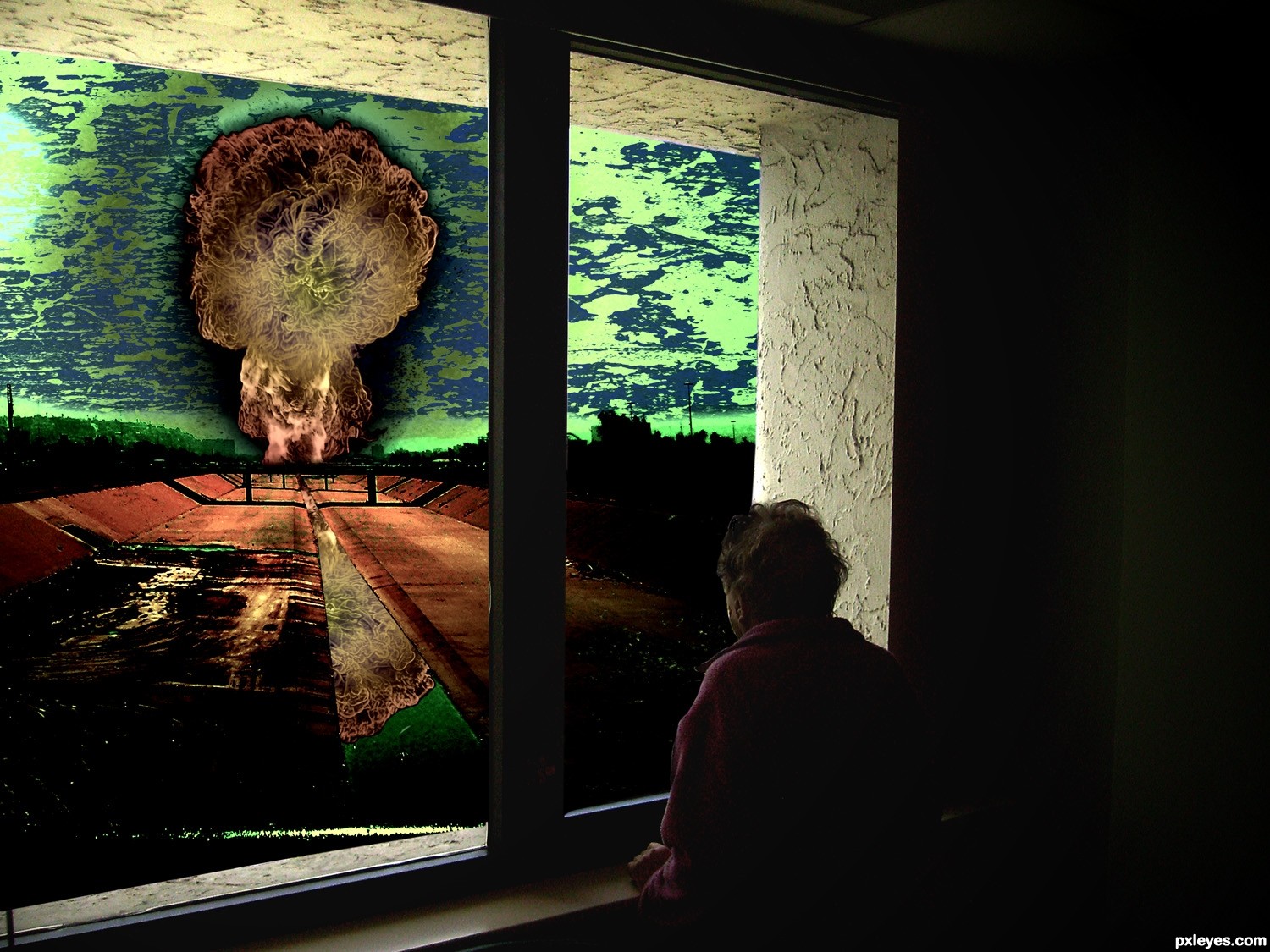
Good concept. The black outline around the explosion detracts from the impact of the image IMHO. It should be a glow.
Try to fix your link so it leads to the brush or brushes actually used.
Story:
"The old man was looking through the window and he was seeing..nothing, cause he was already blinded by the flash explosion a few seconds ago."
Imo, windows would be broken from the exp. at that range - but anyways, i like the concept- imagine staring at an incoming tsunami.
agrees to greyval.. hahaha lol
very very nice work author...reminds me on inevitable...Val's plot gives depth to your creation author...best of luck
It's a creepy story... and mankind is not far from there if we continue acting against life.
Looks like you color inverted the window part ? !
!

Hmm not sure if it helps the image but anyway good luck
Howdie stranger!
If you want to rate this picture or participate in this contest, just:
LOGIN HERE or REGISTER FOR FREE