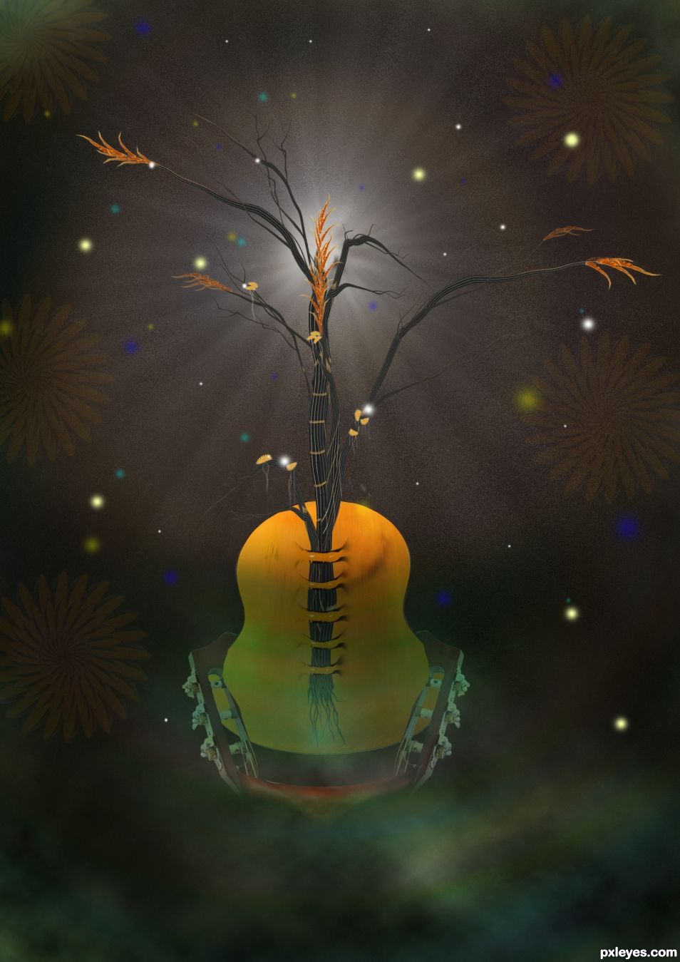
ALTAR is an altered guitar.
Everything is from the source. Please check SBS. (5 years and 1608 days ago)
(5 years and 3021 days ago)
Nicely done, has a good dramatic mood!
Great artwork!
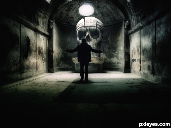
I like the skulls on the walls. Nice little detail. Great mood in this peice. gl
Excellent job!!! Fav!
Hey  thanks a lot Daniela!..
Thank u all for your comments!..
Effective and cool. Really like this author! I love the way the extended arms almost make the skull 'smile'. Nice job!
Hey thanks pixelkid!  now the you mention it.. that's true ,I didn't notice that till now..
you have a good eye..thanks again!.
Howdie stranger!
If you want to rate this picture or participate in this contest, just:
LOGIN HERE or REGISTER FOR FREE
(5 years and 3188 days ago)
very nice work, good blending and atmosphire
Bravo
Well done!
nice colour choice, good construct and I love the little birdie, nice touch.
GL author great work
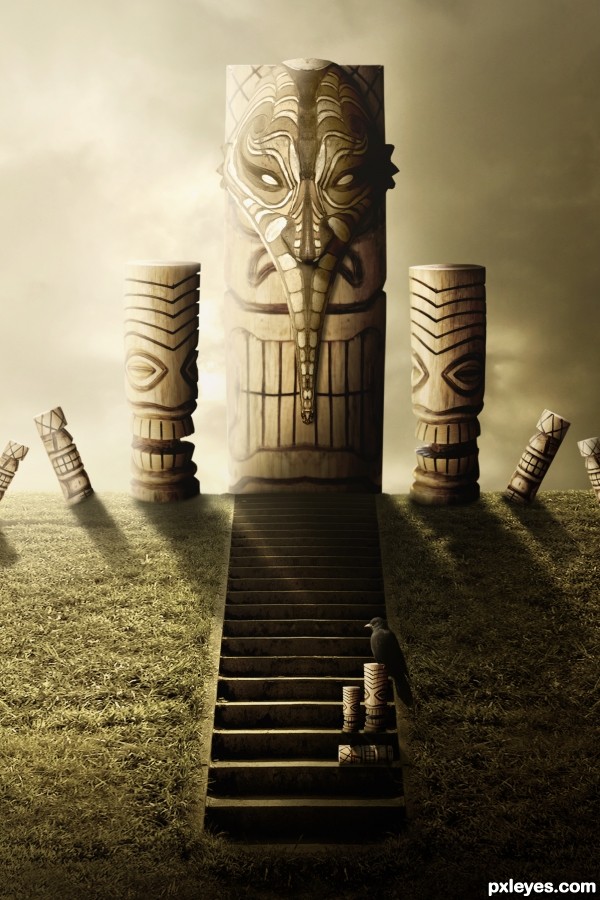
The shadows on the ground, which give the impression of a back light, do not correspond with the high contrast highlights/shading on the totems which give the impression of a very strong left hand side light source. Other than that, a bit formulatic and bland, but nice. Good luck, author.
kind of Brady Bunch.. hehehe.. and a giggle snort.. and a FLEEEEEEEEEEEEEEEEE... good job author.. very moody
I agree MossyB, i tried my best to make the shadows realistic, it's not perfect tho 
the title suggests to me that someone will be offering prayers at the steps, nonetheless a nice one that I like 
make the steps more worn-out, tittered or something, to suggest age/time (too clean now)
Stunning..
@ jordypounce..you cant mention the name of the author in the entry page...entry must remain anonymous until contest is finished
plz refrain from using the authors name.. the contest is suposed to be anonymous... giving away the author name doenst make it anonymous anymore and can bring some user in a better or in a worse situation... people might vote higher because they like someone or lower because the person gave a negative critic on there own entry for example..
Very surreal 

COngrats on 1st place...great entry...you beat to 2nd place yet again *Angry* 
Nice clean work... congratulations
Congratulationssssssssssss
gratz! 
Congrats, very nice work 
Congratulations! 
Congrats!
Howdie stranger!
If you want to rate this picture or participate in this contest, just:
LOGIN HERE or REGISTER FOR FREE
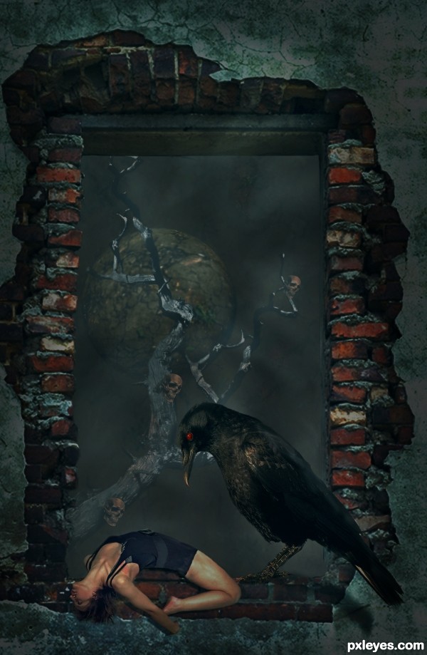
In the Norse shamanic tradition, Odin's ravens represent the powers of necromancy, clairvoyance and telepathy, and they were guides for the dead.
In the Elder Edda's cryptic poem, the Grimnismal, a verse refers to Odin's ravens:
Huginn and Muninn, every day
They fly over earthground.
I fear for Huginn,
that he may not return.
But even more, I fear
for the loss of Muninn.
Thank you Danger99Stock for sharing the picture Tango2 (5 years and 3531 days ago)
Black on black on black...try lightening the background.
Thank you Bob, I agree wholeheartedly. Made a change.


nice work!
Interesting back story and a nice representation!
nice choice of image and well blending -- looking at the high res i wonder if the tree and skulls could use a touch of blur to move them back in the image they seem to be intruding on the raven and girl
Edit -- look better glad to be of some help
'preciate ya Alan, made adjustments, thanks
I see an eminent danger here... it seems the raven will peck the girl any time!
Good suggestion Nator I like it. Eurikuri if I were to have portrayed that it might be off theme. , thanks all, for the commentary and the encouraging remarks
Cool info and creepy image author, good work. Great depth of field shown between the sphere and tree and the raven and girl. Nice final touch with that red eye on the raven! 
Very disturbing ... I can see the necromancy in the image!
very cool work author...ravens eye is fantastic...
Howdie stranger!
If you want to rate this picture or participate in this contest, just:
LOGIN HERE or REGISTER FOR FREE
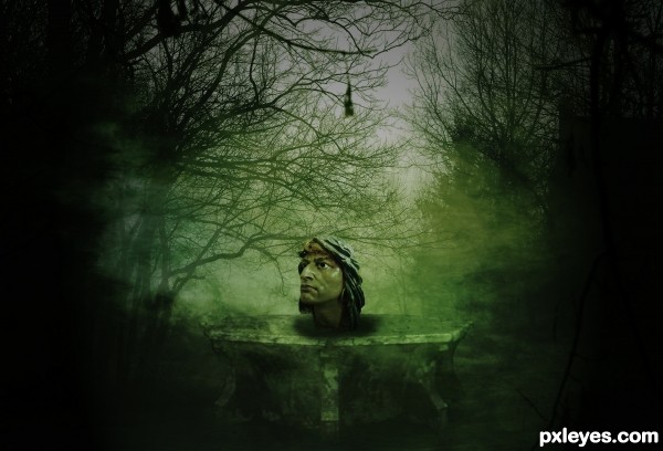
Credits to ~Mehrunnisa-stock , ~masterwks-stock and ~BBs-Brushes from DA for stock
Updated ! (5 years and 3690 days ago)
The colours of the indian head seem to stand out a bit too much, try to match the hues. Also watch out for differing resolutions, it's quite obvious, especially in high res. Good luck!
Floating head?
Like the idea author,maybe u could use this great background.To flip head in actual position and to blend with the rest of the image.This entry can be very very nice and i will hold my vote,maybe u do some changes...best of luck
Thanks Nebojsa, i will fix that as soon as possible 
great idea but yeah what everyone else said.
Thanks everyone ! Updated, hope it looks better now 
I agree with Kevinice about the strength of the shadow, but excellent improvement so far.
Nice . . . . All the best to u . . . . 

Howdie stranger!
If you want to rate this picture or participate in this contest, just:
LOGIN HERE or REGISTER FOR FREE
How fun It's giving off a slight "Cartoonie" feel to it, not a bad thing... just really interesting
I take that as a compliment... Cartoonie feel... hehe
Congratulations, good job!
Congrats!!
Congrats
Howdie stranger!
If you want to rate this picture or participate in this contest, just:
LOGIN HERE or REGISTER FOR FREE