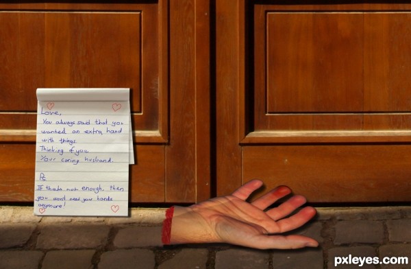
Heh, I spent most of the time actually thinking of the idea rather than on the work itself.. Although I did have fun making this one.. Enjoy :) (5 years and 3565 days ago)
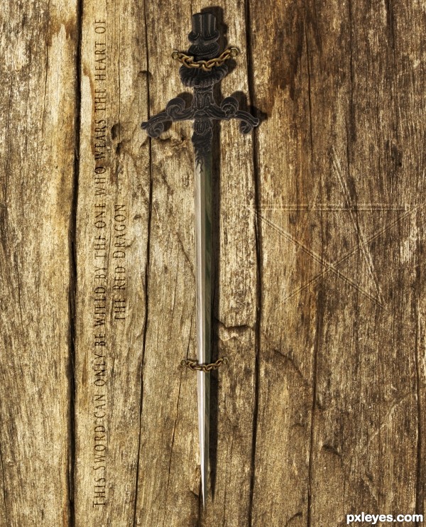
This one took a while to make.. Hope you like it!
Thanks to robby_m for wood texture.
(5 years and 3572 days ago)
GL
Nice.
Nice old and grunge look 
Howdie stranger!
If you want to rate this picture or participate in this contest, just:
LOGIN HERE or REGISTER FOR FREE
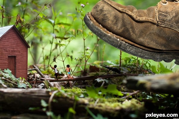
Basicly it was simple to make but the cutting out took a while..
All I did is every source in there has been cut out and blended in, I also added some levels to some of the images and some curves.
Thanks to lyom for source 5 - The Barn. Thanks to fazong for source 4 - the Boot. Thanks to shipaviu for source 2 - Boy2.
I hope that you like it! (5 years and 3582 days ago)
nice work -- only one small thing the leg of the diaper boy could use a touch up
Good thinking, and great masking. Be careful with lighting and light sources, try matching them all to the lighting of the barn.
Thanks for the feedback 
My comment would be the same as above, double check the original light source, soft and diffused. Thats how all the other components need to be lit, soft shadows and soft highlights.
Thanks for the advice.. I made the barn lighter
Nice work all around. I see some leftover debris from a mask in the middle of the safe house. Other than that good job. Good luck!
Gulliver? 
very nice i like the idea
clever idea and a nice entry .............. all the best .......... 
funny and good... 
Howdie stranger!
If you want to rate this picture or participate in this contest, just:
LOGIN HERE or REGISTER FOR FREE
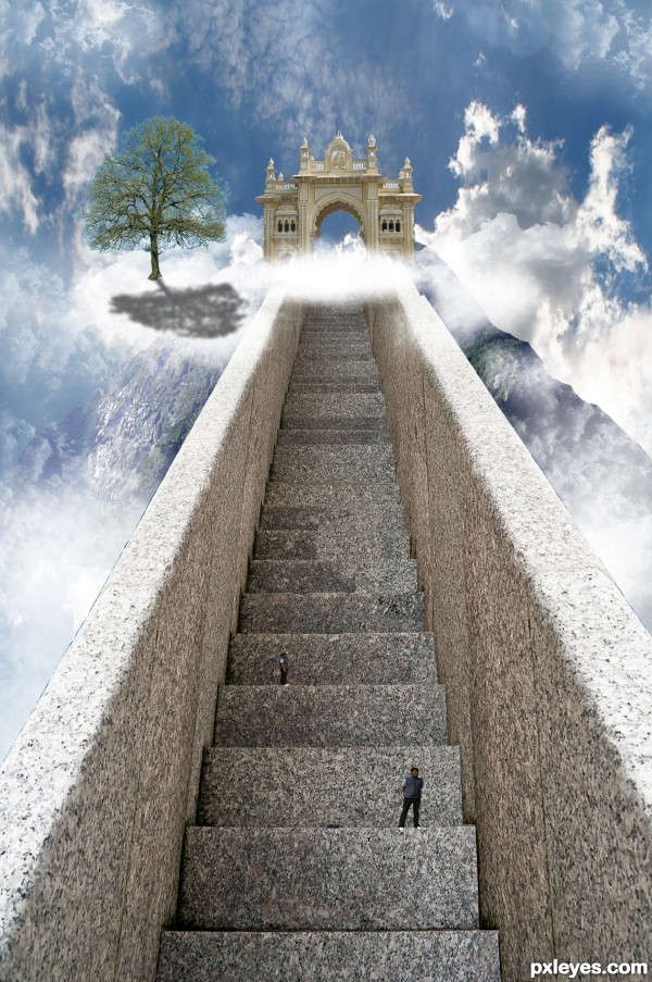
Well, this one took me quite a long time.. But it was quite simple to make..
I gave the stair a right side by copying and then transorming into shape..
I then took the gate and cut that out using the pen tool, did the same for the mountain.
I put it all together and at the end added some clounds and people which I cut out using the quick selection tool.
I also added a tree but I'm sorry but I cannot find the link to the image anymore..
Hope you like it and Thanks to asifthebes for images 1 and 2. (5 years and 3590 days ago)
GO WEST!!! pet shop boys.. hehehe.. 
I think if you move move the gate over to the left a little more and lighter the tree shadow it will look much better. Imo it feels like something is missing but I can't put my finger on it. Overal it is a well thought out entry. gl
I agree about the tree shadow. Maybe give it a gaussion blur and bring the opacity down. I'm a little confused at the clouds that follow the steps to the right? Also, I would get rid of the top guy that looks exactly like the bottom guy. Fix those and this will be very nice!
Thanks for the advice, it was taken on board 
I agree with the shadow, but instead of lowering the opacity the shadow should be broken up with the texture of a cloud. I would also finish masking the arch way and soften the edge of the "mountain" on the right side. Great entry. Good luck!
The brightness of the right front of the tree seems inconsistent with a light source coming from behind the tree. There's an inexplicable notch in the right railing near the top. (Using the Clouds filter to create a mask for the tree shadow might help 'wispify' it.)
This looks great
not to many people getting into heaven lol... nice work author 
lol @Keiley22 I wish I could favorite your comment 
beautiful .... 
Very nice job, only thing that I think of is that the person further up and away is taller than the stair, with perspective in mind, that person must be huge comparing to the person standing closest to us. IMO...Otherwise - really nice job!
sunzet, you are very correct, thanks for the notice ill change it 
GL
Howdie stranger!
If you want to rate this picture or participate in this contest, just:
LOGIN HERE or REGISTER FOR FREE
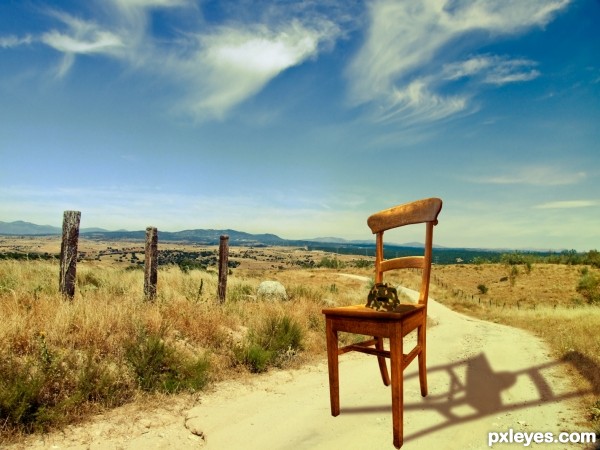
HI everybody, this is my first competition entry and I hope you like my work.
Basicly for this image I got a nice countryside backround. Found a chair and cut it out. Onto the chair I put the competition image, firstly though, I cut it out and puppet wrapped it so it looks like a helmet. Then I added a camo texture to the helmet and played around with the different blend modes. Lasty I put everuthing together by adding some extra shadows, and then I added a nice Brown and Orange gradiend and blended that to look nice.
Take care! (5 years and 3592 days ago)
Welcome to the competition. Just a thought for your entry... The shadow on the chair doesn't match the high noon image it is placed on. It also looks like you distorted the image of the chair (if you hold down shift while resizing the aspect ratio will remain constant thus avoiding the distortion).
Also a high res copy would be nice so that we can see what you did with the turtle shell. 
Cheers and good luck.
Have to admit, the shadow is fascinating  . It's not correct, but on the other hand...who cares
  . A high resolution version would be nice though (if you want that, then go to topnavigation My stuff - My contests, there you see your entry and then you can check the option High Resolution, something like that...). Good luck!
good luck
Howdie stranger!
If you want to rate this picture or participate in this contest, just:
LOGIN HERE or REGISTER FOR FREE
Not bad at all, but according to the text not threatening enough, imo. What if you change it a little bit that i.e. the wife (I guess) demands from her hubby to be more a helping hand at home instead of help his friends to get rid of money that has been spent on beer and such? And then the hand is from one of his friends. Just an idea . Good luck!
Hand is a bit distorted...
Howdie stranger!
If you want to rate this picture or participate in this contest, just:
LOGIN HERE or REGISTER FOR FREE