(5 years and 2930 days ago)
(5 years and 2932 days ago)
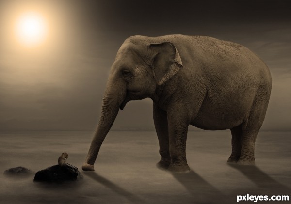
Maybe too small, IMO the mouse is scarcely recognizable.
thx for the comment but i think if i make the mouse bigger,it would be out of proportion
very suggestive atmosphere, the last on earth? bravo
Couldn't tell it was a mouse there until viewing the SBS, and the shadows are a bit off. Here's a tip: On a separate layer, draw lines from the center of the light source through the areas to be shadowed, and work accordingly. Also, your shadow gradients are reversed. A shadow is always darkest when closest to the object, and fades with distance. I like your idea...GL author! 
thx for the tip, im not that good with shadows lol, but i tried to make it look better, and also took another image for the mouse 
Now the mouse is ok! Good luck author
love the whole scene ,, great colour work .GL
Congrats!!
Congratulations!
Howdie stranger!
If you want to rate this picture or participate in this contest, just:
LOGIN HERE or REGISTER FOR FREE
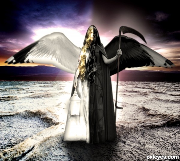
The balance of life and death. (5 years and 2932 days ago)
women are particularly at yin jang. nice job
Interesting but blurry.
Thanks  I know, ugh I just cant get it to do what I want it to. I'll keep trying to fix it though!
great potential..... think you could have done so much more with detail on both sides of girl
good luck
Howdie stranger!
If you want to rate this picture or participate in this contest, just:
LOGIN HERE or REGISTER FOR FREE
(5 years and 2933 days ago)
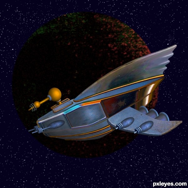
beep beep MCZOOM!!!! I'm a little kid again 
Super beautiful work 
Great use of source, color & texture! 
Wonderful job of creating something totally different from the source, yet identifiable.
Sweet little retro ride, love it! 
I agree with MossyB. Love that the source is recognizable, but in a completely different form.
Great fun, great work!! I also agree with MossyB, excellent use of source, just what a source contest is all about. 
Thank you for your votes and comments! 
Congratulations 
Congratulations 
Congrats Cheryl!!
Congrats IDt8r.
Howdie stranger!
If you want to rate this picture or participate in this contest, just:
LOGIN HERE or REGISTER FOR FREE

(5 years and 2933 days ago)
Great find of picture... but that is all it is, right now, a great find... background and picture found on internet... I think you can do something more with this, maybe atleast make it into a yin/yang zin/zang symbol...
Gimme a break! The Yin/Yang symbol is the most trite thing you could come up with in a contest like this. The meat of the contest is: "create a contrast of opposites based on the oriental theme". The concept of the pairs of opposites is fundamental to all philosophies, and many of the entries in this contest reflect that without using the Yin/Yang symbol.
I concur with what you are saying and would totally agree if you had made the mechanical arm yourself; or if you added something additional to the background you created! (people fighting robots or something like that!)
I faved in advance hoping you would tweak it just a bit... not to my personal suggestions... but just look inside and give it the extra boost it needs to be super duper awesome! 
Sometimes a good find is all it takes. I've seen it work many times, and all this one needed was some graphic impact in the background. Something like people fighting robots wouldn't fit what I had in mind anyway...I see this as a friendly handshake between the creator & the creation. That's why the title isn't Flesh vs. Steel.
I see your point! Sometimes the idea or creative imagination goes along way... 
as stated earlier.. really a great picture and concept!
great picture ..Hate your background... my artistic bias..LOL
good luck
Howdie stranger!
If you want to rate this picture or participate in this contest, just:
LOGIN HERE or REGISTER FOR FREE
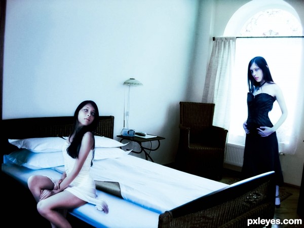
In my opinion, the girl in white should blend better with the bed, I think that adding a shadow on the right side of the dress could make it feel more realistic.
Thanks your right, i add a shadow. i had to work in the room picture it was to grainy im working on it.
I really liked the good and bad sides of the bed idea..... perhaps a little more contrast ...I might have brought dark image closer and would have cropped out left hand drape ( Little things)
good luck author
Thanks for comment. i still working on it
Howdie stranger!
If you want to rate this picture or participate in this contest, just:
LOGIN HERE or REGISTER FOR FREE