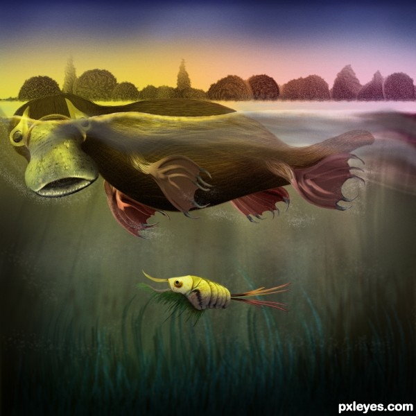
nothing but the source (5 years and 3280 days ago)
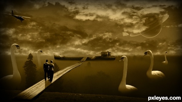
(5 years and 3289 days ago)
Interesting concept. The execution is lacking on several levels. GL author.
The overall lighting is too dark, with the birds on the RH side exceptionally so.
The dark shape between the two birds on the left (a tree, perhaps?) is so dark and undefined as to be visually confusing.
The couple are so dark that it appears that they only have 2 1/2 legs between them.
The "star" blobs in the sky are inconsistent, and illogical being in front of the clouds, but Saturn suffers the same confusion...
This is a really nice concept, but the execution seems rushed and not well thought out. Even for a dream, it leaves a bit to be desired.
Howdie stranger!
If you want to rate this picture or participate in this contest, just:
LOGIN HERE or REGISTER FOR FREE
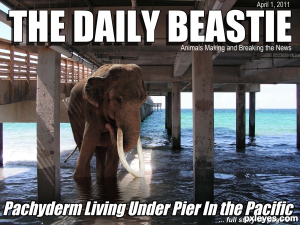
(5 years and 3293 days ago)
very cool composition...elephant look very natural here...best of luck
Howdie stranger!
If you want to rate this picture or participate in this contest, just:
LOGIN HERE or REGISTER FOR FREE
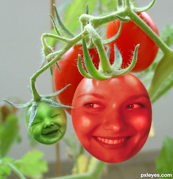
Desaturation of face images, with simple Cut & Paste and Layer Blend Mode changes.
A little Liquify to emphasize the baby's smile, and a bit of touch up painting to even tones. (5 years and 3299 days ago)
The dimensionality of the baby head really works, but the "mom head" needs to have the same quality...right now she looks like an inflated balloon. Suggestion would be to do some dodge/burn on her, or shading & highlights on adjustment layers. GL author. 
Good call, CMYK, thanks!
The light intensity on the plant and kid face is different. You should add some highlights on the baby's cheek and nose (with some bright green or pale yellow) to get rid of this. good luck 
I see you've changed her face. I like this one much better! She relates much better to the baby. Cute idea nicely done! (Just one tiny nit pick, there's some edges showing on the right and lower right side.)
Swordfish and Spaceranger, THANK YOU so very much!
"Too close to the trees (or tomatoes) to see the forest (or edges and lighting)..."
It always helps to have other eyes to spot the small things. That's what helps me improve!
Thank you again!
Red tomato face looks flat, since this isnt a very original concept there are lots of tutorials to show you how it should be done, hope this helps.
http://jengrantmorris.blogspot.com/2007/10/fruit-faces-tutorial.html
Good luck 
Nice tutorial, Geexman, but the result is too "bright" for this image. Trying to erase the forehead and cheeks made the face too dark, going back to the "balloon" effect CMYK pointed out with the previous face, and erasing back to the original image made the teeth and the eyes WAY too bright...Oranges and tomatoes just don't quite work the same...But thanks for thinking of me and trying to help.
Very sweet!
Adorable!!
That baby is just ADORABLE! The woman's cheeks look nice. I just don't like her teeth and eyes. But the baby gets high marks from me!
Very cool...love the idea that both of them are smiling...gl
Howdie stranger!
If you want to rate this picture or participate in this contest, just:
LOGIN HERE or REGISTER FOR FREE
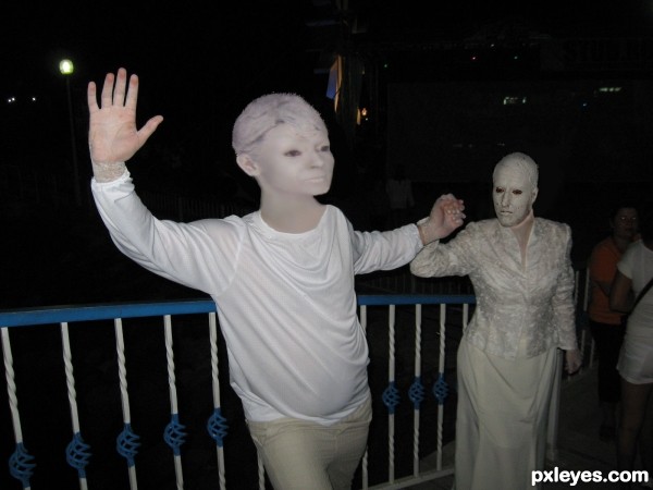
Spec Thanks to Giulia for use of this picture found in member stock on pxleyes.com (5 years and 3299 days ago)
The head on the left is terribly distorted, too flat on top, and the features look squashed.
MossyB Thanks any better?
Mucho gooder!
Thanks MossyB
Howdie stranger!
If you want to rate this picture or participate in this contest, just:
LOGIN HERE or REGISTER FOR FREE
wow, great!! GL!
Haha! Brilliant little creatures, i love how you created the water line, the whole style is very original. Nice work
Whoa! Awesome...great water line idea. Creates a nice, new perspective.
a slightly brighter color on the DuckBill's above surface part would make this perfect .
great entry
Great work! Love it! Love it a lot!!!
I love the small one, it looks very unique. Just a tiny suggestion, you might use less grainess level when you apply the grain filter to the whole image, in Hi-Res it's a bit too noisy. Good luck, author!
nice! good luck!
well done i like it
hehe.. has a bit of Manatee in him too LOL.. great job.. quite lovely
Fantastic work ,GL
Beautiful job. Good usage of the source image. I love all the concept of your work. Good luck!
Fabulous piece of work...Unique approach and great final result...well done author
even thou it seems to me like you mostly draw and painted above the copped source, the final image is for my taste excellent, very creative and technically well made
you have a high vote from me
beutiful job.., the little creature is so cute..
Lovely job........Good Luck Author.
Fantastic work! I see a manatee, too, being from Florida. Cute li'l shrimper!
Very nice work, love the artsy style and texture
Congrats, Stowsk!
Congrats on placing !!!
Thanks All.
Congrats Stowsk, I wanna see more this kind of entry
Congratulations for your second place.... nice work indeed.
Congrats Stowsk! Really liked this one!
Congrats for the 2nd place.. Really great enty
Howdie stranger!
If you want to rate this picture or participate in this contest, just:
LOGIN HERE or REGISTER FOR FREE