(5 years and 3393 days ago)
- 1: mandolin davis'
- 2: L Lemos
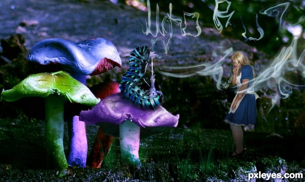
I couldn't resist attempting to make this image. Its always been one of my favorite scenes. I've drawn it, colored it, painted it and finally photoshopped it.There were a great deal of steps involved because of all the versions I toyed with. This is the one I settled on. I'm sure there are areas that will need improved but at this moment I'm fairly pleased. I used smoke brushes for the letters. they were created by
Digit-L-teknique at Deviantart.
Grass brushes by calthyechild
at Deviantart.
The caterpillar was by SunRunnerStock at Deviantart.
The Shisha brush was created by Dr-Garushi
at Deviantart.
The other images used were my own and are included in the SBS. (5 years and 3395 days ago)
Great concept, nice chop, but too dark at the bottom. You can't even see Alice's feet...
Thanks, I'll try to correct it. Maybe too much curve.
I can still see her feet and I think the lighting is fine. However it's the caterpillar that I think needs attention. There's a couple hard edges I think you could improve with liquefy and push tool. Play around with liquefy, but be careful it can sometimes make a bigger mess. The hookah is a nice touch! GL!
I agree about the caterpillar. If you have trouble with the liquify tool, try dodge and burn on the upper portion to give it the roundness like the lower half of the caterpillar. Do the smoke letters spell anything? If so I can't make out what it says. If not, then I would use the source smoke instead. It's more realistic. Resize ,skew, or whatever to replace the letters. Cool concept, and nice SBS............GL.........................JB
That is one of my favorite scenes too.
You managed to pull it almost perfectly. Amazing job 
I can see her feet but cant see her tattoo.  Just kidding
Nice job !! 
Howdie stranger!
If you want to rate this picture or participate in this contest, just:
LOGIN HERE or REGISTER FOR FREE
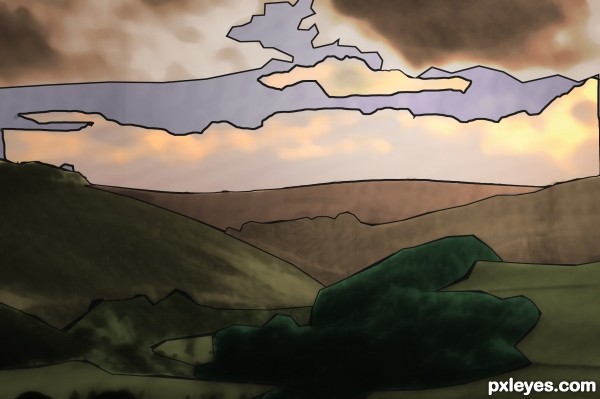
A stained glass of a landscape (5 years and 3406 days ago)
Good idea, you could add more details if you have time and should look great.
I think you should put the dove back into it somehow. 
I agree with jawshoewhah.
Howdie stranger!
If you want to rate this picture or participate in this contest, just:
LOGIN HERE or REGISTER FOR FREE
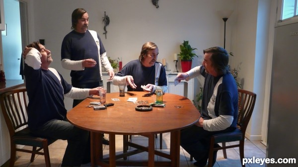
four men,playing cards (5 years and 3409 days ago)
Author, you might want to post a SBS.
all photos taken by mee last year
That's why you're supposed to upload a SBS - because you're using your own photos. 
This is very nice. I like it alot and it works very well!!
I feel sorry for your mom  (must have been a hard child-birth)
Haha gl author 
After seeing the SBS I must say this is good work. 
Great work, so that's what schizofrenia really is about. 
very nice realistic work...gl
Howdie stranger!
If you want to rate this picture or participate in this contest, just:
LOGIN HERE or REGISTER FOR FREE
Special thanks to the sources photo (5 years and 3412 days ago)
Great creation!
Excellent.
Simple and elegant interpretation of the theme. Bravo, excellent work.
Thanks all....
Nice work..well done.
Great work author...gl
Cool colors, nice theme...Congrats 
Howdie stranger!
If you want to rate this picture or participate in this contest, just:
LOGIN HERE or REGISTER FOR FREE
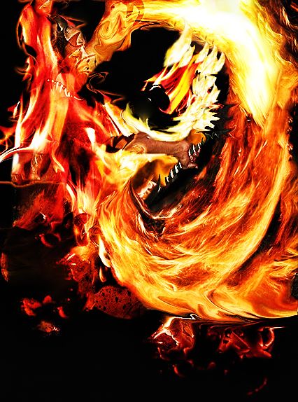
Because of u,....................!!!!!!!!!!!!!!!!
Wha...? Quote: "Because of u,..." oh, we're playing that 3 words story game again

-What is it?
-Tell us please!!
You can add some info in the description, and you could also add a high-res. ( my stuff-my contest- edit entry)
Yes, PLEASE tell us what it is...........
At first I couldn't see the mage
Nice use of the fire.
first thing of all, its name of the song which inspired me to make this one
secondary, someone laughed at me, so i have to reenter in attempt to prove something
im not sure if u guys can see the lion head or not............
Honestly i can't see anything that would make sense, man ( please don't feel offended) but it's kind of chaotic in here. I had to check the sources to guess what happened.
Wouldn't it be easier to cut out the guy with the fire and outline him, make some fire-ish contours, add some burning cracks as well etc, BUT without loosing his shape? GL
Agrees with greymval. There's too much going on.
Howdie stranger!
If you want to rate this picture or participate in this contest, just:
LOGIN HERE or REGISTER FOR FREE