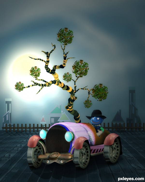
all source and PS custom shape and brushes,.. (5 years and 3414 days ago)
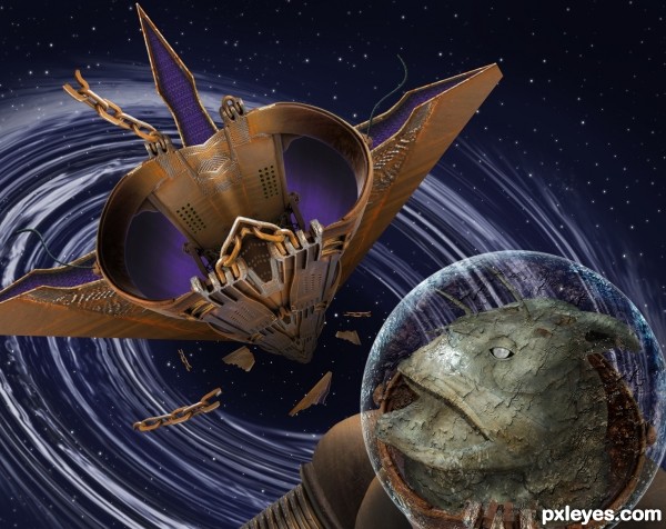
Devastated by radiation bombardment the ancient freighter nears the end of it's millennia long voyage as it's drawn towards a gravity well. The long dead crewman drifts along side his ship his dead eyes witness to countless wonders.
Thanks to madamemonty for the fish skeleton, woodleywonderworks for the NASA earth image and MnMCarta for the Undiscovered
(5 years and 3419 days ago)
Great concept!
Very complex... the end scene looks great! Nice use of different sources. 
I like the way you put together the sources to form the space freighter and the alien head. High Resolution is wonderful....crisp and detailed, my respects, author..... Good luck....
Very well constructed space ship and the beast looks amazing 
Love the story and the whole concept. The ship is wonderful! I agree about the detail and crispness. Excellent work and end image!
WOW... what a creepy looking alien  I love how you have constructed the spaceship
very nice compo author...best of luck
Great details in this
Fantastic. I think I need to say it again: Fantastic! 
Very cool and detailed! Great job, author!
Congrats for your second place, Rein!
Congrats for second place.....
Congrats! Very good work!
Congrats Rein...
Thanks to all for the kind comments and congrats! Thanks to Jaskier for another great source image!
Howdie stranger!
If you want to rate this picture or participate in this contest, just:
LOGIN HERE or REGISTER FOR FREE
(5 years and 3429 days ago)
so cute and well blended. Good Luck Author
Snails aren't insects, but it's still a good image. 
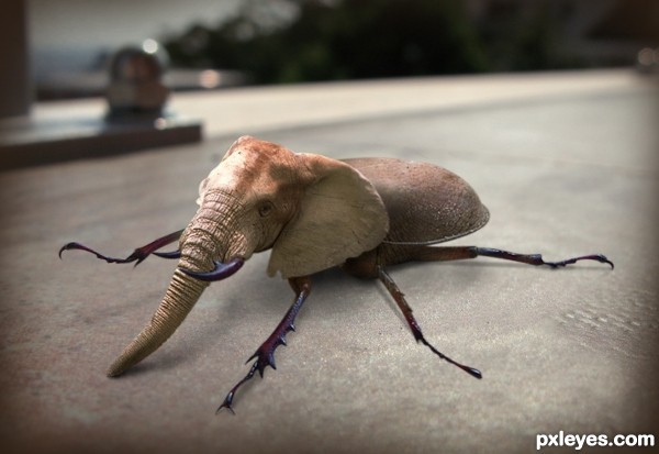
HE'S SO CUUUUUUUUUUUUUUUTTTTTTTTTTTEEEEEEEEEEEE.. and he looks totally pooped!! great elephantroach (still looking for a snail)
Sweet idea, nice replacement of the horns :P
Nice one author GudLuck with this insect, you cant forget this.. 
Wow, very creative! Great creation, author!
With his legs all sprawled out he looks like his head is so heavy he had to take a break ... love the combo!
Great idea. He looks so serious and lost in thoughts 
nice thing...gl
Howdie stranger!
If you want to rate this picture or participate in this contest, just:
LOGIN HERE or REGISTER FOR FREE
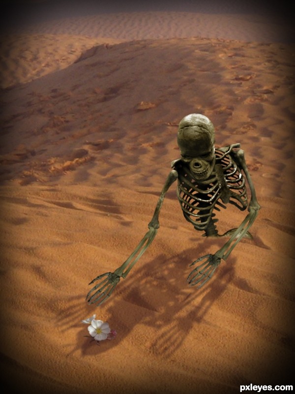
I missed the contest, that's why I'm posting it here...
Thanks to:
- cabby14 @ Flickr;
- Carlo Inglese @ Photoxpress;
- TWS @ Sxc.hu
- Pxleyes. (5 years and 3434 days ago)
SBS? Looks like you're missing some rib cage reference...
@CMYK: Excuse me? Rib cage is intact, from source 4. I just moved the humerus and add the arm bones from outsource... 
Lovely work ... the sense of him (her?) reaching out for the flower is very touching. Hard to make a skeleton "touching" ... well done.
The right hand should be flipped over, left and right arm are an obvious copy, otherwise nice feeling from this.
Well done!I agree with arca.  you made our boney friend sensitive
Howdie stranger!
If you want to rate this picture or participate in this contest, just:
LOGIN HERE or REGISTER FOR FREE
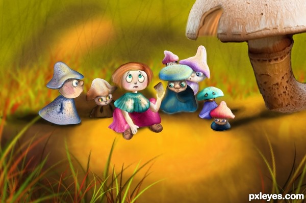
... and as Alice bit the mushroom found herself among 7 strange dwarfs, who were looking at her with curiosity and fear. Where did their Snow-white gone? (5 years and 3435 days ago)
good work,and good luck
This is lovely, beautiful image, great choice of colors... wonderful job 
Really cute scene, great use of source!
how adorable!!!! Great idea! 
very Sweet
beautiful ......... 
Howdie stranger!
If you want to rate this picture or participate in this contest, just:
LOGIN HERE or REGISTER FOR FREE
This one is so CBR'd, I can't make out the source image at all..
YOU are kidding, right mossy??
OMG.
the tires is part of teh source. the front of the sprayer.
the bumper is teh turn on valve on the source.
the ground the car is sitting on is from the brick wall.
the body of the car is the actual nozzle of the sprayer. notice the "soaker" printing??
i admit there needs some work done to blending of things..but CBR? not really. i've seen worse. ALOT worse.
@ mossy,...CBR ? yes..maybe something wrong with your eyes...hehehe...and jadedink's eyes are sharper than yours...I hope your eyes have no problem to read jadedink's comment,...@ jadedink, thanks a lot...
The car image is nicely done, and realistic. The rest is flat & cartoony, and IMO doesn't fit. Still, good work here.
YOU ARE SILLY AUTHOR!!! ... in a very great way LOL.. awesome
True, there are some issues with varying degrees of sharpness, but overall, I love the whimsy and design of this, very clever use of source, author! Great tree and buildings, would make a wonderful children's book illustration.
Fantastic work author...whole image is great compilation of different styles and i see great uniqueness in that...hat down for u author...well done
congratulation!
Howdie stranger!
If you want to rate this picture or participate in this contest, just:
LOGIN HERE or REGISTER FOR FREE