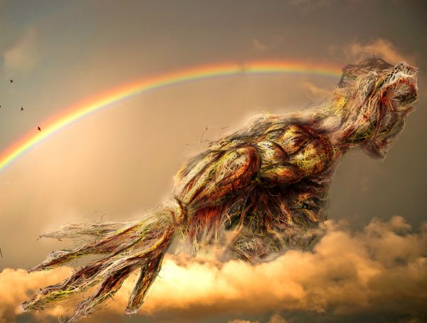
(5 years and 3754 days ago)
- 1: source1
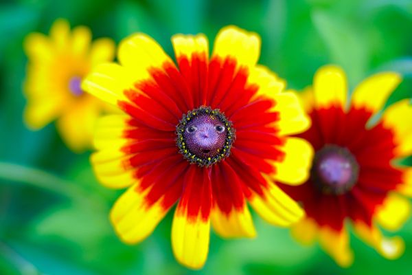
I couldn't help myself!
Source file and PS only; brushes, effects, layers, all that good stuff. (5 years and 3758 days ago)
Uh uh... who are you there, looking at me? 
you need to add a sbs... nice work though 
I added a thorough 12-step tutorial on how I created this image. Thanks for the comments!
well done ... crikey-your sbs must've taken longer than the chop!! ... it's like a tutorial lol
Howdie stranger!
If you want to rate this picture or participate in this contest, just:
LOGIN HERE or REGISTER FOR FREE
(5 years and 3758 days ago)
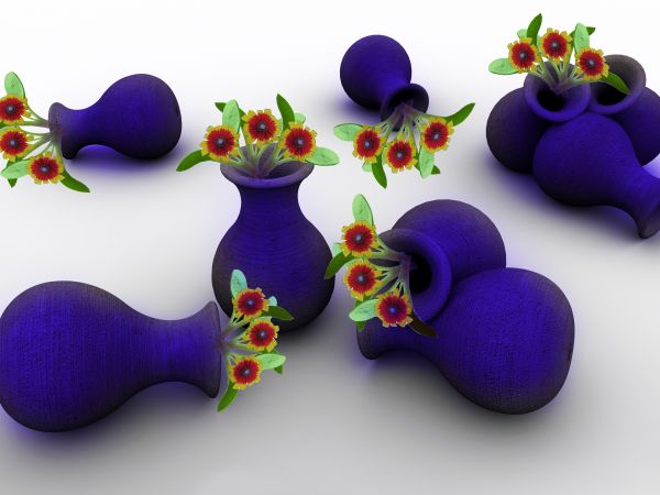
Very nice colours, the stems need some work mostly on the near left vase. 
Someones got some cleaning up to do :P hehe nice entry. Love the colors
masking fo the flowers needs some work to get rid of the white on the edges of the leaves and between the petals.
For tilted pots, some flowers are stuck on them! 
nice idea, but imo matting issues need sorting, and the stems need to lengthened INTO the vases
Howdie stranger!
If you want to rate this picture or participate in this contest, just:
LOGIN HERE or REGISTER FOR FREE
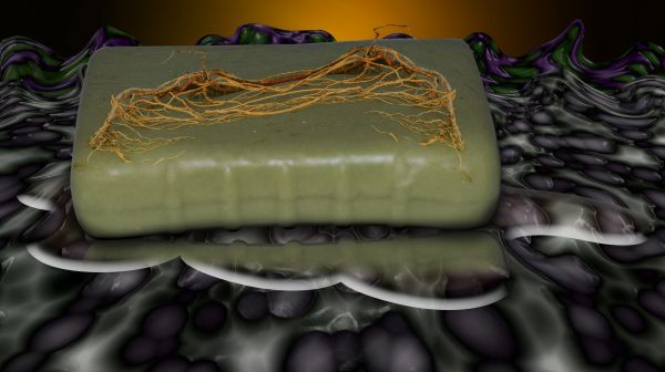
Fear of hair and washing
Had a roommate in college who would wake me up in the morning and ask me to check the bathroom to see if there was hair on the soap. There never was but he was so terrified there would be that he had to ask me to check or he couldn't use the bathroom.
(He had his own private bathroom growing up (only child) and developed a phobia to using other peoples bathroom)
I cured him of his fear by wrapping several strands of hair around a bar of soap and chasing him around the apartment until he wasn't afraid of it any more.
Inspiration for this piece :) (5 years and 3759 days ago)
whoever leaves that much hair on soap needs to shave... simple
if its a fear of washing wouldn't be the soap dry and even cracked (nice idea)
too true reap, but it's the fear of washing with soap that has hair on it, so the soap would have hair recently left on it by someone else, now that I think about it, I can see why that would be a phobia, oh man, I just grossed my self out by thinking about it, OMG YUCK (What have I done? Oh the humanity)
Poor guy... I don't know if it was the best technique used, but you were the best psychologist, certainly! 
ps: I am only child too, but thanks to God I don't have anything like that!
Whoever leaves that much hair on the soap needs to see a doctor.....
Crazy idea..lol...good luck author
nice job 
good idea and nicely done.. good luck to you...
good background story about it.. i didn't know there was such a phobia.. hhmm.. anyways.. nice entry and congratulations for getting your friend out of this wierd and strange phobia.. 
I love the idea but you'd probably be better off without the strange background and putting it in a more mundane setting. Just my opinion.
Great story  nice work and good luck Author
nice xD
Howdie stranger!
If you want to rate this picture or participate in this contest, just:
LOGIN HERE or REGISTER FOR FREE
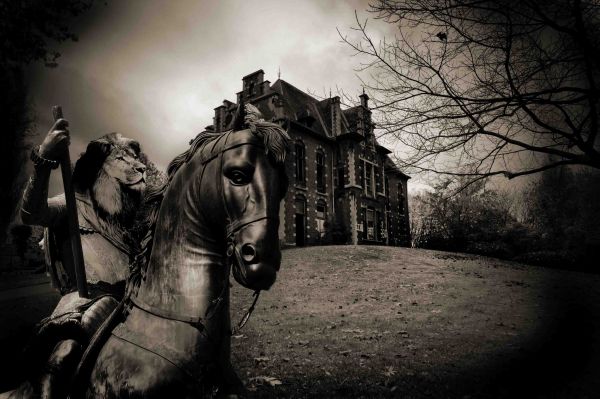
(5 years and 3763 days ago)
More on theme that I have seen but it looks more statuesque, rather than an armored animal.
Idea is nice, but as jaws says, I'd use real animals to take away the statue effect. Also, things would be more clear without the very dark sides (at least here on my screen). Now I know that's also in the background image you used, but right now the lion kinda fades away in the darkness, while he's supposed to be the subject. Good luck!
Thanks for the comments guys ... ok i made the dark areas more clear and now is more light ... i hope i ll have the chance to change the horse as well.. i ll be traveling for couple of days and i dont know if i can fix it before the contest finish... again thanks for the sujestions
nice work....
Good Luck!
Howdie stranger!
If you want to rate this picture or participate in this contest, just:
LOGIN HERE or REGISTER FOR FREE
Incredible! The detail is amazing! Fantastic work...
Beautiful image. I'd suggest trying to create more depth between the arm and body, but this was a difficult source to work with, and you pulled it off.

as the father would say on everybody loves raymond... HOLY CRAP!!!.. excellent concept as well as image.. woo HOOO
Mysterious!
simply...wow
This is just...wow...wow...WOW!!!! This is one of the best entries I've seen on the site since I re-opened my account here 3 weeks ago. I see a winner here...I'm not exaggerating (I hope not). Amazing work, author. AWESOME.
Just to clarify, some more shadow on the arm between the wrist & upper arm would create that depth. Again, a lovely work.
You just knw a top entry wen u see one..nice job author
congrats on getting first place.... lol
note: check your shadows ABOVE the shoulder that you didnt mask out completely... you gots a hard edge..
Simply wonderful and resulted from a hard, time consuming work, I think. The only thing I'm wondering is the perspective of the arm, it looks unnatural. The length of the arm should be longer and the hand should be smaller. Just my opinion in case you want to make the human look, otherwise it's very very good.
Awesome work

Very interesting use ot rhe source and well done
great work.. awesome.. GL
AWESOME !!!!!!!!!!!!!!!!
my fav =]
lovely colours..GL..
Nice work
Great colors and mood.
Very nice!
perfect ! amazing job !
UPDATED, Thanks for suggestions
Fabulous!
Just Amazing.......Good Luck Author.
congrats!
Congrats for your second place, Mqtrf!
Big CONGRATS!!!
you should have been first,sometimes votes sucks,congratulations for your none deserve second place
Congratulations on a wonderful entry!
Congratulations!
Congrats! for 2nd place
Congratulations for 2nd
Congratulations for 2nd
Congrats!
Congrats!
Congrats!
Congrats!
Congrats!
Congrats!
amazing............... awesome.......... cant say anything else.....
Howdie stranger!
If you want to rate this picture or participate in this contest, just:
LOGIN HERE or REGISTER FOR FREE