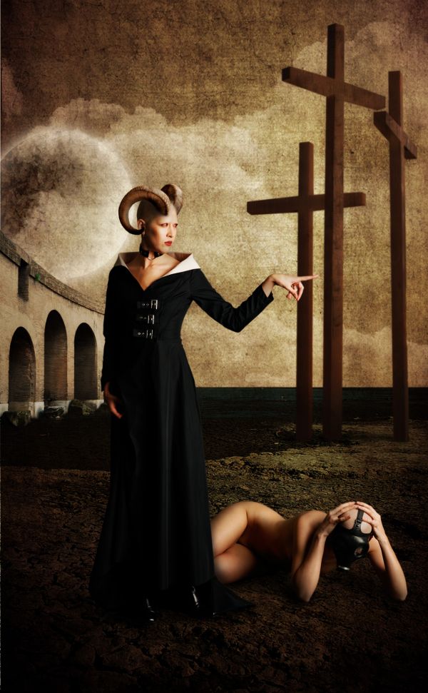
Credits:
Models by Marcus Ranum http://mjranum-stock.deviantart.com
Texture by CSnyder http://csnyder.deviantart.com (5 years and 3719 days ago)
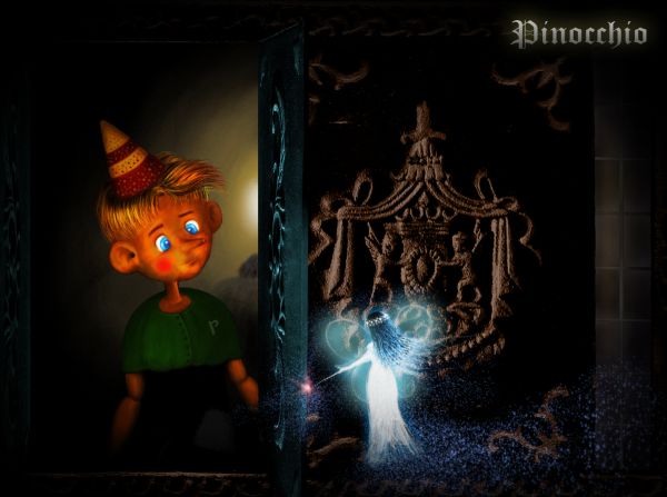
Dedicate to my childhood...
Just the source was used. The remaining is painting. (5 years and 3720 days ago)
very good
excellent job and brilliant result... good luck... I don't really think you need the lettering since it's in the title already... unless you used the letters to balance out the brightness of the fairy.. just a really nice job all round
EDIT.. I figured that was why it was there... GOOD LUCK!!!
Thank you demi, Drivenslush. @Drivenslush: yes, you're right, I use that for balancing the brightness of the fairy. After finishing, I realized that the light of the fairy is a little bit too strong, so... ^^
Nice image, GL 
I love the drawing portion of this one, I just wish that the source and drawing fit together a bit better, but it's very nice.
Thank you Clinge and annabat. @annabat: it's true, they don't fit well, I tried some ways but not desirable. Hope that I can fix them before the deadline.
Yeah, have to agree that your painting and the source/rest of the image don't blend very well. The source looks just blurry and noisy now, you could try to keep some clarity on the source even if filtered. Your Pinocchio is awesome btw.. gonna check this out later for voting.
add a bit color to source image parts and u will have great final result...good luck author,this is very nice work
More works on the source, including the coloring like erathion mentioned, were done. Thank you very much Widiar, erathion for your suggestions.
Great work!
Beautiful! Pinoc looks so cute here 
good job 
Congrats for 3rd place !!
Congrats for your third place, Langstrum!
Congrats
Thank you very much, I'm trying to do better ^^
Howdie stranger!
If you want to rate this picture or participate in this contest, just:
LOGIN HERE or REGISTER FOR FREE
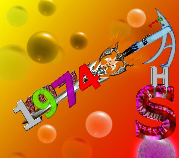
This is my name and B. Year
One external source
Thanks to
http://www.sxc.hu/photo/458644
Author: nazreth
(5 years and 3721 days ago)
cool
Nice 
nice 
Howdie stranger!
If you want to rate this picture or participate in this contest, just:
LOGIN HERE or REGISTER FOR FREE
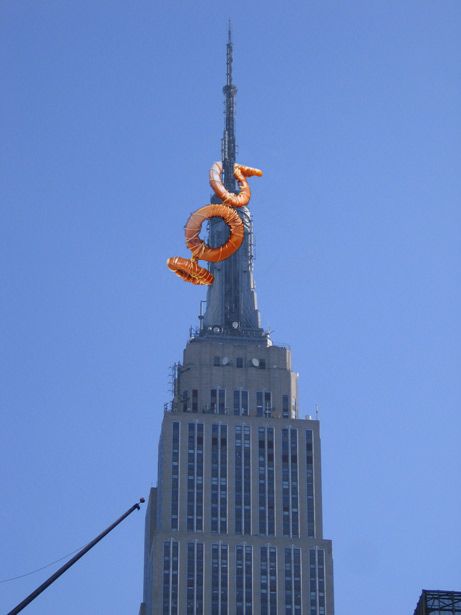
I took the picture when I visited NY and I wanted to make something like this but did not have the picture. (5 years and 3721 days ago)
Post the source link, or if it's your own pic post it uncut in SBS.
ok.. I have to admit this made me chuckle ......
good
Nice.....

a little simple
nice 
Howdie stranger!
If you want to rate this picture or participate in this contest, just:
LOGIN HERE or REGISTER FOR FREE
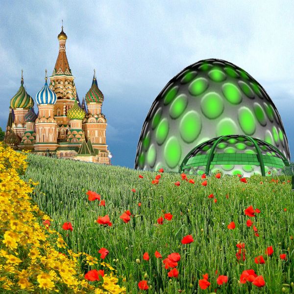
Future domes can be prefabbed
and manufactured where labor & material are cheap and transported easily to any point on the globe in short period of time. (5 years and 3733 days ago)
what is that green object.. aliens has landed?
what is that green object.. aliens has landed?
Interesting take author, but you need a SBS to show how you made this...it's a minimal use of the source.
cool, but I have to agree with CMYK there ...
I would agree that the source usage is minimum. You could have done better. Your idea though is nice...
Howdie stranger!
If you want to rate this picture or participate in this contest, just:
LOGIN HERE or REGISTER FOR FREE
Beautifull GL
GL
Great!
fantastic pic
wow!! hectic! Nicely done!!!!
Love It!
I'm not usually a fan of deviant art stock entries, because they are too easy, but this one is pretty well thought out, and brought together. The only thing is the light sources could be a little well thought out to bring it all in, as a cohesive unit/art piece. On the models it's pretty ok, but the crosses they could be worked on, they seem to still feel out of place. too much light on the left, when both models have light coming from the right, just needs some balancing out. The actual composition is .
.
Ver nice compilation
Thank you for your comments people @annabat, fixed the crosses. Copied via cut the two on the left and flipped them. Worked more on the shadow and light using dodge and burn tool.
U know my opinion...dont have any sugestion...this is great crazy work...well done
The line in the background could be a bit softer for a bit of blending, but GREAT job everywhere else.. nice use of textures for blending
Yup, the flipping of the crosses worked!
Imagination at its best......good luck.... thumbs up!
Love it
love the work! the crosses are my only issue.. the lighting is good, but they seem to lack the grittiness of the rest of the image.... maybe age them a bit or find some real wood texture to put over them... GOOD LUCK!!
Thank you for your suggestion @bjaockx! Changed
Spooky surreal!
Amazing imagination and absolutely fantastic work....
Thank you one more time people! I'd like to say this work was mainly inspired by the censorship one entry has become the target. My entry is a kind of protest against religious and social hypocrisy...
Good choice of colors and tones....excellent mood and fantastic message induced! Great job!
Howdie stranger!
If you want to rate this picture or participate in this contest, just:
LOGIN HERE or REGISTER FOR FREE