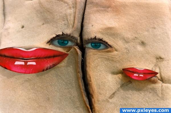
Thanks mordoc, greyman, miamiamia
(5 years and 3886 days ago)
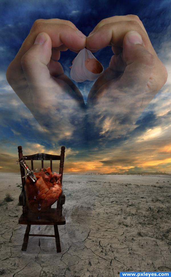
After many years we were told
We would have a baby
To love and to hold.
Emotions dancing above the clouds
The miracle of birth
Finally ours
a swollen belly and love filled hands
a family making baby plans
a little life so tiny and yet so bold
dad wonders what baby will be
when grown and old. .
your room is a desert
and I silently weep
You left us to early
the pain runs deep.
I close my eyes and utter a prayer
All I want is my little one near
I rub my belly and your not there
I create a river
Started with a single tear
I feel so alone now that you’re gone
they say in time I will move on.
Coming to terms
Little love had to part
Now only to be held within my heart
I pray for heaven to send me a daughter or son
I have no preference for either one
Please send one that is healthy
to love and to hold
A baby that can grow and live to be old
(written by author)
thanks to the following for stock photos:
http://fantasystock.deviantart.com/
http://shochinbugstock.deviantart.com/
http://jay-b-rich.deviantart.com/
http://xstockx.deviantart.com/
http://night-fate-stock.deviantart.com/
http://zombie-sheep-stock.deviantart.com/ (5 years and 3886 days ago)
I think you need to try to match all the colours together, and add a few more shadows for the heart, the knife and the baby. Good luck!
thank you will make changes. 
while this is a very emotional piece... You could make the message even clearer if you changed the chair into a rocking chair and made the knife less commercial looking,, (a dagger would be more emotional then a serrated steak knife and a rocker would connect the baby with the rocking heart.. but this is your vision.. so TAKE THIS ONLY AS A SUGGESTION... if this is the vision you wanted.. then by all means stick with it.. Just trying to help  and god bless
EDIT: Sorry.. didn't look close enough to the high res.. but the DAGGER is MUCH better... once again.. god bless
it is a rocker. Golemaura... it was ment as the chair a mother would feed and nurse a newborn.. i love the idea of changing the knife. thanks.
thanks for the feed back i like the dagger better 
beautiful work but i got to go cry now
i didn't even need to read your beautiful poem to see your sorrow! My heart goes out to you ! I love your image , good luck !
the sand below the chair is too mucha diff color from the dry ground other then that.. it takes time to give it a place but you wotn forget it...
thank you everyone for taking the time to comment. Eladine.. the colour under the chair is suppose to the the river of tears... hence the colour difference... thanks for the feedback.
Too contrived, but not bad.
Howdie stranger!
If you want to rate this picture or participate in this contest, just:
LOGIN HERE or REGISTER FOR FREE
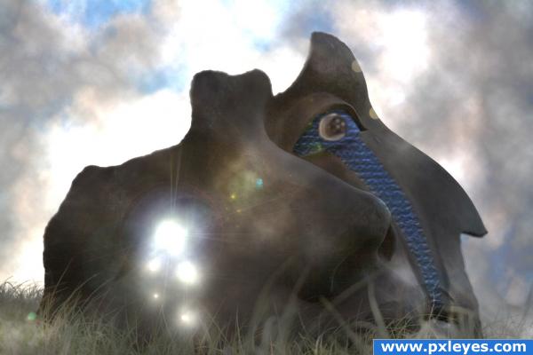
Tears are stardust and water; wishes and worries that may never be fulfilled.
Image from flickr posted by Liber. (5 years and 3887 days ago)
How are dreams and tears emotions? o.o
This is beautiful. I love the mask in the grass.
Think of it as an emotional abstract.
Howdie stranger!
If you want to rate this picture or participate in this contest, just:
LOGIN HERE or REGISTER FOR FREE
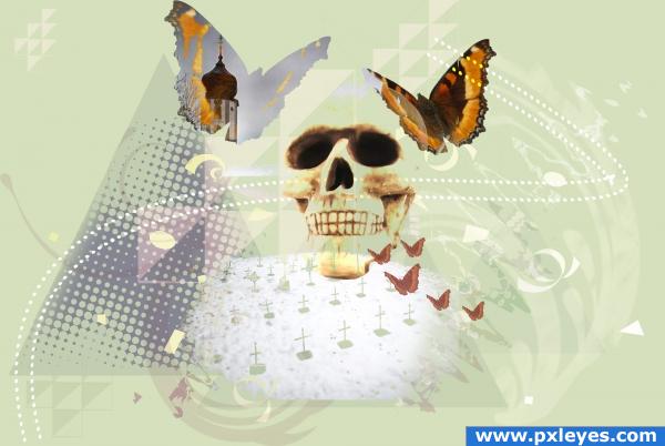
I have basically drew some geometrical forms, duplicated and scaled them, added a lot of swirls and stuff, and blended in the scull, church, graves and butterflies. (5 years and 3889 days ago)
There aren't a lot of these kinds of images on this website. It's more Creative Photoshop then Pxleyes. I like it a lot. Problem is that your first two sources aren't usable. Flickr has plenty of butterflies in their Objects for Layers group.
The first 2 sources are usable. Not sure what you're doing here author, but it won't get pulled for bad sources.
Yes, they should be usable, I checked that. But I didn't know about the layer stuff groups on flickr, so thanks for the tips!
downoffthedragon, why are the sources unusable???? This came directly from the source link given: "to Share — to copy, distribute and transmit the work...to Remix — to adapt the work...Attribution — You must attribute the work in the manner specified by the author or licensor (but not in any way that suggests that they endorse you or your use of the work). "
Interesting image, good luck.
I kinda like this!
I'm not sure about the significance of the tower, but I think your composition works well with how you combined the saturated colors with the pastels for emphasis.
Howdie stranger!
If you want to rate this picture or participate in this contest, just:
LOGIN HERE or REGISTER FOR FREE
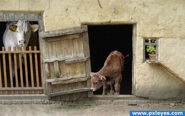
Used supplied image and 3 of my own
1. cow
2. calf
3. flower pot (5 years and 3892 days ago)
cute picture... gl
Good work.
aww the litle cowlet is sooo cute!
The blending here is quite nice. The animal to the left is a bit too dramatic of lighting...where the other has more natural 'outside' lighting. Good job!
Howdie stranger!
If you want to rate this picture or participate in this contest, just:
LOGIN HERE or REGISTER FOR FREE
Seems a bit simple to me, but good luck.
Picasso -esque...love it. Good job!
hehehehe... Just all around fun good luck (this would be awesome in a night club or above a bar.. it would cause a conversation for hours LOL
Cute.
gl
Howdie stranger!
If you want to rate this picture or participate in this contest, just:
LOGIN HERE or REGISTER FOR FREE