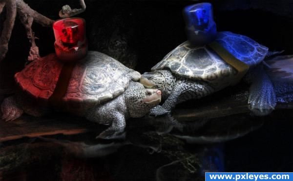
The animalworlds finest show off what they are made off. (5 years and 3896 days ago)
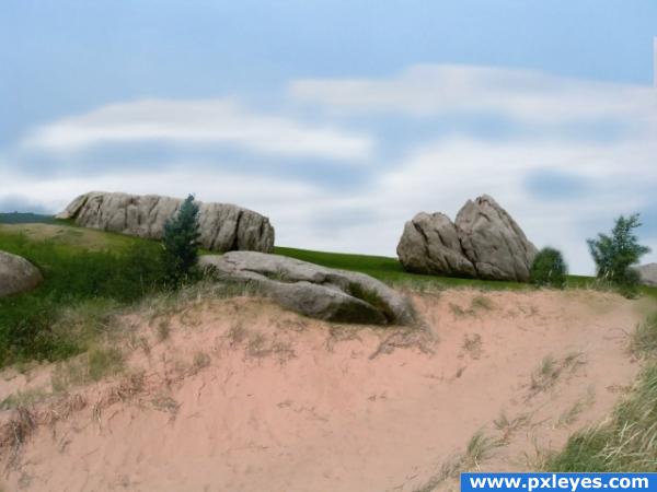
Source image and my own photo. The photo was taken just this weekend in the U.P. of Michigan.
I blended the two photos by placing them one on top of the other. I brought the opacity down and I could see where I needed to erase. I switched from one opacity of the eraser tool to another. It is simple but it was tedious. (5 years and 3902 days ago)
Now all you need is Tiger Woods poking his head out... Great blending, author!!
wow this image really does look awesome! and like ponti said tiger woild be cool...lol awesome image author!
Excellent sea scape,very simple yet elegant.
FORE................can I play through? Very nice.
good blending!
Howdie stranger!
If you want to rate this picture or participate in this contest, just:
LOGIN HERE or REGISTER FOR FREE
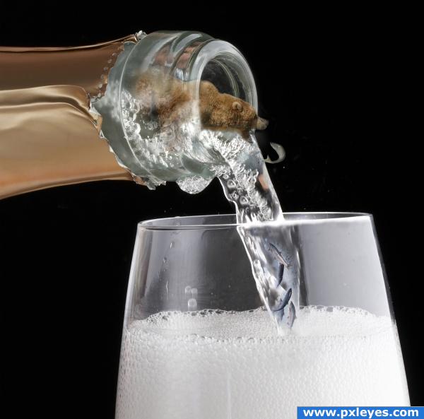
Thanks to David for bear and salmon pictures.
I'm very new to this , I've only had PS about 7 months and was so intemidated by it. I've just now two months ago have been teaching myself how it works. I'd like to give a BIG thanks to all the talent out there for making Tutorials. Thats the only way other than really screwing up on a trial and error basis that I have gotten this far. It's hard for me to remember what I do but , but mostley its just cut and paste on layers using a soft large brush, and some dodging and resizing. I hope to get to where I really understand PS as well as some of you. I'm in AWE at some of the things I see being done with it. Totally amazing! (5 years and 3903 days ago)
There are soooooo many resources out there for you to learn PS. Free ones, too. This website is GREAT. I have learned so much in the few weeks I have been here. The most important thing I've learned competing here is to really pay attention to the details. If you piss your way through a project they will call you out on it. It makes you want to try harder. Also, if you are having trouble making a concept work, often there are people here who will give you pointers.
what is that? yep downoffthedragon is right! i learned that my first couple of weeks too
Now as far as this entry, your blending is pretty good. The concept is excellent. I think that the bear is a little blurry but it's hard to tell. Please upload a high resolution of this so that it can be better judged. You also need to post a link to where you got the pic of the bear.
Wait, were those fish in the bottom there a couple of minutes ago? I didn't see it the first time. I love that!
I like it. Really funny. Though you should get rid of the fish in the glass. You wouldn't be able to see it if it were in the bubbles. Perhaps add a more-faint shadow of it on the left side of the glass where the light would shine through
WOW
should get rid of the fish in the glass........Your right deahhizooke2001 , I removed the fish.
@ downoffthedragon....When I reloaded the updated picture I ticked the box include full version,but I don't see it anywhere.Maybe I did it wrong. Like I said I'm new to this place . And far as a link, my friend David that lived in Alaska for awhile sent me the picture that he took by email.
Okay, took care of the high resolution......Thanks everybody.
Howdie stranger!
If you want to rate this picture or participate in this contest, just:
LOGIN HERE or REGISTER FOR FREE
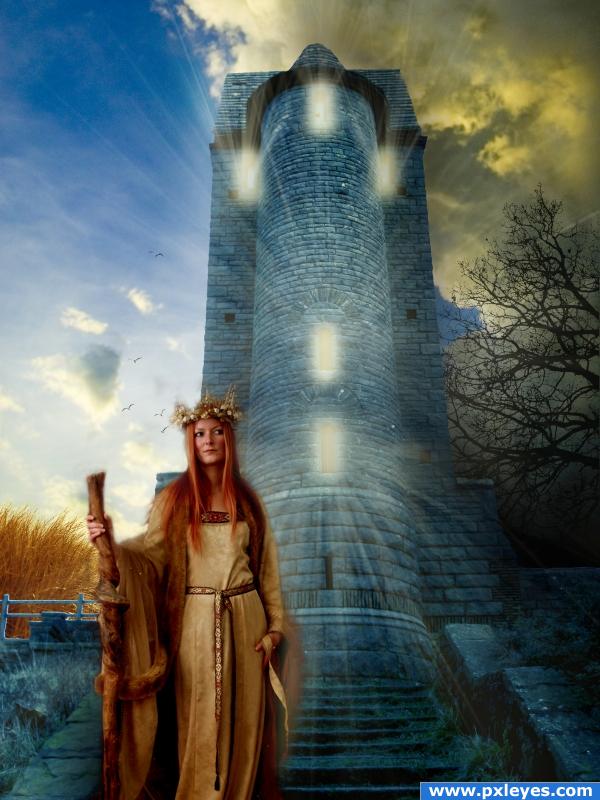
thanks: mizzd-stock.deviantart.com (5 years and 3904 days ago)
beautiful entry.. there's a bit of a halo around the fence on the left hand side, but apart from that.. great job!!
I love how she starts to blur on the right. Very etherial.
It's a bit too light for the strong light beams, and I'd change the sky a bit above her staff...it looks like smoke's coming out of it.  Otherwise, it's a good image.
pretty cool!
You should fix the fence behind her, i looks fake duo to the new background, it's too bright and it has a white stroke.
fantasticccccc
the wheat looks a bit big compared to the birdhouse-- but very pretty!
Howdie stranger!
If you want to rate this picture or participate in this contest, just:
LOGIN HERE or REGISTER FOR FREE
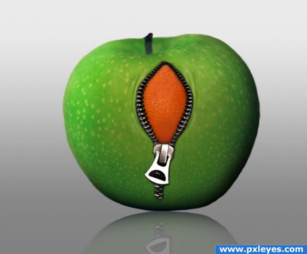
(5 years and 3904 days ago)
I think it would look better if it was the other way around...the orange unzipping into an apple. That way you could show some of the inside of the white pulpy underside of the orange. But what you have doesnt look bad either, nice job with the wrinkles and reflection.
Great job on the folds!! The whole image looks great! Good luck!
very nice wok and funny idea
nice blending work there author, looks almost real lol  i dont like apples, but if the inside tasted like orange, i just might take a bite heheh
Same here. Im more of an orange person 
I love this idea. Very well photoshopped aswell. Good Luck!
wow awesome!
very cute,simple and clear work.gr8 job author!!
Very imaginative!!! Loving this!!!
nice job on the reflection
Howdie stranger!
If you want to rate this picture or participate in this contest, just:
LOGIN HERE or REGISTER FOR FREE
I'd like to know how long it will take them to write out the ticket??? hehehe.. good luck
The look great! The lighting seems a little wrong though, as in the light should huit the entirety of the shell, and mayeb even some mixing between the two lights.. but this is great either way. Good luck!
Nice.
THIS IS GREAT
Howdie stranger!
If you want to rate this picture or participate in this contest, just:
LOGIN HERE or REGISTER FOR FREE