
I was surprised that no one else has done this one yet. It was my second idea. I won't tell you my first, because I might still do it.
The photo in the last step of my guide is my own. (5 years and 3853 days ago)
1 Source:

i put these two together because they both have good porn names :D :D (5 years and 3855 days ago)
Nice image.. but his arm looks HUUUGE!!! I know it's supposed to be like that.. it just looks a little strange, but i'm a fan of House, and for that reason alone you'e getting high marks!
Edit: I just read the description...AHAHA!!
yes i does look big.. but i didn't even touch it!  thanks for the high marks
great image... hope it does not get to the newspaper... lol
HEHEHEHE 
The beefy hand does look a bit big for a little dude like Justin Long, but otherwise this is quite realistic -- and doesn't glove size indicate....
Howdie stranger!
If you want to rate this picture or participate in this contest, just:
LOGIN HERE or REGISTER FOR FREE
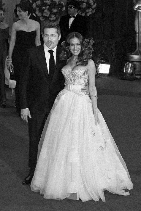
Sarah and Brad for celeb couple contest. (5 years and 3855 days ago)
NOT BAD!!!!! though I don't think you could ever take her away form Ferris 
mathew and sarah are prob my fav couple of modern times.... they are beautiful people
The guy looks like he has no neck! You need to raise his head a little bit. Good luck!
nice but im gonna have to agree with ponti this timethe head is way too low and he looks kinda overweight
Yep...ponti is right alright! Make the head smaller and raise it up so he'll be able to swallow!
Howdie stranger!
If you want to rate this picture or participate in this contest, just:
LOGIN HERE or REGISTER FOR FREE
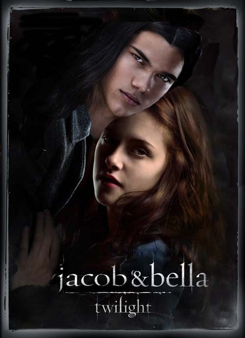
I'm not a huge Edward fan. I love Jacob more. So why not get what I want? (5 years and 3856 days ago)
their heads are a bit off.. you might want to take Jacob head and place it over hers to get the right size then move back in place (so their head sizes are the same)..and place his head behind hers (men are usually portrayed behind the heroine) it seems that jacobs head is a bit smaller then it should be, especially his head being in front of hers, but it's a good image overall
I would but I have a hard time seeing dark colors... Thanks for the tip. =)
very nice!
Thank you Tuckinator
here come the polyvore images.....
Oh and up the top you can still see that other guys hair.
Wacky light sources....
man, i hate that movie.. and i had to go see it against my will 
I hear you elficho... i would've fallen asleep had the girls not been shouting whenever that guy came on screen!
GolemAura gives you good advice..............if you have such a hard time seeing dark colors, why have you chosen to use them? I think it's a good idea that could be better executed!
I have chosen them simply because I wanted to. And I'm still somewhat new to this. And the constructive criticism is greatly apperciated to help better myself.
oh i forgot to comment the entry itself.. i can still see edwards hair, it's quite clear actually, along with that clean cut of jacob's head.. there are also some problems with the background. you could just put jacob's face, keeping everything else from edward. also, you REALLY should consider calibrating your monitor, or at least chop images in a dark room because on my samsung these mistakes are really visible
Howdie stranger!
If you want to rate this picture or participate in this contest, just:
LOGIN HERE or REGISTER FOR FREE
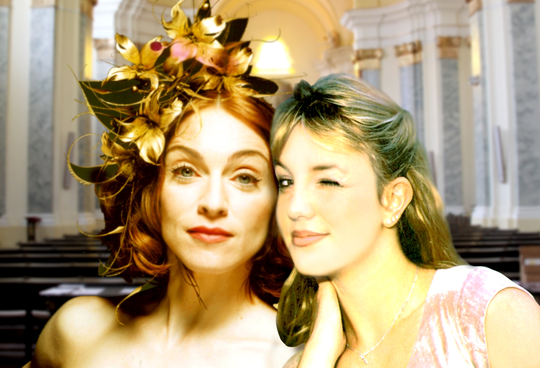
old passion????? (5 years and 3857 days ago)
might want to blur madonna a bit to match britney's blur.. but heck in a hand basket.. working with two different web pics is a bluddy night mare.. good luck on this
To me, this looks more like a mildly edgy pose than a couple. Better matching of the skin tones/textures would not change that fundamental fact.
DanLundberg britney is blinking the eye and thinking she´s mine , the skin tones will never match madonna is mutch more white then britney ,i think what doesn´t match is light is being difficult to fix that, thanks for tip and help
cool image though a different background would be cool:0
i'm not too keen on the background either, but the rest looks great.
well they already got it on so what the hell lol... guess it makes sense then
ok so i had a different bckround and a little make up to britney hope is better now,thanks for tips
Good change, the background looks good now Hehe
Howdie stranger!
If you want to rate this picture or participate in this contest, just:
LOGIN HERE or REGISTER FOR FREE
Photography and photoshop contests
We are a community of people with
a passion for photography, graphics and art in general.
Every day new photoshop
and photography contests are posted to compete in. We also have one weekly drawing contest
and one weekly 3D contest!
Participation is 100% free!
Just
register and get
started!
Good luck!
© 2015 Pxleyes.com. All rights reserved.


Looks nice! Good job
very nice...
one word.... CLASSIC
looks really cool and i think the pic is dominent!
Thanks everyone!
Howdie stranger!
If you want to rate this picture or participate in this contest, just:
LOGIN HERE or REGISTER FOR FREE