(5 years and 4047 days ago)
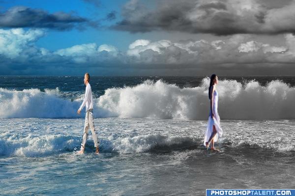
(5 years and 4049 days ago)
they're a bit stretchy.. remember to hold down the shift key when transforming so they don't lose their proportions... good luck!!
thanks for the tip
the people are very blury. The light on the girl doesn't seem to match the picture well. Good job on placing them so they look like they are walking in the water.
I like this concept! I think it would be even more effective if the woman was monochromatic like her surroundings. Good job! 
those people look a tad bit distorted
Interesting...
First, author, both the image of the man and the woman are rights-managed. Do you have permission to use them? Rules are, you have to show proof of authorization or payment receipt in the SBS. Once you're over that potentially disqualifying hurdle, next, the concept is good, but to make it work successfully: 1. re-add the man and woman from the original source, making sure they are in correct proportion (they are too "tall" or "skinny"right now to be natural); desaturate the woman to make her grayscale like her background. There are also some light source/shadow issues. Good luck!
good luck 
Good Luck
idea is good, but the picture is compressed
Interesting concept, but fully agree with elemare. I'd go for some more higher quality images, keep them in the right proportions (press shift while scale images) and try to match the light from added images compared to the source image. Good luck!
The people are too stretched out, but the idea is good. Also she looks like she's walking on water, maybe because of the desaturation...
Howdie stranger!
If you want to rate this picture or participate in this contest, just:
LOGIN HERE or REGISTER FOR FREE
filters/plastic wrap
contour bevel emboss
gradient etc... (5 years and 4051 days ago)
ehe nice eye
gl
Nice idea good luck!
Good Luck 
Not bad, but I kinda miss connection between the drawing and type, it doesnt make it a whole. Not completely sure about the font either, not the most readable (especially when you'd resize is). Good luck!
Creepy..i like it.. Good Luck!!
Creepy eye! 
Howdie stranger!
If you want to rate this picture or participate in this contest, just:
LOGIN HERE or REGISTER FOR FREE

First try to this contest...
Full size interface on http://img23.imageshack.us/img23/5228/essai1p.jpg (5 years and 4051 days ago)
Preety cool work......love this one........
nice
Nice work, I like it 
I like it 
oOo!this is actully pretty good!
Great feel to it 
this one is nice good luck!
Sleek and professional...well done
good luck
I love this one!
good job and good luck
very good... simple yet screams sophistication  goodluck.
Nice Job! Good Luck
nice
nice one
Pretty nice and clean, but maybe here and there needs some improvements. Right now a bit too many things happen, despite you kept it clean. I agree with Nator about "com", should have the same font size as "eyes". Also, it's a bit out of balance since too many things happen on the left side (some kinda frame, some white lines, huge "pxl" . I might have removed the white vertical lines and align "eyes" with PXL (of course also align on right side). The reflection most likely hàs to stay, makes it glossy, but then not sure about the half frame on the left side. If you wanna keep it, at least align the whole logo to the center of the frame. But I do see possibilities here
  . Good luck!
Modest! Good luck!
Too much going on, but nice idea... (the EYES and COM should be same height, and not distorted. I like the background, but don't think the red/green work).
Too much going on, but nice idea... (the EYES and COM should be same height, and not distorted. I like the background, but don't think the red/green work).
Too much going on, but nice idea... (the EYES and COM should be same height, and not distorted. I like the background, but don't think the red/green work).
Too much going on, but nice idea... (the EYES and COM should be same height, and not distorted. I like the background, but don't think the red/green work).
Howdie stranger!
If you want to rate this picture or participate in this contest, just:
LOGIN HERE or REGISTER FOR FREE
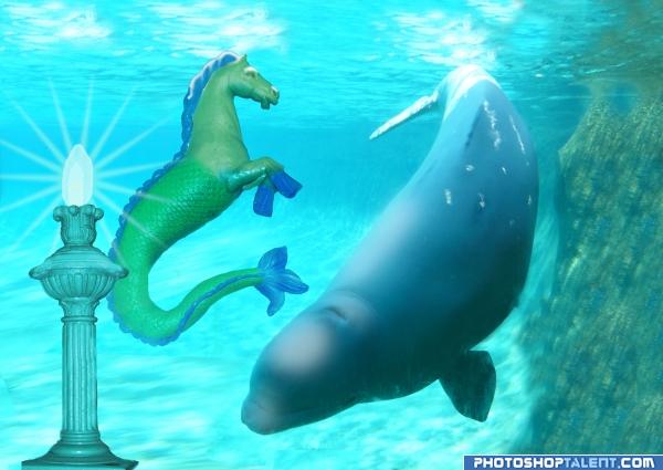
Lamppost, seahorse, whale (5 years and 4052 days ago)
very nice idea, good luck
Its nice, I would like to see it in high res tho 
I think the lamp and light burst needs a bit of realism.. the horse and the whale are just awesome.. high res would help
Interesting 0_0
interesting chop we have here Lol nice idea good luck!
agree with GolemAura.
I think it would look better if you blended the green from the tail to the body a bit more.. GL.
nice
Step 9 is now a high res version of this.
good job and good luck
Howdie stranger!
If you want to rate this picture or participate in this contest, just:
LOGIN HERE or REGISTER FOR FREE
gl
Quite a lot happens here, but hard to see the actual connection with the ste, especially when this will be in the final measures. Good luck!
Could not read it scaled down, sorry
i think your design it's fine put the square attracts the eye more to them than to the anme and the colors are to expresive...you should trry and google some COLOR THEORY see how that can help you good l;uck
Good luck! Nice!
Nice!
Looks like something from Windows '85 - sorry. I think it's the bright green and bright blue - a no no.
Howdie stranger!
If you want to rate this picture or participate in this contest, just:
LOGIN HERE or REGISTER FOR FREE