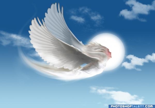
background sky i have created with photoshop brush tool of cloud. (5 years and 3960 days ago)
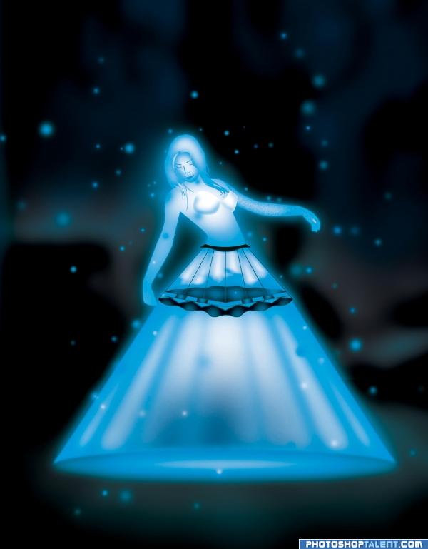
(5 years and 3961 days ago)
beautiful
oh!! she is lovely....
Any sources or references??
EDIT: SBS was only showing 5 steps.. Hahaha - its showing more every time i refresh the page..
lovely color scheme. some edges are very sharp, correct it
SBS's are still coming!! Hahaha.. Someone has been busy!!
I like the tree in the background better, like in Step 27.. IMHO.
she so purdy.. looks like she's floating on stardust.. very sweet
Cool idea
Great use of the source love the colour & transparency super stuff!..... nice SBS
Congratulations for 3rd
Congras!
congrats
congrats
Howdie stranger!
If you want to rate this picture or participate in this contest, just:
LOGIN HERE or REGISTER FOR FREE
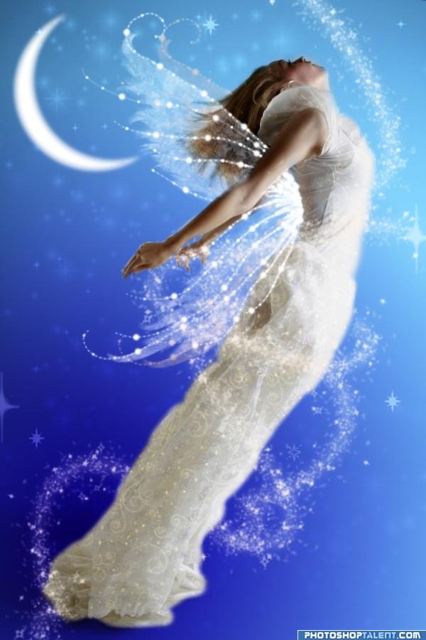
Fixed the wing under her arm.. and a few other things I found that were wrong. (5 years and 3963 days ago)
Beautiful... a part of the wing is missing under her arm or the bottom of the wing is too flat... I hope this makes sense... good luck
Nice Tinkerbell feel. Wings are weird (as BlueSparkle noted): Too parallel to shoulder blades and there's no bottom to them; too narrow or needs second set of wings. Stars appearing through the shadowed part of the moon is physically impossible (but that may be a quibble since Tinkerbell herself is fantasy). I don't get the white streak just below her knees.
so pretty  do you use a brush for the stars etc around her?
NICE !! 
Very Pretty!! IMO the moon is a little big...kinda distracts the eye from her...Nice Job and Best of Luck
nice idea, .........can improve. wings need to be more big
Good Luck 
VERY nice wings
Christy: I used a brush for the stars around her, as well as the glitter on her dress.
Howdie stranger!
If you want to rate this picture or participate in this contest, just:
LOGIN HERE or REGISTER FOR FREE
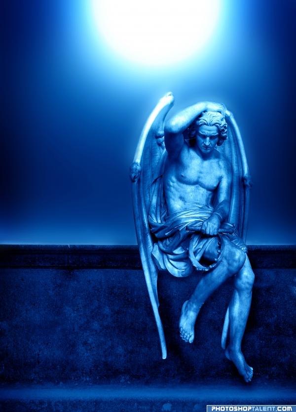
Chopped two images together and played with color and contrast (levels) and some Gaussian blur on the sky.
Your comments are welcome. :) (5 years and 3966 days ago)
Classic Author.. and very daring using Lucifer as your subject.. I could never do that.. of course I'm a recovering Catholic so I can't do a lot of things LOL.. very good job in creating the mood
EDIT: Should have known 
Edit to the Edit: amazing change with the title isn't it.. changes the whole interpretation.. now it's not so.. angelly sweet, it's angelly AWESOME 


thinking?  very very!
u should change the name i´m not shore but i guess this is the only statue about lucifer ,at least the name should be fallen angel if u want 2 call him angel G..l
nice, gl
good work
Intense!! I LIKE IT 
nice job 
haha cool, nice work 
the statue is full of emotions and regret and looks very nice in blue
This is image is just plain beautiful... the lighting, the expression on his face... the title is very appropiate! One of my favorites. GL
I like this one a lot, maybe wod've added a blue hellpit or something )) GL
Howdie stranger!
If you want to rate this picture or participate in this contest, just:
LOGIN HERE or REGISTER FOR FREE
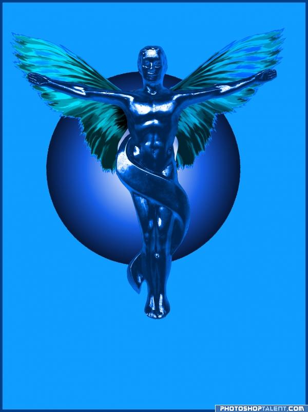
transform paste curves and hue saturation (5 years and 3967 days ago)
the sphere is off center..if that was your intent.. that's okay.. just it causes one to look at the sphere instead of the main subject..very beautiful piece though.. GOOD LUCK
EDIT: Well HIGH FIVE then for the explanation.. hehe.. good luck!!
looks better off center  nice work author
By placing the sphere off center the balance is thrown off. From a purely technical point, the sphere must be optically centered behind the angel. As GolemAura said, this position causes the viewer to look away from the main area of focus. I also see two gray areas on the inside of the wings near the body. They look like they should have been cut out so the sphere could show through. I do like your concept and the work is nicely done!
good work
I like this good concept
nice job 
Howdie stranger!
If you want to rate this picture or participate in this contest, just:
LOGIN HERE or REGISTER FOR FREE
nice entry (face...........not angel's)
Nice idea still needs a little work tho mostly on the wings removal of the black line..
source or sbs ???
looks like a witch with that nose
Would have been much better if you had not made her face look like a witches
its a grt idea but the feathers needs wrk..........................plz do it................ gl
nice step by step??
I see nothing wrong with the nose, so either I'm not very savvy or the author has already fixed it.. this is a very strong entry as Nator said...the sweeping motion of the wings does a great job of mimicing flight and thank you so very much dear author for covering up those hands.. I know they are necesarry in someof these images,, but the way they are all kaphooie in every direction really drives me nuts HEHE.. good luck on this one.. very nice
Very lovely piece! You do need to show your sources and a step by step would be nice.
I like the composition of the image! Good luck!
very creative
http://www.bigstockphoto.com/photo/view/976408 this is a paid for image, do you have proof you paid for it??? i only know cause i brought the image a long time ago. The only part used is the part without the line through it.
thatis cool
Howdie stranger!
If you want to rate this picture or participate in this contest, just:
LOGIN HERE or REGISTER FOR FREE