(5 years and 3175 days ago)
(5 years and 3177 days ago)
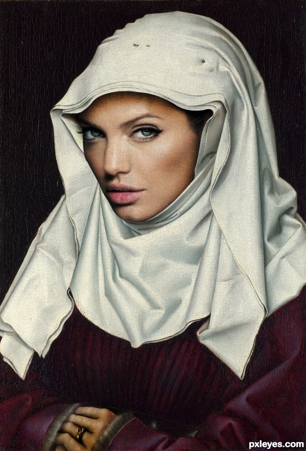
Nice blending author. One suggestion would be to make the texture smaller on the face, similar to the veil.
I think now its better 
Nice job...a couple of things though. On the upper right (face) there is an obvious line, brush that out and on the left soften the area between the face and the head wrap. Just suggestions. All the best!
Head is too big. Overlay the 2 images & compare.
The diagonal line along the wimple and down Angelina's cheek is too straight and distractive. The Angelina source you used was too severely photoshopped to remove all curvature of her cheekbone on that side. Perhaps you can find a bit more natural source, or reposition the face so that the line is not continuous along that diagonal.
The hair pins are very cool.. glad you kept them... very good job on this.. love that you used the extension of Jolie's face (it is a long one) good job all round author 

Unlike the original painting, Angelina's viewer's-left-side of her face is in shadow so the lack of shadow on her wimple is off-putting.
Howdie stranger!
If you want to rate this picture or participate in this contest, just:
LOGIN HERE or REGISTER FOR FREE
(5 years and 3180 days ago)
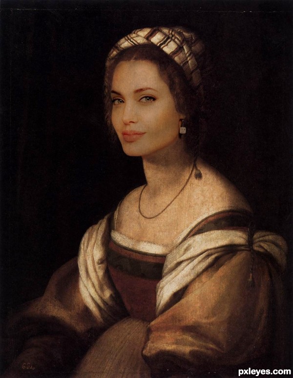
what a great blend.. GOOD LUCK AUTHOR!!!
Really nice image. Wish there was a SBS too...
very fine job Author 
Great blend and match.
Nice creation,good luck author 
Congrats!!
Congrats!!!
Thank you for your comments and votes.
Howdie stranger!
If you want to rate this picture or participate in this contest, just:
LOGIN HERE or REGISTER FOR FREE
(5 years and 3186 days ago)
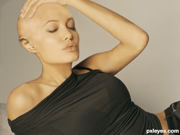
Great photo! It looks like she's enjoying the feel of her hairless head. Nice job!
she looks good .... anytime n anywhere 
Very good chop, GL!
nice chop and she is still hot i agree 

Howdie stranger!
If you want to rate this picture or participate in this contest, just:
LOGIN HERE or REGISTER FOR FREE
(5 years and 3477 days ago)
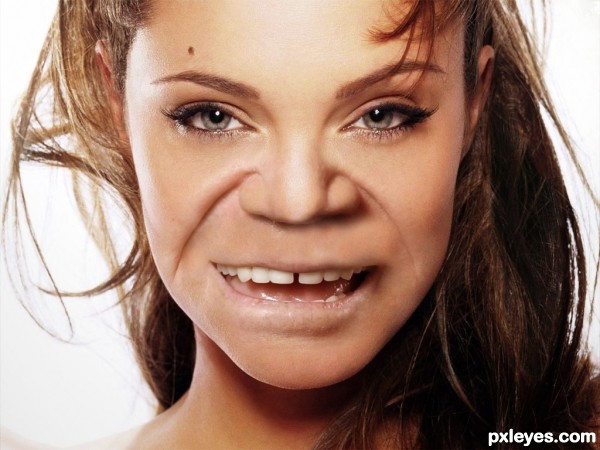
I love the blending of the wrinkles (that must have been a nightmare to get them to blend) great JOB (the corners of mouth make my mouth dry..
blending is very good... gl
OMG.....eye catcher !!! 

good one
OUCH!!!
Oh god i got scared when i first saw this loool amazing blending author!
This one is great , could very well be true.
Great! slightly creepy but..... GREAT! 
to tell you the truth this creeps me out too
Put a veil on her face, like those belly dancers do... So she takes her veil off and... aaaaaaaaaaarrrrrrrrrrrrrrggggggggghhhhhhhhhh! Smile... 
OMG, now THAT's an odd couple!!!! LOL 
Well done = )
Congrats
Howdie stranger!
If you want to rate this picture or participate in this contest, just:
LOGIN HERE or REGISTER FOR FREE
Hi-res is low res.
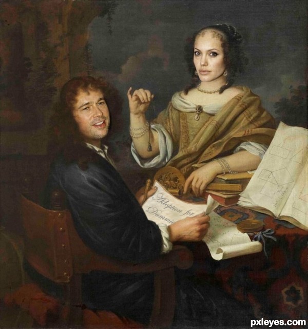
Brad's face is too small, while Angelina's face is too big, and both of their faces are too shiny.
Great job of reflecting the feel of the original painting author, Good luck and very cute humor
fantastic good luck author
Howdie stranger!
If you want to rate this picture or participate in this contest, just:
LOGIN HERE or REGISTER FOR FREE