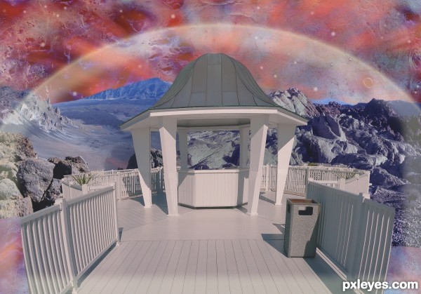
(5 years and 3304 days ago)
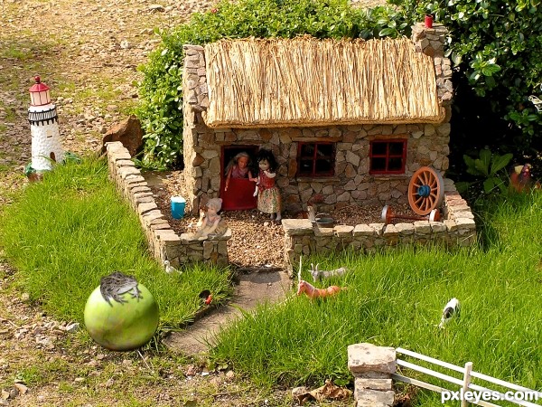
(5 years and 3305 days ago)
shadow on the 'vegetable'...(isn't it?) is wrong... g l 
how do you mean hereisanoop?
the light source is coming from the right upper side' you can see it on the wall of the house
the light source on the veg is from the other side and that`s wrong.
The easiest way to solve your shadow and light problem, author, is to flip the "marble" horizontally. I see you are trying to change the light and dark with other manipulations - that is much harder and usually doesn't work too well. If you still have your original image in separate layers (a good thing to do until contests are over, by the way), just flip the marble and you will see a huge difference, and the light and shadows will match. Good luck!
Thank you elemare, I made the change, hope it is better now
You're welcome! So glad you liked my tip. I find that matching and/or creating shadows and light are probably the most common challenge when adding outside elements to scenes.
Very cute...nice job!! best of luck!!
Howdie stranger!
If you want to rate this picture or participate in this contest, just:
LOGIN HERE or REGISTER FOR FREE
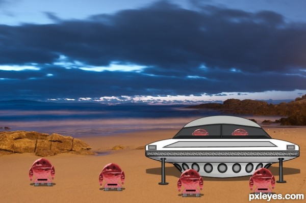
(5 years and 3310 days ago)
the simple shadow you placed under the saucer would help the little guys you created, (a little gauss would help) a soft burn brush over the saucer's lower edges could aid in the thickening of the ship (giving it density) (dodging the top accordingly) but then it would become my creation and not yours... the cartoonish effect is done quite well, if you wish to bridge into a more dense image, go for it with my suggestions, but I do love the fact this is recognizable as your own.. GOOD LUCK (and as always.. IMHO)
EDIT: the easiest way I find to manipulate gaussian blur is to go full tilt, open a layer underneath the little ships and draw a very flat oval, fill it with black. Go to Guass blur and just move the slide bar til the edges blur nicely (keep it as dark as it is, you can always reduce opacity later... place the disk under one of the little ships and align it with the size moving it back and forth til it looks good (Use scale to make the size right) then just play with the opacity till it looks well blended (You may have to gently burn the bottom of the ships so it blend well (next time you are driving down the road look at the shadows cars cast on the road, you'll see that it's darker directly under the car and where the wheels meet the road then the rest of the area (that's a guass blur..also the wheels them self will be darker just at the edge where it touches the road (sometimes the exact same color) it's an easy way to create realism.. and to ground and object so it doesn't look pasted on)
Good Luck..  !! and good job
Thanks Drivenslush I just redid look any better ? hey give me all the comments you want Thats how some of us learn Now I have to ask on gaussain blur I always did 3 but now I have it up to 6 was I to low on it plus tried what you said in comment...Thanks
The start pic for the planet surface is a brilliant choice. I would adjust the sky and the ground differently (as the sky result is great while the ground is washed out and kind of flat). The cartoon spaceship and aliens on a realistic background is a valid artistic choice. I think the shadows should be stronger, however, especially where the cartoon elements touch the ground so they don't look like they're floating. The spaceship landing struts should cast shadows plus the underside of the spaceship should be shadowed as well as the aliens' crotches and wheel tops.
Thanks all Here is another redo
Howdie stranger!
If you want to rate this picture or participate in this contest, just:
LOGIN HERE or REGISTER FOR FREE
Great Tutorial.
http://www.secondpicture.com/tutorials/digital_image_processing/photoshop_water_tutorial.html (5 years and 3352 days ago)
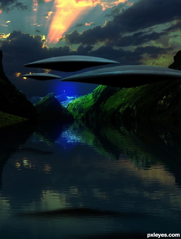
Nice...move the foreground ship down a bit so it doesn't touch the edge of the far ship for better composition.
Come on...we do it as were chopping..
Sorry I rushed my comment. You can still improve the composition.
Edits made, thanks.
pretty nifty!!!
very beautiful work! 
Nice concept, good depth and color!
Beautiful work author...U created very very interesting scene...water looks fantastic, reflection is perfect and the whole UFO mood is great...well done
Great concept, nicely executed ships, reflection and atmosphere. 
hey congrats!!!!! 
Congrats!!
Howdie stranger!
If you want to rate this picture or participate in this contest, just:
LOGIN HERE or REGISTER FOR FREE
(5 years and 3422 days ago)
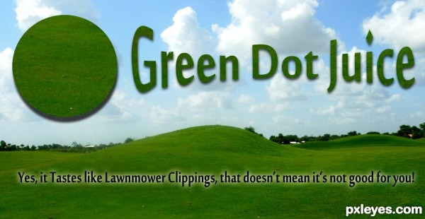
o my o my...so for our health we could squeeze out our lawns....
lol, and I've had that grass shot before, and well like I said had, cause it's a little too green for me = )
When I used to drink Wheat grass in my youth, I'd always have to follow it with a big glass of carrot juice.. UGH!.. it really does taste like lawn clippings 
Howdie stranger!
If you want to rate this picture or participate in this contest, just:
LOGIN HERE or REGISTER FOR FREE
Howdie stranger!
If you want to rate this picture or participate in this contest, just:
LOGIN HERE or REGISTER FOR FREE