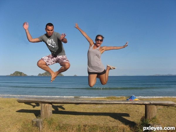
Edited cloth, removed some stuff in the background plus changed position (5 years and 3696 days ago)
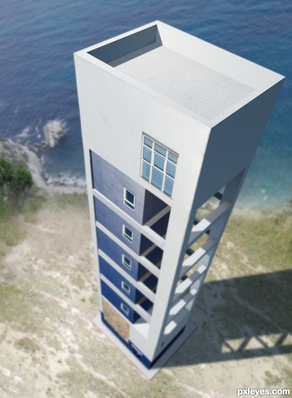
I thought I would look at the contest from another perspective than the rest of the contestants. So I just changed the whole thing.
Everything is done within Photoshop. To 3D program used, to vector or anything like that.
Unfortunately I didn't have the time to add the lighthouse light at the top - another time :)
Hope you like it, it's my first entry since the site change name from PST... (5 years and 3712 days ago)
A bit too much blur, but everything else is great! 
PS: Good to see you're back, author! 
Nice idea well done
-- PS welcome back wondered where you were hiding (LOL)
Yeah, I had my doubts about the blur. That's why I added the last step in SBS to show the details missing. But the high res wasn't made for full size viewing.
Looks like incredibly tedious work, author.. but an excellent idea and very well executed.
 That's a different point of view!...
And let's consider blur as a soft focus, or DOF...  I like both versions!
@Erikuri:
It was supposed to be DOF...
And I meant:
No 3D program, vector or anything like that was used...
Great job author...its not bad that blur thing,gives some idea about how high is building...good luck
good idea
excellent!
Great perspective! I can never create such thing  When I saw your Step 1 just gave up, too mathematical, geometrical, logical etc, etc, for me
great job
Interesting idea and well done...GL
Super concept.
nice............... 
Congratulations for 1st, excellent.
Congrats for your first place, Lundmikkel! 
Congrats Mikkel, terrific work 
Congratulations on the first place, Lundmikkel! 
::: CONGRATS :::
Congratulations! Looking at this, I think I learned one more way to do the things... 
 .......... congrats for the 1st place ..............
Congratulations!
congartulations!!!... for 1st place...
Congrats!! 
Thanks a lot everybody. Nice to be back in the game.
Had this still been PhotoshopTalent it would have been my 6th 1st place in a row. So thanks for the nice votes 
Congrats! for your winning. Great perspective work  , Well deserve
Howdie stranger!
If you want to rate this picture or participate in this contest, just:
LOGIN HERE or REGISTER FOR FREE
Uploadod by Leftfield1, fjsa, lauralucia and jpaulocv (5 years and 3723 days ago)
sweet concept, excellent construction
Marvellous... 
Oh, how nice!
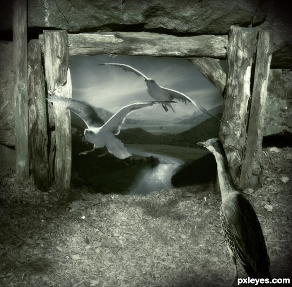
Author, you've got some problems with shadows here: base on the wood, the light comes from the upper left downward to the lower right, so the shadows of all the 3 birds are wrong. Removing the shadows of the flying birds are easy but change the light casting on the standing bird is difficult, so I suggest you to flip these birds horizontally, they will be fit to the source. Also, the back scene should be blurred more and some tiny glowing spots on the water can help the viewers focus on the center of the image, where should be the main part of your image. Come to the positive points, you have a nice idea and you found a suitable sources (I especially like the standing bird  ). Good luck to you
Good idea, but I don't think the vignette helps, and there are 2 different light sources.
Thanks langstrum, great suggesstion as usual. I have flipped birds, painted some light glow on water surface and blurred background.
Tthanks CMYK46, reduce vintagge. 
Nice 
Look very good author,i like changing perspective idea...good luck
as thye said the idea is very good ,but thinke about what langstrum said
great work author, love the mood
Nicely done.
good job, like this mood
nice job and good luck. 
Very imaginative, wonderful execution......good luck on this.
Lovely concept and beautiful result.....G/L Author.
beautiful entry, author... love the mood and colors... GL
Howdie stranger!
If you want to rate this picture or participate in this contest, just:
LOGIN HERE or REGISTER FOR FREE
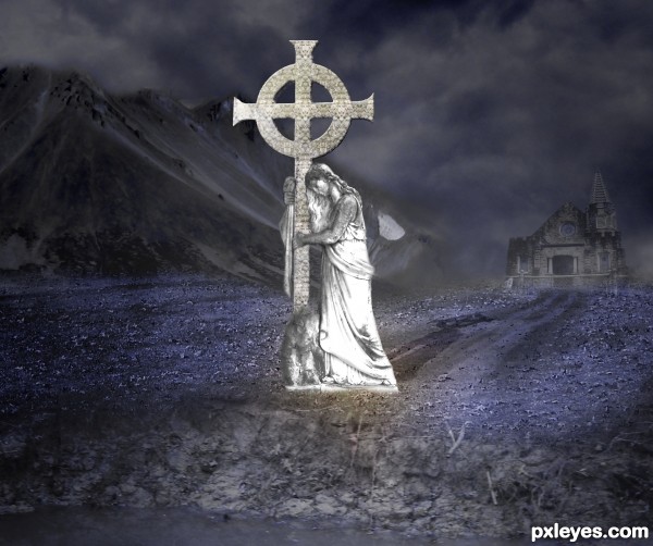
All images used were my own except for the cross which is the contest image.
(5 years and 3747 days ago)
Please post source links.
workin on SBS at the moment it includes all sources
Your selections seem a bit rough and a bit too feathered, i also think that a black and white image (maybe at about 80% opacity to bring in a bit of colour) would look great. Good luck!
You have a very beautiful idea, author...I'll echo, however what ponti said about the edges looking a bit unrealistic. Also, is it just me, or are there two shadows being cast in opposite directions? I think it looks pretty good in color as is, but it would be interesting to see in B&W.
well done author
Thak you all for your comments and input
Please mods do not remove this entry.. I have recieved your notification.. I will have the corrections made tonight..
dang I hope so Author and yes clean up and blur edges a bit.
I will wait to vote 
Author, just say it to the mods when you flag it.
Good job author...gl
the adjustment you've made is better. nice work.
Howdie stranger!
If you want to rate this picture or participate in this contest, just:
LOGIN HERE or REGISTER FOR FREE
Thanks to ''night_fate'' for source 1
Thanks to ''mjranum'' for source 2
Thanks to ''pixelchemist'' for source 3 (5 years and 3759 days ago)
Nice! Doesn't look much like a hoax photo though, but mood is very nice. 
EDIT: Wait...I saw the high-res. This is another 3D image, isn't it?
amaizing... waiting for the SBS 
This is gorgeous!!! though it doesn't look like a hoax photo.. it just looks like a spectacular sci fi piece (I would keep this image but replace the human with a real one so you have a better chance of winning the contest) it really is a supreme image though.. I really love it
It's very good, with no shadow of a doubt! But I think the most of people here - including me - don't have a 3D program - look, I'm not criticizing you... but it's clear that things go better when you have the tools! 
There is a free 3d program called Blender. And since you're allowed to use 3d programs, I don't see why you're complaining? sbs would be nice author. Good luck 
Does it really say anywhere "you are allowed to use 3D programs?" And anyway, as I said before, it's not the program that seems unfair, it's the extent of it. When a small part of the image is 3D, fine. But when the main components of it are, it becomes more of 3D contest than a PS one.
That's a shame if the same thing happens 3D contests, but does that mean that it still has to happen here?
Not much, really. Eventually, just some guidelines should be put in place. Until then, it's just my opinion, and I know of a few other people who will most probably criticize you for using 3D software...*coughCMYKcough*...and one of your nice meter guard entries did ultimately get pulled, didn't it? Maybe just try to limit the use of 3D in your future entries...you'll get less haters and have less risk of being pulled.  Good luck, author.
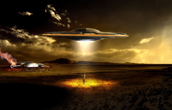
Pretty cool! The bright UFO light above the alien should be creating highlights on the top surfaces of the alien (e.g., head and butt) with a corresponding shadow on the ground. I think a much brighter center for the light spot the alien is standing in would be much more dramatic. Also, I find the bright spot on the clouds in the center of the image distracting. (It would be interesting to experiment with moving the big-UFO/alien elements to the right a bit instead of being centered.)
Just to be clear, I never said you cheated. Just thought maybe the 3D was used a bit too much. But, thanks, Nator. I suppose I neglected to look in the most obvious place for the existing guidelines. 
BTW, author, why'd you delete all your comments? Now I look like I'm talking to myself. 
This is the Photoshop contest and we can use the 3D program to support our work, not the 3D contest supported by Photoshop. I agree with gamemastertips. If you don't provide enough your technique, people can misunderstand you use only PTS and this is UNFAIR (for example, picking an 3D image is much easier than creating the 3D from the 2D image). However, to gamemastertips, I think this is not the good place for discussing too much, you can do that in the forum. Focusing on this work and as far as the PTS factor is concerned, you might did a good job turning the left UFO into the damaged one.
Because you didn't show the PTS steps, so I just guess this is the part you used PTS, right? Beside that, I agree with Drivenslush that you could replaced the human with the real image (this one looks bad to me). Through other entries of yours, I know that your PTS skill is also very good, you can do a good job even with the pure PTS manipulations and get higher votes from people like me and gamemastertips. Anyway, wish you a good luck with this contest.
Agreed, Langstrum. Sorry if I rambled on too much. :p
this is supposed to be a PHOTOSHOP contest.
Just to repeat again what I said, author, and to echo Langstrum, you have enough great PS skills to do a pure PS entry. If you do, you'll have alot less people giving you low votes because they don't think it's fair. I rest my case, and I don't mean you to change your entry, just think about it for the future.
Great looking picture, I like how you have incorporated the 3d work into your "PHOTOSHOP" contest image. Palaekman is right there are plenty of free programs out there don't knock it until you've tried it. Just because this member used a 3d program to generate a piece of the picture does not mean it is a guaranteed winner. The photoshop work is still very evident in this entry. Good job author! high marks from me.
Okay thought some more about the other side of this argument: 3D is somewhat fair because you could have either pulled the UFO image off the internet or simply made it yourself. You chose the latter, which is perfectly fine, and the PXLeyes guidelines says so. But on the OTHER hand, author, didn't your "Last Chance" meter guard entry get pulled? (I'm really asking you this, it's not rhetorical.) Why exactly? Was it because you used too much 3D and not enough of the source? But then why is that a problem if PXLeyes allows the use of any program? This is what seems so convoluted. Because if they say that any program can be used, then what if you use Photoshop as minimally as possible? Wouldn't the entry get pulled then? So my question is: what is, in everyone's view, the limit that an external program can be used? I think I'll make a forum post about this soon.
http://www.pxleyes.com/photoshop-picture/4ba89ef0802ef/Lost-Chance.html
I would think the voters spoke well in this case 
Oh terribly sorry about that. O.o I missed that entry...moving on now...
To end my annoying rant, I guess I'll just say that I see both sides of the argument, your picture is still awesome, and I wish you luck. 
Aside from the 3D controversy, I don't see how this image represents a hoax photo.
there is no more "3D controversy" MM cleared it up in the forums, good work 
Yes, 3D aside, I do agree with CMYK. It's a very nice sci-fi photo, but it's pretty fake, unfortunately.
Love the colors here. UPon looking at the High res, I think the figure could be better blended into the overall image, she/he looks pasted on.
The Rules and Guidelines regarding use of 3D images states: "People are allowed to use 3D renders from the net in the photoshop contests, they just have to provide links etc. But it is so much better when they make them themselves. From the guidelines: (UPDATED 08/2009): If you use a 3D program to create a model (eg. with Poser), it is required to post this in your step by step guide. You are allowed to use any program you'd like to make your entry. If you make your own renders, please make screenshots from the object in wireframe modus and show in the Step By Step how you made your render." Whether we agree or not that rule makes this a perfectly valid entry.
a quote from the comments on this contest suggestion - Contest Moderator: "The contest theme is to show a UFO. This means a vehicle of some kind that is an Unidentified Flying Object, which you may show in flight or hovering or even landed."
Yes Ichappell that's just a reminder, I think to clarify this isn't about aliens and monsters but about UFO sightings.
So how does this represent a hoax, which seems to be the point of the contest?
dude ) ky ( try reading the goal of this contest,
you are an idiot

thats..... cooool..... I like the result..GL
I am wondering why are there seperate '3d contests, ps contests, and drawing contests.. 3d max is that much advanced for making fabulous models... I want to ask here whether my entry will get pulled if i put a drawing of a scenario which has a ufo... this not to hurt you author.. since this is amazingly well constructed.. but still doubt about using 90% work with 3d....
what happens if somebody use a 3d program to construct their own images... since it is allowed to use images that are not copyrighted...
every entry here at pxl in the end is 2d, thats what we see here,
photoshop is an image editing software so it is a catchall in the contest, some may draw, some may use 3d, some may set up a photo, and some look for a photo source on the net,
no matter what type of source you use in the end you edit it in a 2d and post in contest
amazing ! 

And also congrats for your second place! 
thx all for your comm...and grats!!!
Congratulations for 2nd too
Congrats!
Congrats 
Howdie stranger!
If you want to rate this picture or participate in this contest, just:
LOGIN HERE or REGISTER FOR FREE
You did a great job with their arms! Just try to fix the blue part near the boy's arm, cloning the color to get it uniform, so it will be perfect. You could remove the beach towel as well...
great job with the blending
very nice
Good work!
cool.. i love the scene...it makes them look happy anf their enjoying themselves
nice work
Howdie stranger!
If you want to rate this picture or participate in this contest, just:
LOGIN HERE or REGISTER FOR FREE