Counts down to December 21 when you can party like there's no tomorrow.
Thanks to Redrobes for the sand texture (5 years and 2773 days ago)
- 1: sand texture
Counts down to December 21 when you can party like there's no tomorrow.
Thanks to Redrobes for the sand texture (5 years and 2773 days ago)

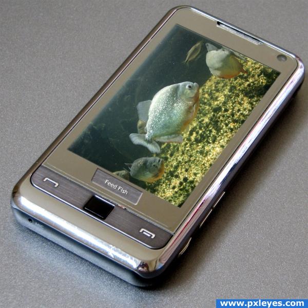
A combination of micro electronics and compression of space leads to a real fish tank for your cell phone.
This was done with a combination of layer masks and a blank layer to restore the depth in the screen. (5 years and 3853 days ago)
Well done!
Nicely done.......... It will look more good if you make the left side of the screen more solid...............
Neat... I had those kind of aquarium widgets for my cell phone... Only one thing, the perspective of the the feed fish button is really off... See the other button...
Nice image but arkncheeze is right you really need to sort that perspective button out. It is rather distracting.
wow!!! i cant even take a photo on my phone and you got fish swimming in yours lol ( probably shouldn't have gone to tha pub tonight hehehee)
Nice job...try blurring the 'feed fish' ever so slightly. The surface it's on...isn't that sharp. 
Not bad, but you may want to make the left edge from the screen (the side above the fish) sharper and perhaps it can also do with a bit of inside shadow (see also the original cell phone image to compare). Good luck!
Howdie stranger!
If you want to rate this picture or participate in this contest, just:
LOGIN HERE or REGISTER FOR FREE
SOOPA COOL!!!
Love the concept, great idea! Nicely done.
Really nice drawing and texture looks good. I can see a smudge at lower left corner, and image looks slightly crooked.

edit: looks good now
Thank you, nice. I removed the smudge (which showed up after I entered this, of course) and straightened up my entry.
LOVE IT!
Thank you for the votes and comments.
Howdie stranger!
If you want to rate this picture or participate in this contest, just:
LOGIN HERE or REGISTER FOR FREE