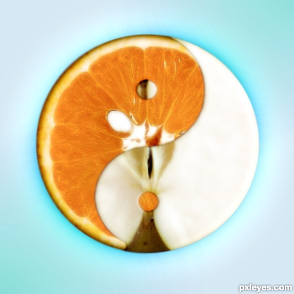
(5 years and 2829 days ago)
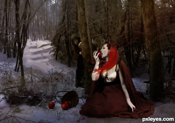
Snow Glass Apples is a very twisted version of Snow White written by Neil Gaiman. This is my take on the story. To understand the image completely you have to read the story. I drew the hair on in photoshop. (5 years and 3029 days ago)
The lighting is very discordant between the woman and the background, it looks like a bad studio set up. The shadows on the model are far darker than the background, and the dark edge along the bottom of the image just emphasizes the discrepancy. Perhaps you can adjust the levels on the woman to brighten her up a bit, or find a "moodier" background that is as dark and heavily shadowed as she is.
Are you saying all the rest of the source pics are your images? You need to place them UNCUT in the SBS.
Step 2 "vampire" only shows a tree.
what a really neat creation, very fun visual 
Howdie stranger!
If you want to rate this picture or participate in this contest, just:
LOGIN HERE or REGISTER FOR FREE
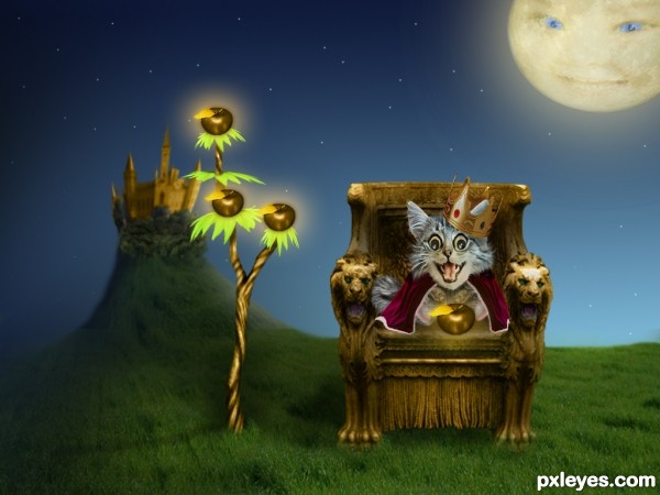
"A certain king had a beautiful garden, and in the garden stood a tree
which bore golden apples. These apples were always counted"
thankyou:
totgstock.deviantart
starbl00d-stock.deviantart.
lilystox.deviantart.
swashbuckler.deviantart.
dreamrose-stock.deviantart.
tatt2dchic.deviantart.
biancaverheijen.deviantart.
(5 years and 3083 days ago)
Looks good
I don't know why, but it has something from Alice in Wonderland!
Good job!!
Different but nicely done, good luck!
thatsa lotsa fun!!!
CONGRATS!
Congratulations!
congrats, great image
Howdie stranger!
If you want to rate this picture or participate in this contest, just:
LOGIN HERE or REGISTER FOR FREE
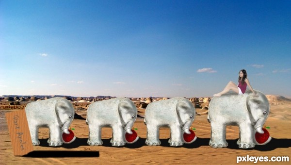
getting lunch (5 years and 3234 days ago)
Howdie stranger!
If you want to rate this picture or participate in this contest, just:
LOGIN HERE or REGISTER FOR FREE
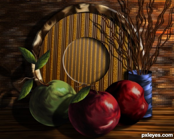
Only source image used. (5 years and 3237 days ago)
Very nice work! Best of Luck 
Thank you Christy.
very interesting! good luck!
Thanks Androla....comment appreciated.
Beautiful, one show
love the inner disk
I really like the lighting in this. Great shadows. 
Beautiful work on the apples, amazing sbs 
Thank you for comments and support.
Beautiful!!!  Best of luck author!
Fabulous work author...all pieces are maintained with superb skill...best of luck
Beautiful work author....Best of luck !!!
Nice Still Life.......... Very good effort.....Best of Luck Author.
Your comments are appreciated, thanks so much.
Congrats for another fine still life George, an excellent score as well!
Howdie stranger!
If you want to rate this picture or participate in this contest, just:
LOGIN HERE or REGISTER FOR FREE
fantastic
Great concept - almost surprised I've never seen one like it before. Nicely done
almost creamy great job
Very original!
very strange, very weird, very not... usual....

I like it alot
Brilliant and creative idea!
I think it is great .... original and makes the viewer keep looking
I would of liked apples to have a thicker skin .... but they don't..
good luck
Howdie stranger!
If you want to rate this picture or participate in this contest, just:
LOGIN HERE or REGISTER FOR FREE