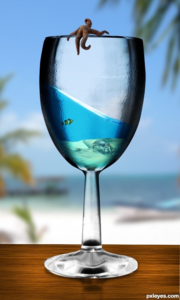
I was inspired to create this when I saw something similar in a tutorial.
Wanted to take it a step further by creating the glass purely from the source image
Please view high Res, Thanks :) (5 years and 3158 days ago)

Credits to ~foureyestock , =whisperingforest , =CozycomfycouchStock , ~RosalineStock , ~najustock , ~chulii-stock , ~shadowh3 and ~abysius71 for stock.
(5 years and 3629 days ago)
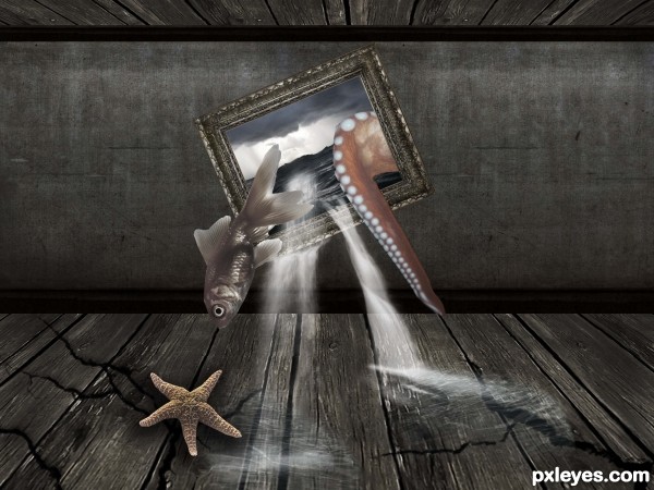
Ok, it's surreal, but if you chose sea elements, try to add a marine fish - kingyo is from fresh water. The perspective of starfish and water on the floor need to be fixed, and water could be less transparent. GL! 
I don't think the fish needs to be changed since its surreal, but I do think the water needs a bit of work. The water would start at the edge of the frame, not the middle. Good luck!
very cool work author,great colors...octopus is a nice touch...gold fish should be a smaller and sea star a bit darker...any how i love this...good luck
Nice idea.
Howdie stranger!
If you want to rate this picture or participate in this contest, just:
LOGIN HERE or REGISTER FOR FREE
like the composition -- nice owrk
very nice OWRK.. hehehehe...I know I know. its Work.. but I love typos that are funny LOL.. good luck
I think the lower edge of the glass' feet should be darker (compare it to the reference image). But apart from that it's a very good job.
Wonderful! The glass is a beauty to look at. A few things (yeah I'm just nit-picking now) the edges are too dark for a "glass", but who really cares, it was a god freakin' stylus before that!
Good luck
Thanks for the suggestions, I will make some changes
nice work -- (lots of work!)
Very creative manipulation, great detailed sbs!
Howdie stranger!
If you want to rate this picture or participate in this contest, just:
LOGIN HERE or REGISTER FOR FREE