May not be safe near fire :)
Only source and texture used.
Try to see the high-resolution image, the texture and the details of the armor look great in it. (5 years and 3423 days ago)
- 1: Texture

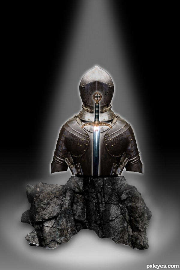
Knight in shining armor and the sword in the stone that defeated him, now set in a display (5 years and 3424 days ago)
It lacks a bit of depth and shadows on the side of the rock, but the idea is excellent and nicely executed. 
You could have extended the arms downward to go behind the rock. (You still can...). I don't think they had short sleeved armor back in the day. 
Also, the glow around the sword should be different than the glow around the armor to help it pop.
Thanks for the feedback fellas. I cant get the arms extended, and it be the quality I like. It just becomes a pixelated mess, and throws the rest off.
Thank you both very much for your critique, and I will try harder on the next contest.
Thanks for the feedback fellas. I cant get the arms extended, and it be the quality I like. It just becomes a pixelated mess, and throws the rest off.
Thank you both very much for your critique, and I will try harder on the next contest.
You know you can edit your entries until the contest closes right?
IMO, you lack background, I know it's extra work ( and my least favorite part of chopping) but it adds a great effect, why not try some paved stone on the floor and placing the scene in a catacomb, ruins, cracked earth, on a hill with mountains around -I'm brainstorming right now.
Yeah I know. Call me lame or any other name that you would like. maybe I'm over the top in my line of thinking but I feel that I should stick with my original submission the way I submitted it. Believe me this isn't because I don't value the critique because I treasure it. It's exactly why I compete. Back to my point though I feel that I learn a greater lesson if I suffer the consequences now instead of constantly retooling what I have already presented. I feel I should have taken these things into account before I presented. They are all great observations/ suggestions and I wished I would have thought of them myself. You better believe I will on the next one. That's for dang sure.
I was actually thinking of placing it in a museum I just couldn't ever reproduce what I was envisioning. I will learn with time and the great feedback that I get here.
It's cool author, no one's calling you lame, and you have some nice adult-ish arguments there, with which I don't totally agree, lol.
Yeah I can see both sides of the argument, take the advice, improve it, win. You know what I might start a thread in the forum after the contest has finished because I would really like to hear all the views on it. Maybe I am out of line in my stead fast and most likely over the top manner of competing.
Howdie stranger!
If you want to rate this picture or participate in this contest, just:
LOGIN HERE or REGISTER FOR FREE

Made only with the source image, I hope you like it!! (5 years and 3449 days ago)
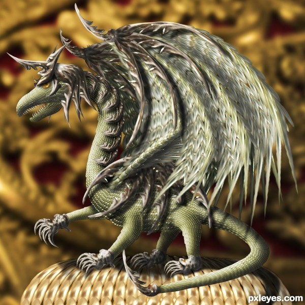
Concept is good. The background is more saturated and has more contrast than the dragon. Makes him look a bit weak. Wings seem a bit blurry compared to the rest of the creature. Tail angle doesn't look natural.
The highlights and shadows really make this brilliant!
Not sure about the anatomy, but it sure is intricate.
Good work and use of the source. Good luck.
I reiterate my previous comment about members with fewer entries having an advantage. Now we have an entrant with only 5 previous entries.
This is a nice image author.......... however, this seems to be the kind of entry alot of people are making lately.
An amazing amount of work on this ... cute little guy!
Gorgeous creature 
Wow, very beautiful and I see you've put a lot of hard work into it. 
Congrats for 3rd......!
COngrats for your third place, Zakfuego!
Congratulations, Marco! 
Beautifull - well done on third place!
congrats on third
congrats 
Congrats! I hope to see more of your entries. 
Congrats Marco on the next level of success in Pxleyes, keep it up buddy!
Congrats!!
congrats
Congrats...
I like the 3D effect, congrats for third place !
Thank you to all!!! this work take a lot fo time and Im happy you like it 
congrats
Howdie stranger!
If you want to rate this picture or participate in this contest, just:
LOGIN HERE or REGISTER FOR FREE

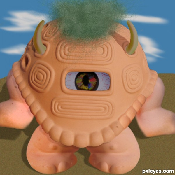
Used only given image , and manipulated it into a cyclops alien. Everything not from the turtle was drawn in photoshop. (5 years and 3611 days ago)
The two back legs would look better if you sharpened up the edges and used the burn tool to give them depth. Awesome idea!
Its nice that you managed to edit the turtle into a different shape. Though the feet pointing at eachother at the front is a little disconcerting, its an okay image. The eye is a plus, though i can't say much for the fuzz on top... But its not too damaging.
good luck
HA, that's creative  the eye is a bit too dark, imo and the left horn too rough (the edges)
Howdie stranger!
If you want to rate this picture or participate in this contest, just:
LOGIN HERE or REGISTER FOR FREE

biborné veres dorottya-http://www.sxc.hu/profile/vdori
Thanks for the great image of the wasp...
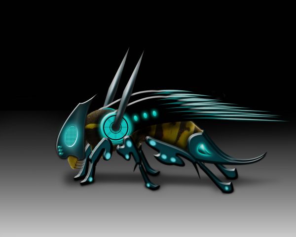
Please watch High Resolution before voting....Thanks guys (5 years and 3679 days ago)
He is SO BEAUTIFUL.. good luck author
nice job 
nice job, good luck
great drawing and use of photoshop!
That sting must be sharp and painful... 
good work but the shadows are not convincing... need to work on that... still this is awesome.. GL
High Resolution looks so better,well done author
Very nicely done!! My favorite so far in this one. Excellently executed!! Good Luck!
Howdie stranger!
If you want to rate this picture or participate in this contest, just:
LOGIN HERE or REGISTER FOR FREE
Try warping the wood grain to conform to the contours of the armor. Also, reducing the highlights would help it appear wooden.
looks bronze to me maybe even gold idk haha
Nice work author...gl
Howdie stranger!
If you want to rate this picture or participate in this contest, just:
LOGIN HERE or REGISTER FOR FREE