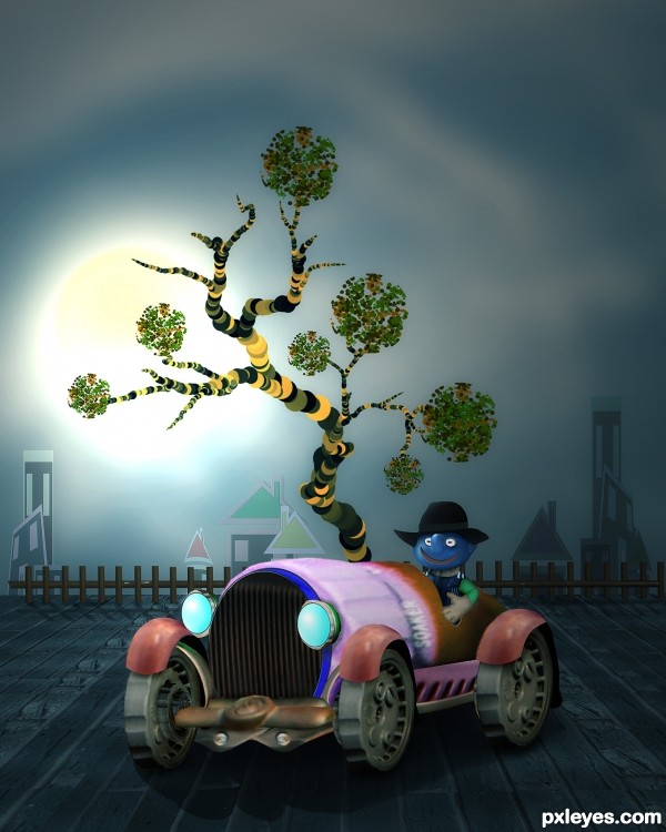
all source and PS custom shape and brushes,.. (5 years and 3503 days ago)
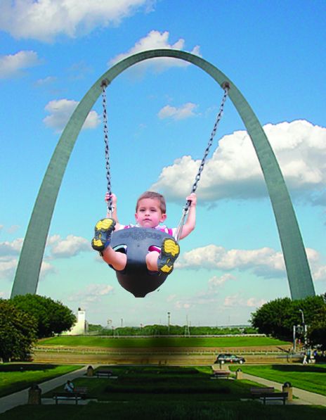
Having fun swinging off the St Louis Arch in Missouri!
For some reason the picture did not come out on here as well as it was on my screen. Perhaps it is the size but anyways enjoy!! (5 years and 3511 days ago)
Great concept, but the perspective angle of the swing is too skewed for the angle of the arch. Either the kid needs to be more face forward, or the arch needs to be angled.
Sources are not usable. Please read http://www.pxleyes.com/blog/2009/06/how-and-where-to-find-legal-source-images/
@Mossy i had trouble with that becuase i could not figure out which way it was faced. the two bases of the arch are the same width and obviously the sun is coming from the right. but i could not figure out the angle of the arch. i tried my best though. :/ haha
@CMYK thank you very much for nothing that.!!! i have fixed it. appreciate the care 
You might want to consider a different swing source. Here are a few:
http://www.everystockphoto.com/photo.php?imageId=60368
http://www.everystockphoto.com/photo.php?imageId=3910555
http://www.everystockphoto.com/photo.php?imageId=3910505
http://www.everystockphoto.com/photo.php?imageId=4775508
http://www.everystockphoto.com/photo.php?imageId=4226660
http://www.everystockphoto.com/photo.php?imageId=4852980
(You'll have do do a little chain work, 'tho...)
Author, these sources are still not usable. Please read http://www.pxleyes.com/blog/2009/06/how-and-where-to-find-legal-source-images/
CMYK NOW i have fixed the problem, i apologize I'm very new to this site and I am still feeling it out!! I thank you for your time 
Great rework! Don't worry, it gets easier with every contest you enter!
Author, you finally got it right...good luck to you! 
Thanks CMYK hahaha.. im just new to PXLeyes so im still getting used to it. sorry for the inconveniences. !!
Howdie stranger!
If you want to rate this picture or participate in this contest, just:
LOGIN HERE or REGISTER FOR FREE
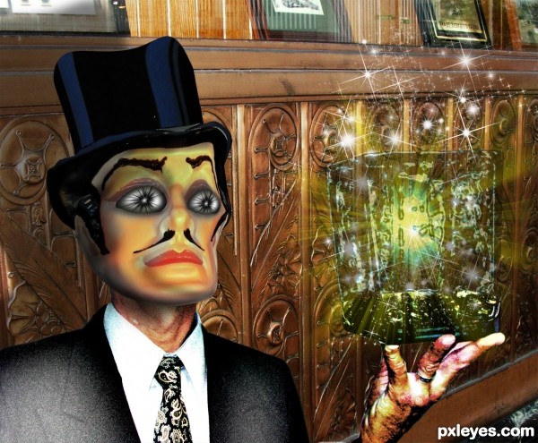
Siouxie Sioux and the Banshees "the Killing Jar"
Two Photos both MINE
Thank you for Brushes
Light Beam Brushes
Sparkle Brushes (5 years and 3570 days ago)
A magician and a magic jar?
Very interesting image, and as always, well made. 
Very nice idea author, maintain the face colour for the neck and hand(remove the skin texture). Good luck
Great effects u have here author...best of luck
This cat looks like a Michael Jackson remake.... great job author that makes this entry extra spooky dooky.... eeeeeeoooohhhh I just had a chill! weird! Best of Luck!
I don't know about adjusting anything... because it makes perfect sense to me... geezzz!
I agree with woodztockr ... when I saw it I immediately thought of MJ ... but a very weird MJ ... and that is scary!
great work... very well done
Nicely done - congrats!
Congrats! . Well done 
Congrats!!
congrats
Congrats! x10... 
congrats slushy.., welldone
Howdie stranger!
If you want to rate this picture or participate in this contest, just:
LOGIN HERE or REGISTER FOR FREE
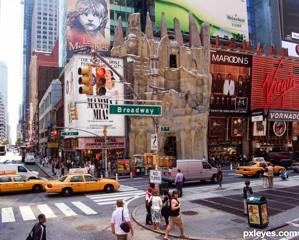
Credit to grngobstpr for the street source (5 years and 3608 days ago)
good idea -- maybe add some people in front and some sort of a door would help -- nice blend of the building into the scene
Thanks Alan2641, added a couple of people.
Cool... it seems a kind of amusement attraction (a horror castle, for example...) I like the idea and the blending. 
nice idea good luck
So creative and I'm sure this took a good while to make. Fits in perfectly = )
Cool!....nice fit.
great idea ...i like it ! gl
Very very good blend author and great idea...my only suggestion would be to play with a levels just a bit more...u have maybe 10% light colors more then u needed,so decrease white just a bit...best of luck
Nice work and good masking. 
hehehe.. looks like a street in Disney World LOLOLOL
Thanks for all the comments. Much appreciated.
great idea!
Congrats...this was my favorite...
Howdie stranger!
If you want to rate this picture or participate in this contest, just:
LOGIN HERE or REGISTER FOR FREE
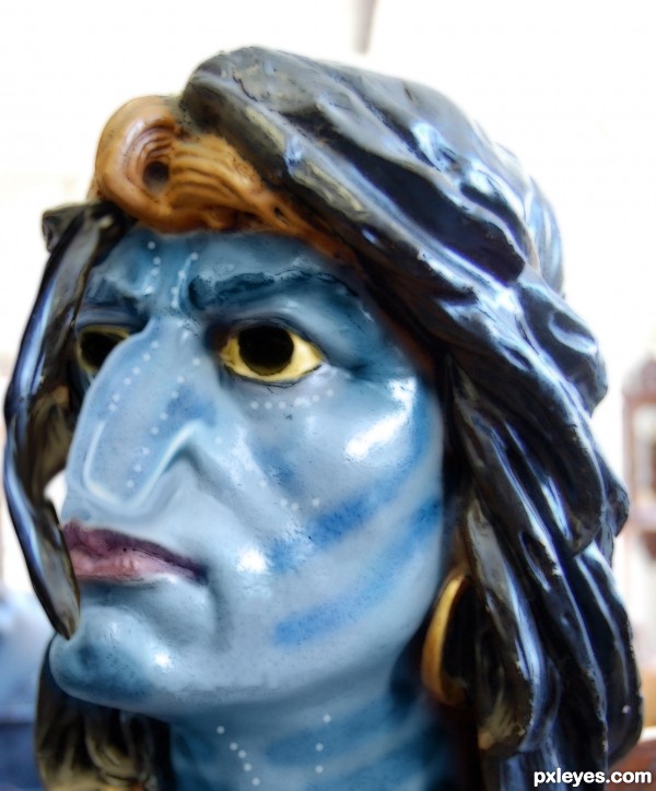
Avatar was basically just Pocahontus with smurfs so here the tables have turned ;-) (5 years and 3677 days ago)
Naavi Indian...
I think the nose needs more work, it looks over liquified. Try looking at some of the characters around the internet for reference. Good luck 
Howdie stranger!
If you want to rate this picture or participate in this contest, just:
LOGIN HERE or REGISTER FOR FREE
This one is so CBR'd, I can't make out the source image at all..
YOU are kidding, right mossy??
OMG.
the tires is part of teh source. the front of the sprayer.
the bumper is teh turn on valve on the source.
the ground the car is sitting on is from the brick wall.
the body of the car is the actual nozzle of the sprayer. notice the "soaker" printing??
i admit there needs some work done to blending of things..but CBR? not really. i've seen worse. ALOT worse.
@ mossy,...CBR ? yes..maybe something wrong with your eyes...hehehe...and jadedink's eyes are sharper than yours...I hope your eyes have no problem to read jadedink's comment,...@ jadedink, thanks a lot...
The car image is nicely done, and realistic. The rest is flat & cartoony, and IMO doesn't fit. Still, good work here.
YOU ARE SILLY AUTHOR!!! ... in a very great way LOL.. awesome
True, there are some issues with varying degrees of sharpness, but overall, I love the whimsy and design of this, very clever use of source, author! Great tree and buildings, would make a wonderful children's book illustration.
Fantastic work author...whole image is great compilation of different styles and i see great uniqueness in that...hat down for u author...well done
congratulation!
Howdie stranger!
If you want to rate this picture or participate in this contest, just:
LOGIN HERE or REGISTER FOR FREE