(5 years and 2948 days ago)
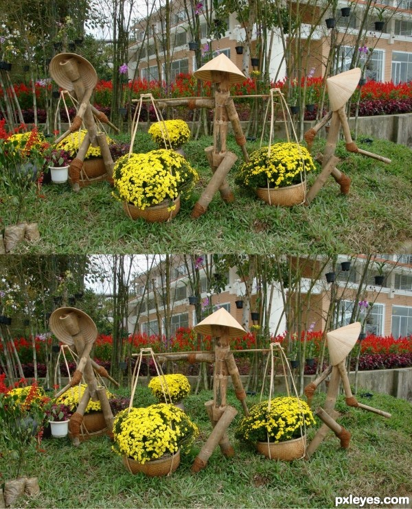
There are 5 differences between the two images. The solution is animated in the SBS.
The photographer, eschu1952 was notified by e-mail. (5 years and 3041 days ago)
I found 3, good picture. I might try again before I peak at the SBS =)
Really made me scratch my head before peeking! 
Howdie stranger!
If you want to rate this picture or participate in this contest, just:
LOGIN HERE or REGISTER FOR FREE
LOOK CLOSE
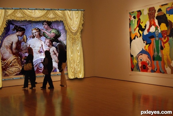
Curtains, Drapes, Blue border and Art from original picture (5 years and 3116 days ago)
Love it, would really like an SBS
Love it, would really like an SBS
That's very creative image manipulation - and the source image an the final image blend very well. Thumbs up
add more shadow for the creases to the curtains... the two faces of walls should have more contrast
nice idea 
Howdie stranger!
If you want to rate this picture or participate in this contest, just:
LOGIN HERE or REGISTER FOR FREE
(5 years and 3150 days ago)
Votes and Notes
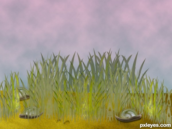
Looks like grass is growing out of the snail on the left, and the edge of the rock is too smooth for that texture.
EDIT: On second look, some of the grass is transparent.
The grass color is a bit bland, and the rock looks very flat and "cut and paste," but that may be the effect you were going for, rather than realistic...
ok thx guys , great notes :
- the mountain's gone
- grass's fixed : colours and position
Transparent grass removed ............. !
Howdie stranger!
If you want to rate this picture or participate in this contest, just:
LOGIN HERE or REGISTER FOR FREE
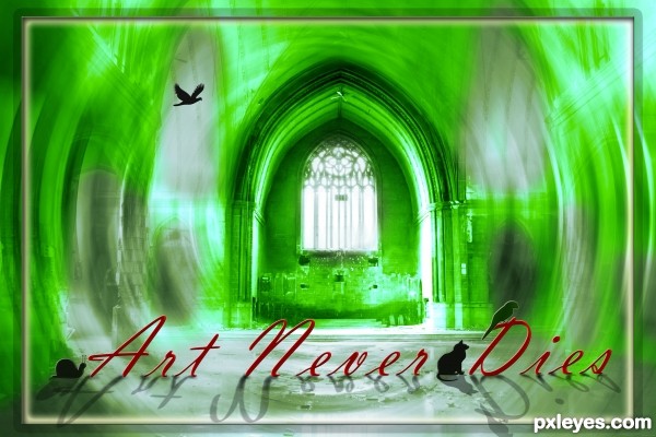
Simple PS work...only filters rule ! (5 years and 3151 days ago)
you have a light conflict, like CMYK46 say  ,shadow of the text must to be in front because light came from behind (window in this case)
There also needs to be an 's' behind "Die."
"Art Never Dies," meaning it's immortal.
Thanks members...For your valuable suggestion...

Howdie stranger!
If you want to rate this picture or participate in this contest, just:
LOGIN HERE or REGISTER FOR FREE
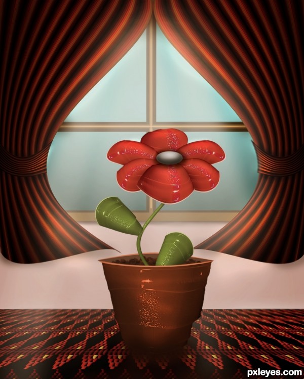
Absolutely creative! Great use of the image source for sure.
I'm gonna be picky on this one because I like it so much. I thing the middle of the window is a bit distracting and the middle of the flower could use some more blending on the edges. I really like the flower, how you did the leaves and most of all the curtains and table. Good Luck!
thank you for your comment Chalty but I guess it's too late now!
Very appealing image author! I like the colors and the whitish glow around the flower. Really almost gives it an early 60s feel.
Imagination at work...... good luck on a good work.
Congrats!!
congrats
congrats oana
thanks a lot for the comments and the congrats!
Howdie stranger!
If you want to rate this picture or participate in this contest, just:
LOGIN HERE or REGISTER FOR FREE