(5 years and 3303 days ago)
1 Source:
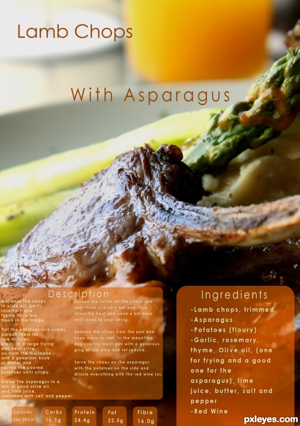
- 1: Lamb Chops
Photography and photoshop contests
We are a community of people with
a passion for photography, graphics and art in general.
Every day new photoshop
and photography contests are posted to compete in. We also have one weekly drawing contest
and one weekly 3D contest!
Participation is 100% free!
Just
register and get
started!
Good luck!
© 2015 Pxleyes.com. All rights reserved.

Sounds delicious, but the light reflection off the pork chop is too high contrast, looking more like a glare than a highlight.
You've also misspelled "ingredients."
Ohh thank you i didn't notice.. must have pressed "e" twice by accident...

I'll fix the contrast too
the text of your description need to be centered to the panel with an equal gap seperating the 2 columns and give more space on the left side text (its a guillotine operators nightmare).......sorry to be picky but I do this for a living
Sounds good, but the small text is barely readable in high res.
Right on theme with an upscale-magazine layout. Unfortunately, the glare on the pork chop hides the central ingredient. I think making "Lamb Chops" and "With Asparagus" bigger and having the former slightly overlap the latter could be more dramatic. Also, traditionally the ingredients come first (i.e., on the left side here) followed by the instructions (i.e., on the right side here). (I suppose alternatively having the ingredients higher than the instructions might visually convey the traditional ordering arrangement even if the physical arrangement is non-traditional.)
Very nice! GL!
Howdie stranger!
If you want to rate this picture or participate in this contest, just:
LOGIN HERE or REGISTER FOR FREE