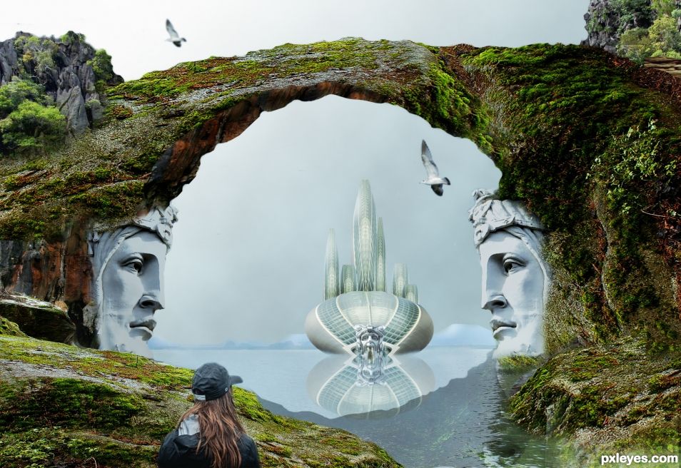
Photoshop 7 again. Doing my best. Images used for this entry are from Pixabay. (5 years and 1529 days ago)
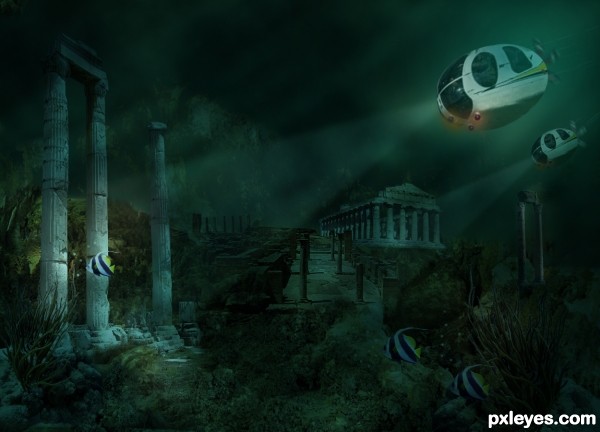
Thanks to the following artists from flickr, for providing the pictures for this entry.
Giant Ginko, lamsongf,profzucker,Sebastia Giralt,theory,Alvez, and Geekybiker.
(Links in submission) The rest is Photoshop. (5 years and 2810 days ago)
I will appreciate any suggestions to make my entry better.
hi author
I think this is actually nice , but it would be better to turn down the opacity of light exposure on the submarine.
and also it would be nice to add something as the engine at the end of the submarine to show it moves forward , for me it seems that it is just sinking
Thanks for comment, added an engine, bubbles, and lowered opacity of light.
Looks really good, nice use of source!
Thanks Rein...It took me time to figure it out!
Lovely entry which is blended very well. 
Hey Solkee....thanks.
Congrats George, fine work!!
Thanks Rein......
congrats george !
Howdie stranger!
If you want to rate this picture or participate in this contest, just:
LOGIN HERE or REGISTER FOR FREE
(5 years and 3349 days ago)
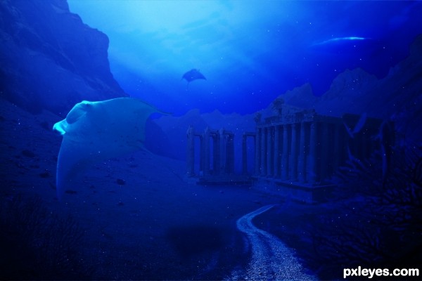
Looks better in hi-res! Too much light on manta ray... Mountains and temples need more light... IMHO 
Thanks for your comment! the thing is I had very little time to work on this (about 20 in) so I couldn't work propely in the final details... Anyway I'm quite pleased with the final result, the underwater sensation...
Sorry, I ment about 20 minutes
cool work author...and yes high resolution looks way better...best of luck
Howdie stranger!
If you want to rate this picture or participate in this contest, just:
LOGIN HERE or REGISTER FOR FREE
(5 years and 3619 days ago)
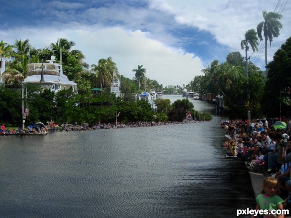
I think the river in the background is a bit high, and boats big comparing to the people on the left side of the river/street. But I like the blending of the water in the foreground.
i agree with erikuri
Cool!!
In addition to erikuri, you can ripple a bit the shadows in the bottom right corner, because they are in the water.
Did some tweaking (removed part of the source photo to connect the back water)... the ship is just going have to be a monster.. I tried to shrink it but it kept making the balance go wacky..
Thanks for all the help!!
Except for maybe the motorcycles on the right riding on the water (only noticable in high res) it's a pretty convincing blend, so good luck.
very nice blend author,looks very realistic...i agree with Jaw,in high resolution bike rides on the water...please try to fix that...best of luck
Howdie stranger!
If you want to rate this picture or participate in this contest, just:
LOGIN HERE or REGISTER FOR FREE
(5 years and 3681 days ago)
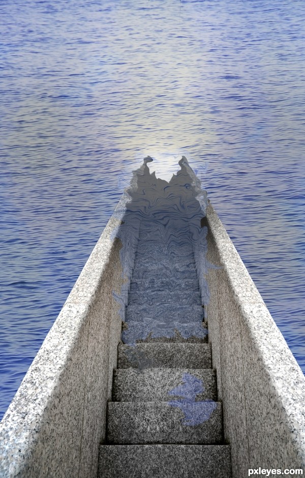
Interesting.. I do think that the stairs need a little bit more masking to get a more realistic result  GL!
GL!
Really good idea. Water doesn't act like that though. With this perspective the water is really hard to get right. Trust me, I remade your entry so I could tell how the water would react. The water would actually travel further up the stairs than it would on the railings. Good luck!
The surface of the water should be parallel to the stair treads we're looking down at. If the water came all the way up to the second step down, then the edge of the water would follow the faint line that starts at the left edge of that step and continues up (literally up as you face the pic) the left railing. Note that the water would then touch the railing's top edge right where you show water lapping. Ergo, you should be showing water covering the stairs all the way up to the front edge of the second step.
You should also make the water transparant on the staps, the opacity is to high. Also the water would transform the stairs, create wrinkels in the stair part thats underneath the water. Good luck!
thanks for all your comments again, ive changed it the best i could, but couldnt use the same source so it looks slightly different. but thank you again for the help
Better luck next time.
Nice try on a difficult task you set out for yourself. It will certainly be something I will be experimenting with to see the most convincing way to achieve what you were going for. gl
Howdie stranger!
If you want to rate this picture or participate in this contest, just:
LOGIN HERE or REGISTER FOR FREE
Good texture work, but I'd make the reflection match the darker shadows of the object, and roughen up the edges of the rock bridge. Right now they look obviously cut out.
PS 7 is all you need to create good images. Don't let it discourage you! Lots of my entries were made with it.
Thanks Bob, it is always nice to have a comment and suggestions from you. I am doing well. I like PS 7 anyway. I did some changes you told me. Stay well...
Congrats George!! Beautiful image and a good week for you!
Thanks Rein. I did good.. learning from all of you.
Congrats George
Thank you.
Congrats George.
Thank you.
Congrats
Howdie stranger!
If you want to rate this picture or participate in this contest, just:
LOGIN HERE or REGISTER FOR FREE