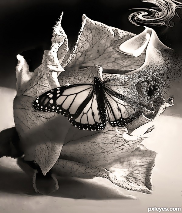
Went with Option 1.
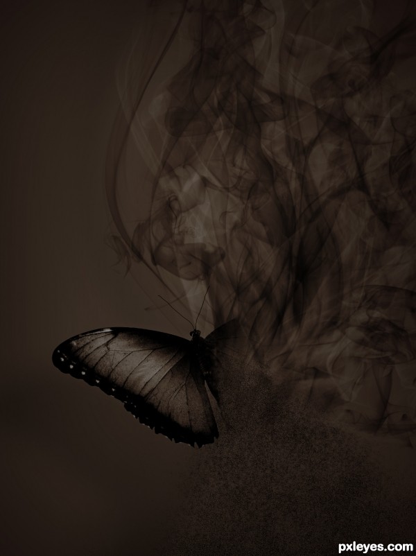
Thanks to 001099 from sxc.hu for the butterfly image.
Thanks to falln-brushes from DeviantArt for the smoke brushes. (5 years and 2973 days ago)

this is my interpretation of your specifications (5 years and 2975 days ago)
very pretty
It's a very impressive/expressive/cool work! 
Congrats!
Congrats on silver, Rick! 
Congrats for taking 2nd and 3rd, well done!!
Congrats !
congrats
Howdie stranger!
If you want to rate this picture or participate in this contest, just:
LOGIN HERE or REGISTER FOR FREE

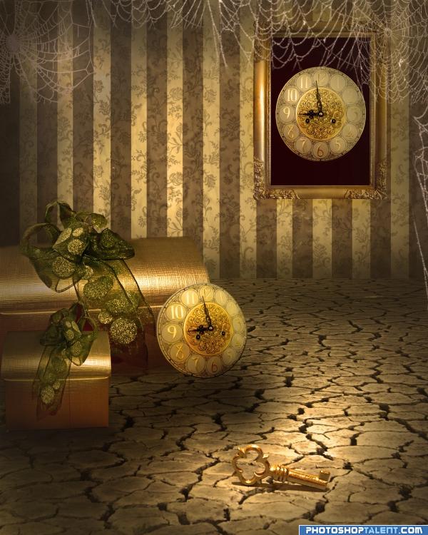
The perspective tool and the warp tool were very useful to create the background with realistic dimensions. For the color scheme I've used the photo filter option and the contrast tool.The shadows were made using the blur option and a blurry brush set on dark grey. Enjoy!
credits and thanks:
http://chop-stock.deviantart.com
http://falln-stock.deviantart.com
http://sammykaye1sstamps.deviantart.com
http://sylwia-stock.deviantart.com
http://www.cgtextures.com
(5 years and 3942 days ago)
Very nice work
Lovely manipulation  Great job author!
Lovely manipulation  Great job author!
cool
This is sooo cool. the lighting is great and the cobwebs are fantastic. High marks from Ponti!!
Nice work, just notice the red still in the ribbon of the smaller box.
nice mood
very nice
Congratulations for 3rd
Congrats
congrats
Congrats!!
congrats!! 

Congraaaats 

Howdie stranger!
If you want to rate this picture or participate in this contest, just:
LOGIN HERE or REGISTER FOR FREE

(5 years and 3954 days ago)
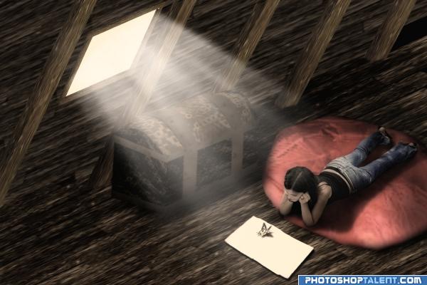
Great feel to this pieve. I like the trunk in the corner. Wonder what's in there? Great Job. Good Luck!
Very nicely done... what I noticed though is that it's a bit hard to see where the wall ends and the floor starts, so the chest kind of looks like it's floating and IMHO the shadow of the girl is a bit too dark, maybe you could try using a gradient to soften it a little... good luck! 
Nicely done. Good luck
I remember this from a long time ago. I like it even more now. Great job, author!
extremely nice mood and image. .I think its cute that Chaplain misspelled piece.. and spelled PIEVE.. I had to double take and ask myself.. what the hell would make some PIEVED off on this piece LOL.. good luck author.. very nice image
Author, I remember our discussion about light & shadow the first time.  Whatever our differences, I still like your image.
Nicely done......G/L Author.
Very well crafted image top job!
I love this! Great Job!
good work, nice lighting
I liked this as much now as the last time if not more. Really nice entry!
great mood
hahahaha coool
Beautiful...
very nice 
nice idea g.l.
Congratulations for 3rd
Congrats! Very well done.
congrats!
congrats!!
Congraaaats 

Congrats!
Howdie stranger!
If you want to rate this picture or participate in this contest, just:
LOGIN HERE or REGISTER FOR FREE
Great job with the butterfly; IMO you could add some shadows to the background and use a colour more of black or gray than brown. Otherwise its amazing Good luck!
Thanks for the feedback Lamantine, good luck with the book.
I added a subtle shadow but kept the background plain as it would be easier to add whatever text for the book cover that way.
Thanks I wish you good luck for the contest, its better now
Desaturated the image at 60% to reduce the brown look
I like the change as well, seems more moody and ominous now.
Howdie stranger!
If you want to rate this picture or participate in this contest, just:
LOGIN HERE or REGISTER FOR FREE