(5 years and 2870 days ago)

as far as i remember (i did this on monday.. i think) I didnt use content aware fill.. only stamp tool and some smudge plus a little healing. (5 years and 3599 days ago)
It's a little on the simple side. Maybe add more damage to it, I don't know...
hey that looks pretty real, but it can use a few more missing bulbs here and there...
ya......... it looks real ............. all the best ............... 
good idea
nice work and idea....
excellent blending.. would actually be something a client would commission... IN REVERSE.. giggle snort... great job!!
It needs to be fixed!!!
Author, very well executed, it's pretty realistic! 
Yeah you got until Friday 10:00 PM GMT time, FYI.
Well done author.

nice job good luck 
Howdie stranger!
If you want to rate this picture or participate in this contest, just:
LOGIN HERE or REGISTER FOR FREE

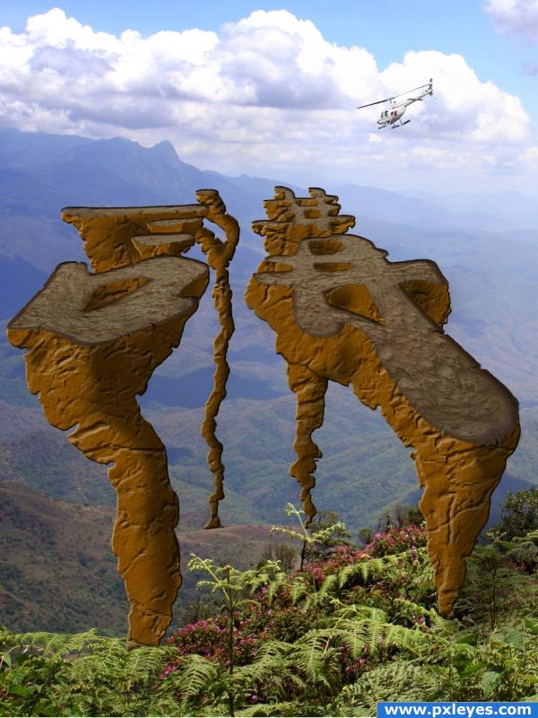
1; Masked out letters
2; Changed perspective
3; Made cloud layer then changed perspective
4; Painted in rocks coming up from below
5; Adjusted color and used bevel and emboss
6; Put in shade then shadows
7; Painted in cracks then highlighted and blurred
8; Masked out chopper, copied and made shadow (5 years and 3907 days ago)
nice idea but i feel you need to soften the highlight on the rock face its too hard !!
Nice!
omg the background ruined it! a better background is needed
Howdie stranger!
If you want to rate this picture or participate in this contest, just:
LOGIN HERE or REGISTER FOR FREE
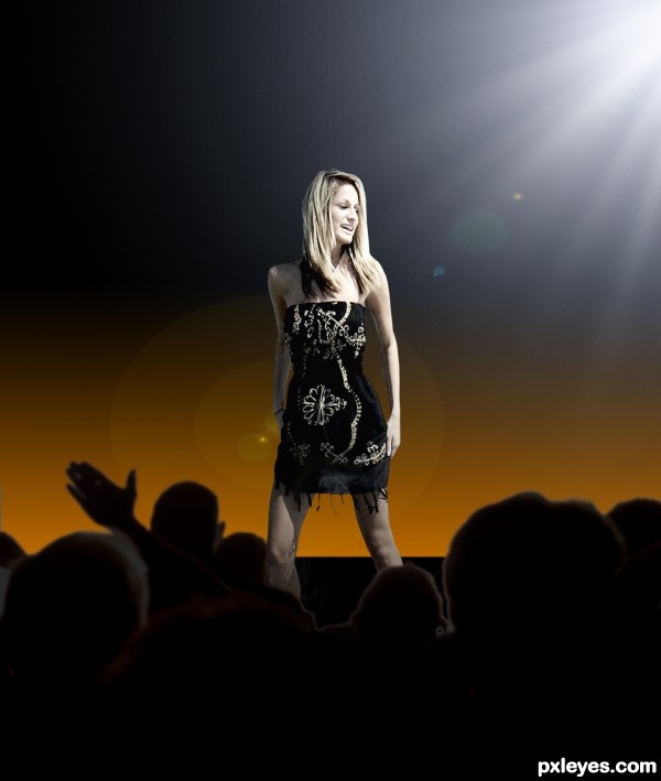
Great idea here. The pose is just perfect for the new scene. You could add a mike too.
Nice idea. Would be good to have some more supporting elements on stage, like a microphone or hint of a band (musician/instrument) to the right - in her line of sight.
Howdie stranger!
If you want to rate this picture or participate in this contest, just:
LOGIN HERE or REGISTER FOR FREE