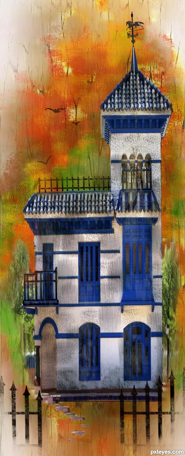
Thanks to emik at pxleyes.com for the texture photo used in background. Weather vane is my own photo, and the rest of image is created from source photo. (5 years and 3105 days ago)
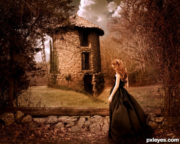
sky source to be found in my sbs.
(5 years and 3410 days ago)
Very nice!! Beautiful... all them nice words 
Yep, and the title really suggests a walk on a cold and colorful Autumn morning!... Very beautiful image! 
wow this is very dramatic! i love the dreamy effect it has! very well done!
 GL!
GL!
fantastic .....
Thanks! Was quite surprised to see the favs on this one!!! I appreciate all of your comments and votes everyone! Thank you! 
Great work author...perfect blend with great colors...Very well done
Beautiful image. Hmm, I wonder who this is...
Oh, not the person I was thinking about, but very similar styles. Still great job!
Howdie stranger!
If you want to rate this picture or participate in this contest, just:
LOGIN HERE or REGISTER FOR FREE
(5 years and 3441 days ago)
Interesting CBR. Nice colors.
SBS would be good to show how the source was used. 
Edit: Maybe some arms, too? 
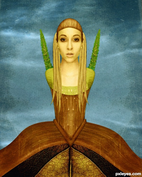
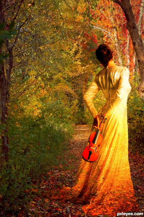
i used from the source picture the sky the road for hair, parts of the house for the concept dress and hat and the bushes from background for shoulder plants, the main job was the blending , the color and painting over.
edit: cmyk i prefer her without arms becouse I want my attention points on her head and bottom
Author, you need a SBS...what's the source for the tree things growing out of her shoulders where the arms might have been?
EDIT: How can she pick her nose with no arms? 
how can she pick her nose with no arms? hehehe...nice comment...and nice work too...
bad , bad CMYK
Wow, .....beautiful!
Lovely! 
Very very nice final result,but SBS for sure have to be more detailed,especially when u do some CBR...good luck author
Good things: chick, colors, textures, constrast, proportion, chick, formes.
Not so good things: source not easily enough recognizable, she could have had a window from the shed on her (Dali style) , Symmetry !!! = Makes it less interesting.
You know that short poem about the perfect cube ? It will make sense when you ll read it 
I explain in SBS step guys, practicaly was duplicate, flip horixontaly and for the dress i distors the part of the house with twirl on default setttings.
I know this isnt muchy but this came out ...what can I do.
the most job on her was to put the color togheder the blend and for this I used selective color, curves, hue saturation.
Also I paint over the shadows and lightning .
Thank u for your comments.
good luck.... it is an interesting work.....
Congrats for your third place, Nanaris!
congrats...
thank u!
Congrats!!
Congrats...
Howdie stranger!
If you want to rate this picture or participate in this contest, just:
LOGIN HERE or REGISTER FOR FREE
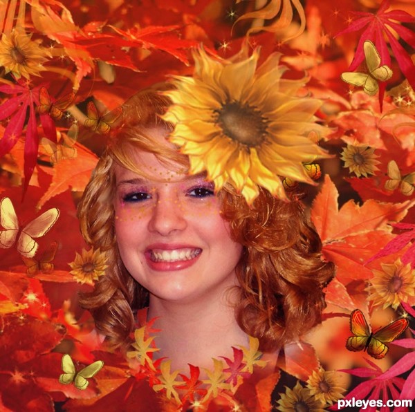
Used my own photos and created sunflower and butterflies. This tells how beautiful autumn is to me, the beauty soon will turn to snow, but renewal to look forward to in the spring. (5 years and 3473 days ago)
Hope she doesn't have any allergies... (Beautiful fun work author.. great JOB)
Beautiful model, great entry  GL
GL
beautiful entry.......... congrats 
congrats.... 
Congrats!
congrats  .... thought this would do well!
Congrats!!
Howdie stranger!
If you want to rate this picture or participate in this contest, just:
LOGIN HERE or REGISTER FOR FREE
Thanks LastClick, Michael Shake, hisks , mjranum (5 years and 3483 days ago)
very pretty  good luck author
  (it really does look like a Grace)
"To prove the authenticity of your work, your entry must have a step by step guide with at least 1 intermediate step + all sources must be mentioned."
Very impressive... I love the way you made the dress blending to the falling leaves. And she really looks like holding the violin. 
beautiful job .......... 
Stunning image and so well put together. A quiet and emotional piece, lovely!
Nice image but IMHO it is to much oversaturated and the blending is a bit to harsh. What I would do is take the final JPG, duplicate the layer and desaturate the new layer. Then blend it with multiply, this will give (in my opinion) much nicer colors. About the harsh blending: take a small (2 or 3 pxl) soft blur brush and trace the outside of the woman. This will make it more 1 image. Offcourse it's up to you author 
nice image...good luck author
Howdie stranger!
If you want to rate this picture or participate in this contest, just:
LOGIN HERE or REGISTER FOR FREE
Too much canvas texture for a watercolor.
This is how I really do acrylic watercolor on canvas. Have you ever tried it?
The canvas texture is too dark, so it doesn't look like "real acrylic watercolor on canvas." It just looks like too heavy a digital canvas texture.
Also the trees on the side have no texture or paint effect, so they just look like pasted on tree distortions.
It's an interesting digital technique, it just needs a bit more polishing to not look quite so artificial.
Yes, acrylics are indeed water soluble, and you can paint with them on canvas. Watercolors are of course also water soluble, but are mostly used on watercolor paper, not canvas as the title of this image implies.
I like the effect, well done.
like the colours within this image... texture is a personal preference , i will take it as creative licence.
Beautiful work,,,,,,,,,,,,,good luck!
Very beautiful author, I love the textures and feel.. AWESOME!
Howdie stranger!
If you want to rate this picture or participate in this contest, just:
LOGIN HERE or REGISTER FOR FREE