(5 years and 3306 days ago)
- 1: Hand Cursor
- 2: Ebrima Font

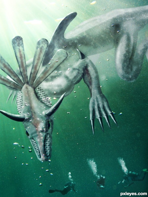
Protecting his submerged vestiges in the North Pacific Ocean, near the ancient city of Tehuantepec, he attacks clueless divers and treasure hunters.
(5 years and 3327 days ago)
I don't get it (good score).. just don't get it
I just made a description for fun it started like an Aztec submerged site hauted by a monster who's the reincarnation of an ancient leader - and from there it evolved.
nice nice
unless you were thinking Montezuma's Revenge? that would make a whole lot more sense
I don't know, I was never good at making titles. But of course I can change it if anyone gives me an original suggestion  . Montezuma's Revenge sounds good, but it's taken.
(montezuma's revenge is Diarrhea author.. ) oh lord.. why do I try
LOL, that too! Thanks for stopping by !
Edit: changed name to Diverhunter so it won't be associated with the crappy video game 
love the colors the lighting and the overall construction of the monster, good luck !!
Thanks nanaris & andi. It feels good to know, that there are people who get and like my entry and that my efforts are appreciated 
You've done a good job on this. I think it might look a little better if your creature were more the tone of the water like those divers are. Just my 2 cents...nice work.
Thanks for the comment, i'll give it a try, but i especially made the creature white so it stands out more, like a big shark.
Made a slight blend adjusment, you can see the before in the SBS. I can't guarantee you ll notice a difference since it might also dependsof your screen.
great work author!
I really like what you've done author! Good work!
This entry was dedicated to Drivenslush for helping me get through my laziness. I managed to instal Ps3 and create this entry using multiple psd files so that my laptop could handle the memory. It was fun, thanks again Drivenslush.
Howdie stranger!
If you want to rate this picture or participate in this contest, just:
LOGIN HERE or REGISTER FOR FREE

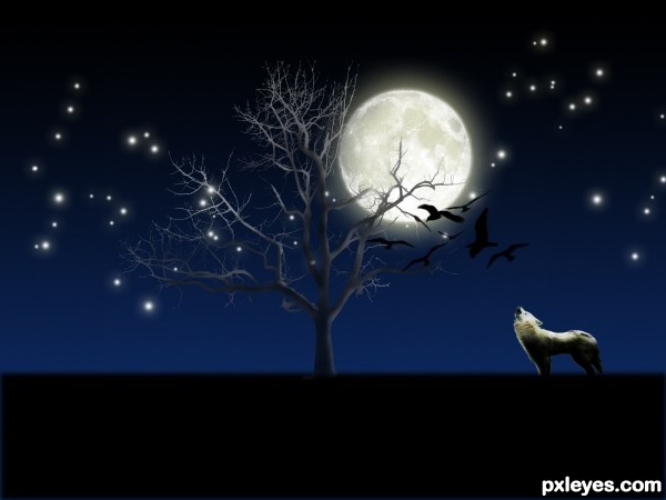
This is a howling wolf who is crying at the full moon. Thanks to ForsakeWolf for providing that lovely wolf image. Thanks to midnightstouch for those beautiful tree brushes. And the stars that you see in the background are not brush presets but made by me using the brush scattering settings, so Mr moderater please dont think that they are brushes and ask for source of those stars. Thanks to Falln-Stock for that lovely moon brush. Thanks to redheadstock for those birds brushes. (5 years and 3407 days ago)
far too much use of "one click" brush`s for me
Howdie stranger!
If you want to rate this picture or participate in this contest, just:
LOGIN HERE or REGISTER FOR FREE
This is a update from my previous avatar upload. I know there was another avatar in this contest,and i just want people to know that i didn't steal this idea. I was planning to make one my own before i saw the other avatar. Hope you like this one. (5 years and 3518 days ago)
Really nice... 
Just suggestion:
White dots is not looking real try to play with layer blending mode, I guess soft light can fix this.
Both avatars in this contest seem to be lacking the avatar ears and hair styles.
Thx Adhir, I thought the dots looked nice, but it is my first avatar and i guess theres always room for improvement, so I'll keep your comment in mind for my next one 
To jadedink, I was thinking about the ears but after spending almost an our of search with no results within the free images sections, i just had it with the ears.
You have plenty of time to improve this entry if you wanted to. I choose not to vote til closer to the end if I believe someone can make vital improvements to their image that will raise their vote.
And here is a tut with a link to the ears I used on my first try at an avatar. I have done a few since the one I entered here and found some new techniques for blending colors and getting more of the avatar look I was going for. http://www.webdesign.org/photoshop/photo-editing/na-vi-avatar-photo-manipulation-exclusive-tutorial.18015.html
Hope that helps.
Thanks jadedink, im working on a new avatar now with this tutorial as a guideline. Its to bad i cant use the ears from the link you gave me. My work would be removed (AGAIN!) if i use it. But thanks for the link. Its really helpfull.
Well, I actually think the overall effect is good but in terms facial construction it's not naavi... one thing I would like to stress though is that flare type lights in this type of image are a big NO NO!!...  LOL...
also you have to remember to put texture back into liquified areas as you're stretching the pixels out...
blending around the hairline is also noticeable but it's a tricky transition to pull off.
but overall, I think it's pretty good 
Your work wouldn't be removed for using them as long as they are clearly linked. I know because I used the same ears in a contest here when I first joined.
And don't be discouraged when something is removed momentarily. At least they give you the chance to fix it and go on.
I really like your idea and your approach. IMHO it looks a little too blurry. Good luck.
I can't stop looking at the eyes 
Try to lower the opacity of the white dots a bit more.
very nice Na'vi girl....good luck
Howdie stranger!
If you want to rate this picture or participate in this contest, just:
LOGIN HERE or REGISTER FOR FREE
Avatar style Asian created using only photoshop
**Update used the source image and extracted the hair and free transformed and warped it to reworked the hair** (5 years and 3521 days ago)
Everything is nice, I only wish you did something more creative with her hair = )
Will look at the hair as im not overally happy with this entry yet. Was done on a laptop using the mouse pad whilst burry eyed. Not the right environment to creat a work of art me thinks. Thanks for the comment.
The white dots need to glow..., good luck author.. 
Your must have turned my layer effects off will update when i get home. 
You should find some avatar ears to make this more like an avatar.
I like your idea. Aside from the hair, I am having trouble with the white dots. They look like they are on the pic and not on the avatars face. Good luck.
Less opacity on the white dots would help.
Dots are too big... but nice effort. 
nice work...gl
Howdie stranger!
If you want to rate this picture or participate in this contest, just:
LOGIN HERE or REGISTER FOR FREE
Very creative use of the source, author! Cool 'think outside the box' type entry. Nice job!
Funny idea, but perhaps you can put the face options left under? After all it's all white there, while on the right side you cover her arm. Good luck!
Waz is partially right. But if you place the icons in the right side it will be less ergonomic.
That's why i suggest you flip the girl horizontally, so her hand won't be covered.
Very nice work, we had something similar here long time ago but IMHO this is one of the best entry's in the contest...well done author
Howdie stranger!
If you want to rate this picture or participate in this contest, just:
LOGIN HERE or REGISTER FOR FREE