Photoshop Pictures: Avocado


results 1 - 5 of 11

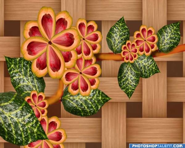
avocado flowers - created by semas


avocado flowers
Favs: 2SBS: 4Hi-resRank: 18/56Score: 56.9% (0)8246 views

This is my first entry and I'm not sure how to explain the process.I have tried to note it as I did the art.The cut avocado became the flower petals and the green avocado became the leaves by cutting out the shape and transforming the angles.The background is a pattern fill blended. (5 years and 3798 days ago)

avatar nishagandhi

looks great

avatar Nellista
Nellista says:

Love it! And spot on with the backround: it really suits the whole image! Best of luck!

avatar gopankarichal

good idea, stem is blur some places

avatar Siminho90
Siminho90 says:

nice!

avatar GolemAura
GolemAura says:

I love the flowers and all that stuff.. BUT THE BACK GROUND IS SPLENDIFEROUS..

avatar CMYK46
CMYK46 says:

Pretty good...would be better with shadows...

no avatar

Nice

avatar nasirkhan
nasirkhan says:

beautiful work

avatar Tuckinator

neat

avatar Akassa
Akassa says:

Nice flowers, you're really creative :P

avatar ReapRevenge
ReapRevenge [banned] says:

nice. good luck!

avatar pixelkid
pixelkid says:

Nice job! Maybe a shadow casted from flower, like CMYK said.. onto wood would help realism.

avatar LKY
LKY says:

sweet idea....nice work on flowers....GL

avatar zatrix
zatrix says:

very nicely done for the 1st entry - good luck!

avatar chakra1985

very nice

Howdie stranger!
If you want to rate this picture or participate in this contest, just:

LOGIN HERE or REGISTER FOR FREE


Applacado - created by tuckerh


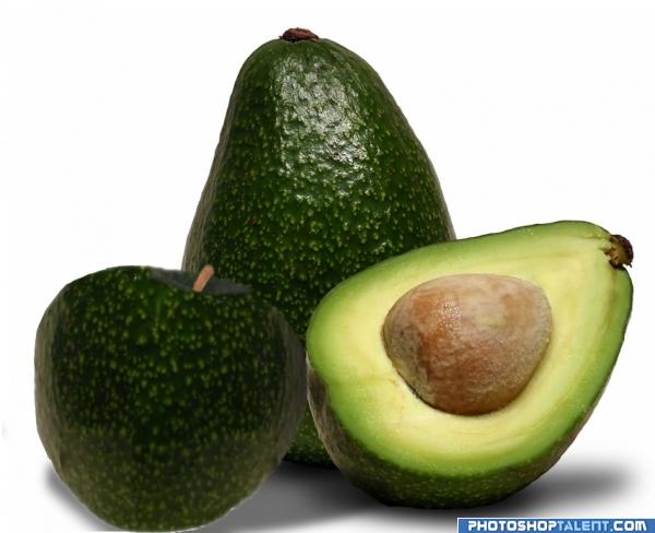
Applacado
Favs: 0SBS: n/aHi-resRank: 55/56Score: 46.8% (0)11486 views

Now to imagine what it would taste like... Chicken? BTW it's all source, and my own cursor. (5 years and 3798 days ago)

1 Source:

avatar Tuckinator

love the image but the apple is a little choppy good job overall though

avatar Christy
Christy says:

Great Idea...The apple needs some work...Kinda flat...Good Luck

avatar Nellista
Nellista says:

Good idea...but some shadows and highlights would really help your "avoapple" stand out better! Best of luck!

avatar gopankarichal

good

avatar siderismaris

not so well blended...

avatar chakra1985

nice

Howdie stranger!
If you want to rate this picture or participate in this contest, just:

LOGIN HERE or REGISTER FOR FREE


avocado - created by RGB


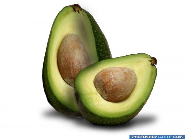
avocado
Favs: 0SBS: 5Hi-resRank: 53/56Score: 47.5% (0)8807 views

all photoshop
no external source
comment are welcome (5 years and 3798 days ago)

avatar elficho
elficho says:

i think you should work on the perspective a bit more

avatar Tuckinator

:l

avatar Christy
Christy says:

The back avocado needs to have a little more depth...It looks flat Good Luck

avatar annabat
annabat [banned] says:

I like this idea very much, And the left side is ok, but the right side is skewed to much to the left. From the center outward to the right it's not following the correct plane. It almost looks like you were trying to do a 1/3 or 1/4 cut which would have different shading and "planes". if you are trying to do a 1/2 cut the whole right side of the inside needs to be more round and extended for the pit and the lighter flesh needs to extend to the right following the contours of the shape of the outside.

avatar gopankarichal

simple

avatar ReapRevenge
ReapRevenge [banned] says:

your idea is good but you really need to work on your perspective ... good luck

avatar zatrix
zatrix says:

if the avo is split - one of the halves will not have the seed

avatar chakra1985

nice

Howdie stranger!
If you want to rate this picture or participate in this contest, just:

LOGIN HERE or REGISTER FOR FREE


The hand - created by RGB


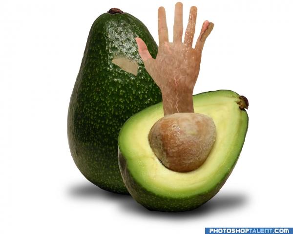
The hand
Favs: 0SBS: n/aHi-resRank: 54/56Score: 47.4% (0)7198 views

Ok first thinks first, i`m not very good at photo manipulation but i least i try and i like it
so please leave a comment :)
specila thx to demordian for the hand photo
(5 years and 3798 days ago)

1 Source:

no avatar
Omermintz says:

great idea ! the hand is looking good but try using the stamp tool or something like that to blend the 2 objects, but still good start

avatar GolemAura
GolemAura says:

. I see what you are trying to do author and it is great.. try a banana peel approach.. the film might look better peeling away from the skin.. .. place it over the hand like it should be then use distort /warp to peel it back.. it's a great start .. good luck author!!!

avatar Tuckinator

pretty ... cool

avatar Christy
Christy says:

Where did the extra thumb come from??

avatar gopankarichal

idea is good

avatar zatrix
zatrix says:

blend

avatar chakra1985

nice

Howdie stranger!
If you want to rate this picture or participate in this contest, just:

LOGIN HERE or REGISTER FOR FREE


Avocado Child - created by Omermintz


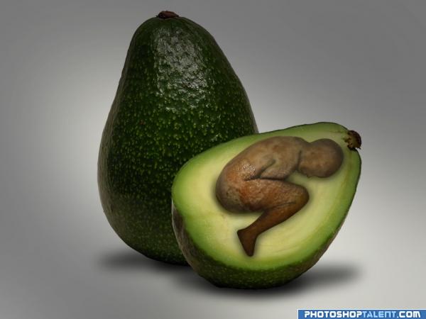
Avocado Child
Favs: 0SBS: 4Hi-resRank: 24/56Score: 55.8% (0)9501 views

No external sources (5 years and 3798 days ago)

avatar Tuckinator

nicework

avatar mariosilva

nice job, i can say that this, was one of my first ideas to this contest i work on her but i didn´t put her out,but i think if u could put fetos in real fetos posician it wood stay mutch better and sweet if u see this inside part of avocato is perfect for that, fetos match perfect with smal adjusts but this is just my opinion, good work and good luck

avatar gornats
gornats says:

fetus needs a much larger head then body just a tougt - good idea

author says:

@mariosilva - thank you =] ! good point about the position. comment appreciated , but i like it this way its more artistic like this in my opinion

@gornats - LOL your right , but if avocados had babys i think they would look like this (my opinion) thx for the idea btw

and thx everyone ales for the Awesome feedback

no avatar
Jerinelle says:

Awesome! Very well done and original.

avatar CMYK46
CMYK46 says:

Looks like a curled up child, not a fetus...

author says:

**Changed the title to "Avocado Child"

avatar mariosilva

this piece came from your thougt, u know better what u pretend, i think the name is better now, keep with the good work.

avatar Nav777singh

Now that is the work im lookig for good

no avatar
semas says:

good work

avatar gopankarichal

good

avatar GolemAura
GolemAura says:

very well done.. good luck

no avatar

Nice Idea, GL

avatar ReapRevenge
ReapRevenge [banned] says:

Great imagination!!

avatar LKY
LKY says:

excellent thought.......awesome work.....

avatar Kid
Kid says:

Very nice idea, shadows could be more sharp though

avatar shaiju1974

nice idea and good work!

avatar darkshellie23

Sweet idea.....

avatar zatrix
zatrix says:

truly nice work, the foot looks a bit flat

avatar chakra1985

very nice

Howdie stranger!
If you want to rate this picture or participate in this contest, just:

LOGIN HERE or REGISTER FOR FREE