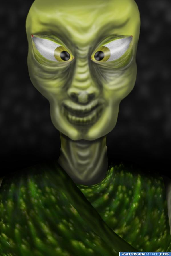
all source...drawn freehand..hope you like it! (5 years and 4022 days ago)
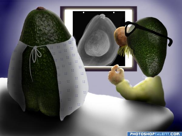
SBS to follow. no outside sources used. (5 years and 4024 days ago)
the Patients BUTTOCKS are PRICELESS..hehehe.. and the hand of the dock is adorable with mustache.. and glasses..very well drawn.. Exceptional
nice work
This idea is BEYOND brilliant, If you spent more time shading and blending the doctor and a little more on the wall, you'd have something really worth voting for. Right now the lighting doesn't really make sense. and the some of the shading is a little on the sloppy side. but  for humor.
Really GREAT concept... Yeah, it kinda needs some work with the shadows and maybe some dodge n burn here and there... but really good work so far ! 
Lol.....I like it. Very very good job. I also like the idea very much. High marks and Best of luck.
cooooool
very interesting.......
LOL... I second the butt crack... lol... nice humor...
hahahahahah!!!!!!!!!!
Very funny - there seems to be an issue where the glasses are.. The nose is not fully attached to the face?? Maybe just extend the seed back more to fill the gap?
funnyyy! nice! i like it!
Ohh thats funny, nice work.
like the idea,
very funny  it's really a good idea , it needs some work with it (the light and shadow , improving the edges , the doctor's nose behind the glassess) but still very nice concept...... well , i think they found that she's pregnant , isn't she?? ..... GOOD LUCK
The x-ray is fantastic!! A little bit more time working on the shading and you have yourself a scorcher of an entry! Well done!!!
Thank you all for the nice comments, and suggestions. I've made a few changes, hopefully for the better.
very funy. great idea author. 
very funny and brilliant at the same time

incredible
Hilarious and beautifully rendered!
lol, good idea
very nice 
Howdie stranger!
If you want to rate this picture or participate in this contest, just:
LOGIN HERE or REGISTER FOR FREE
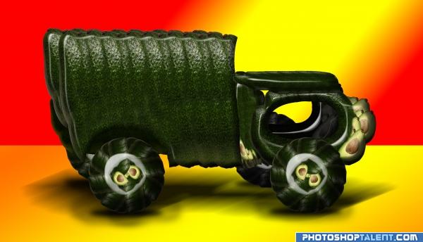
source pic (5 years and 4024 days ago)
very-very good use of source image
very good improving of performance, why not making the reflection look more like shadow? select reflection of the car fill in with black blur it with gaussian blur filter, nice entry, good luck
EDIT: ah, sorry i forgot, HIGH MARKS FROM ME
EDIT2: looking much better,  also try to concentrate shadows right under the tires with brush tool and black color and opacity around 30% for the brush tool not the layer and soft round brush, good luck
Marissa..thanks for the fav, means a lot.. orientallad.. compromise, I motioned blurred the reflection as shadow.. it was a bit too pretentious with the reflection, thanks for the help
very nice and good job ... GOOD LUCK 
great job
great job author. very nice idea. love it!! 
nice work
fix the shadow and you have a killer entry
Great entry...  well done..it's so cool

Creative use of source.
can I get one of these?
very nice 
Howdie stranger!
If you want to rate this picture or participate in this contest, just:
LOGIN HERE or REGISTER FOR FREE
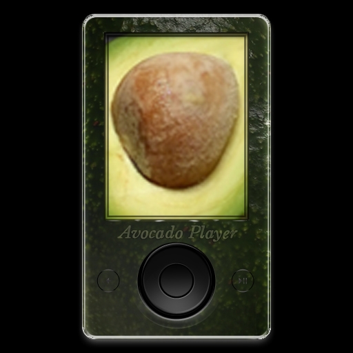
First I created a MP3 Player and to create the shape of the player I created a rounded rectangle. Then I created another rounded rectangle for the screen. I created a total of 8 circles for the buttons. After I put them all together I took the image of the avocado and used the magic wand tool to separate them. Once they were seperated into 4 different layers I positioned them over the player and cliped each one in the place where I wanted it to me. After all that I proceed to add a layer style to each and every one of the layers minus the avocados. I only applied the layer style to the layer they were clipped to. I used the dodge tool to add the darker areas. (5 years and 4025 days ago)
Good luck
very neat. a tad bit on the dark side.might want to lighten it a bit so it can be seen a little better
EDIT: Can really see it now!!! good luck
Too dark, bad spelling.
PS: Your SBS shows nothing on how you actually made the MP3 player...
Thanks for the comments. I dont know how I spelled it like that but I did. Thanks for pointing that out. And yeah I thought it was on the dark side also. But I tend to like darker images. But I do understand what yo are saying about letting it be seen.
nice feel
@CMYK46 when I decided to add SBS I had already done the MP3 player. Which means that I had already merged them layers together. I will take note to take screen shots through out the process next time so that it can be better understood how I have completed a project.
nice 
Howdie stranger!
If you want to rate this picture or participate in this contest, just:
LOGIN HERE or REGISTER FOR FREE
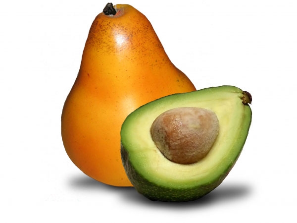
A pear partnered up with a Avocado.
It took me a bit of time with the pen tool. It just doesn't seem to look right. But no matter what i do i can't get this entry to do exactly what i want it to do.
Special thanks to Free Range Photos for the use of the image of the pear (5 years and 4027 days ago)
I think part of the problem might be that the avocado would be casting a shadow on the pear? Just an opinion.
a little simple but cool!
cut and paste feel is there
genetic manipulation is getting advanced, good work
Howdie stranger!
If you want to rate this picture or participate in this contest, just:
LOGIN HERE or REGISTER FOR FREE
the expression really makes it .. good luck author
great job
great job. very good idea.
Great Job.!!
thanks guys!
great alien
nice work, eyes need to fix properly
Good!!
imo the eyes don't look right
do you mean the way they are crossed? because that was purposeful...it was supposed to be humorous.
nice work
I think the neck would benefit from some blur..
very nice
Howdie stranger!
If you want to rate this picture or participate in this contest, just:
LOGIN HERE or REGISTER FOR FREE