Photoshop Pictures: Away (page 2)


results 6 - 10 of 54

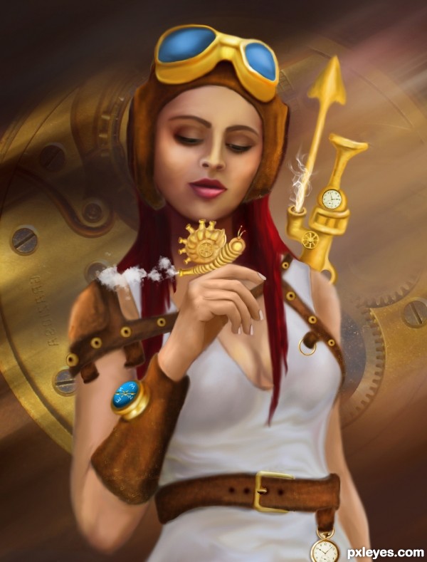
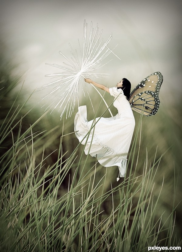
Up And Away - created by solkee


Up And Away
Favs: 0SBS: n/aHi-resRank: 10/19Score: 63.4% (0)4550 views

My fairy getting a ride on the dandelion.

Please view in high resolution.

Thanks to layerstack for the background.
Thanks to LongStock for the girl.
Thanks to riktorsashen for the wings. (5 years and 2728 days ago)

3 Sources:

no avatar
pshoudini says:

great overall creation. there are some minor issues with masking the white parts of the dandelion, but than again, its pretty difficult to mask it 100% without leaving some imperfections. good luck

avatar macarhign
macarhign says:

try this one author
use layer style on that flower layer
color overlay: (white) ffffff
blend mode: normal
opacity: 100%
i think that one will work with the edges issue because that layer is white and no other color.
if not?
play adjustment levels then channels first...
***********************************
nice idea author, i like her demonoid tail. Good Luck!

author says:

Made some minor changes, not how you suggested but thanks for the input.

(5 years and 2727 days ago)


Howdie stranger!
If you want to rate this picture or participate in this contest, just:

LOGIN HERE or REGISTER FOR FREE


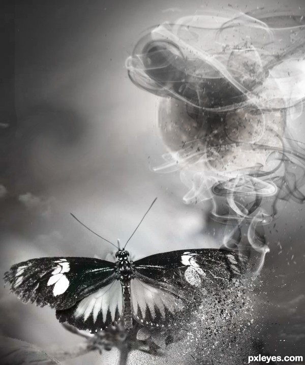
Fly away - created by ushurani


Fly away
Favs: 4SBS: 11Hi-resRank: 3/19Score: 72% (32)17245 views

Wanna thank Faestock, Littlebluestocking and Foxstox for the stock. Obsidian and Falln-brushes for the smoke brushes. (5 years and 2767 days ago)

7 Sources:

avatar nishagandhi

very nice work!

author says:

Thanks Nisha.

(5 years and 2767 days ago)


avatar hereisanoop

beautiful drawing author....

author says:

Thank you Anoop.

(5 years and 2767 days ago)


no avatar
Keiley22 says:

wish i had your talent author excellent work.

author says:

Digital drawing/painting seems hard but trust me on this, its not at all. All you need is practice, practice and more practice

(5 years and 2767 days ago)


avatar pearlie
pearlie says:

Beautiful work, author!

author says:

Thanks Pearlie.

(5 years and 2767 days ago)


avatar CMYK46
CMYK46 says:

Good drawing/painting. IMO would look better less saturated. GL author!

author says:

You are right about the turning down the saturation but my intention of bright colors palette is to go for something different than the usual.

(5 years and 2767 days ago)


avatar samanway
samanway says:

Congrats !

avatar oana
oana says:

congrats!

author says:

Thanks a lot for the votes, comments and favs

avatar pearlie
pearlie says:

Congrats!

avatar spaceranger

Congrats!!

avatar hereisanoop

congrats

Howdie stranger!
If you want to rate this picture or participate in this contest, just:

LOGIN HERE or REGISTER FOR FREE


Fading Away - created by RickLaMesa


Fading Away
Favs: 1SBS: n/aHi-resRank: 3/19Score: 68% (28)14142 views

(5 years and 2816 days ago)

4 Sources:

avatar erikuri
erikuri says:

Very cool and intriguing work!

avatar pixelkid
pixelkid says:

This really well done. Love it!

avatar erikuri
erikuri says:

Congrats again!

avatar spaceranger

Again Congrats for taking 2nd and 3rd, well done!!

avatar hereisanoop

congrats

Howdie stranger!
If you want to rate this picture or participate in this contest, just:

LOGIN HERE or REGISTER FOR FREE


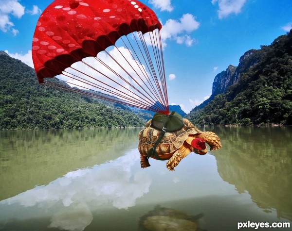
A Fabulous Bombs Away - created by SaEllisson


A Fabulous Bombs Away
Favs: 3SBS: 9Hi-resRank: 2/19Score: 66% (31)14622 views

(5 years and 2866 days ago)

5 Sources:

avatar CMYK46
CMYK46 says:

Funny idea & good execution!

avatar amn
amn says:

lolz , nice idea.........

avatar Drivenslush

fantastic set up.. great job!!!

avatar sande1001
sande1001 says:

Super funny man, luck

Howdie stranger!
If you want to rate this picture or participate in this contest, just:

LOGIN HERE or REGISTER FOR FREE


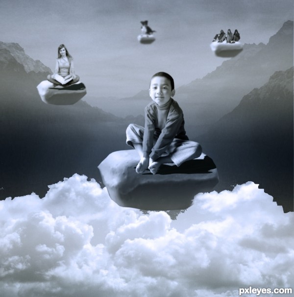
Floating away - created by maiaschka


Floating away
Favs: 0SBS: 5Hi-resRank: 3/19Score: 63.6% (25)9092 views

(5 years and 2867 days ago)

9 Sources:

avatar enblanco
enblanco says:

Great entry. IMHO the bottom of the "main mint" is not much credible. If you wanted to merge it with the clouds you should put near clouds between the mint and the camera (or just a little fog with a smooth brush). Anyway, great entry, good luck!

avatar tnaylor21286

Maybe use different kids on every mint so there is some variation? just my opinion. Good luck author!

author says:

Thank you guys. I took both your advices. I hope you like it better now.

avatar tnaylor21286

Much better! IMO

Edit: Maybe blur the girls on the third cloud back. They look a little crisp, almost as crisp as the kid in the foreground IMO. I know I'm probably being annoying author but I'm just trying to help Good luck!

avatar CorneliaMladenova

Congratulations!

author says:

Thank you all

Howdie stranger!
If you want to rate this picture or participate in this contest, just:

LOGIN HERE or REGISTER FOR FREE