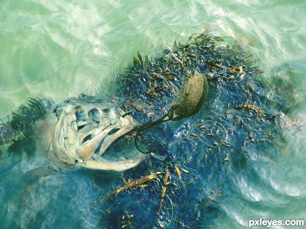
Thanks to beglib at morguefile.com for the water and seaweed source and also to jeltovsky at morguefile for the fishing hook. (5 years and 3566 days ago)
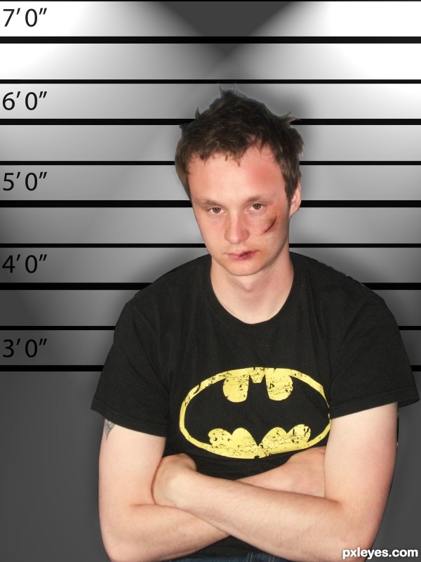
This was a very fun entry to do, i went for the more subtle apraoch, hope you like :)
The source used is a picture i took of my boyfriend, i appologise for the quality of the photo.
Please vote/comment (5 years and 3567 days ago)
don't forget to show the 'before' picture - either in the sbs or as a source image.  nice cut!
v nicley done, i like the realism and the fact its not over the top. Nice cut! 
The cut edges (around hair, mostly) really need to be blended better. The wound on the mouth looks pretty nice, though. Good Luck!
I agree with SweetSue about the edges.
Now, a question: did you have a reason to do it to him??? 
thanks for the advice sweetsue/erikuri, i attempted to fix it by bluring/smudging but it was difficult i will work on it and try and improve though 
.... haha he should know better than to steal my cookies! :P
Howdie stranger!
If you want to rate this picture or participate in this contest, just:
LOGIN HERE or REGISTER FOR FREE
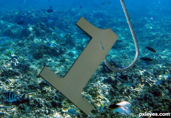
We have all heard of the 1 that got away... This 1 was not so lucky!
Thank you to dannstock & CLF for their permission to use their stock images. (5 years and 3577 days ago)
Funny 
Thanks!
lol, original and funny, good luck to you!!
Great idea! 
Congrats for your third place, Heinrich!
Thanks!!!!
Congratulations! 
Thank you! 
Howdie stranger!
If you want to rate this picture or participate in this contest, just:
LOGIN HERE or REGISTER FOR FREE
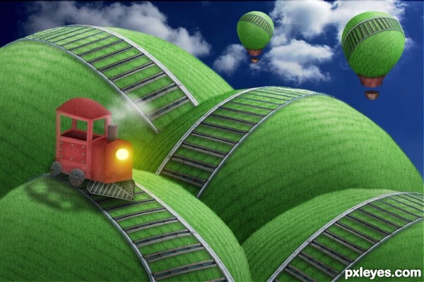
I originally planned to do something entirely different, but then this surreal little scene popped into my head upon a second glance at the picture...
Train is made from scratch, with parts from source pic. Tracks, hills, and hot air balloons are all pure source, except for a couple of texture brushes. Aside from the brushes and a filter, the sky is the only external source used. (5 years and 3646 days ago)
I guess that's you  . Simple but very nice, especially color and looks cartoonish
  . Good luck ^^!
very very fluffy fun.. good thing the train wasn't scheduled for that back hill.. train would go bye bye.. GREAT JOB!!! (tweek the edge of the hill so that track doesn't look like it just cut off in space. ) IMHO (all fixed.. great job)
EDIT.. yes the farthest hill's rail looks like it just ends not goes behind the other hill.. I'm sure it's super simple, but it does draw the eye.. (GREAT JOB ALL ROUND)
Thanks to the both of ya.  Drivenslush, are you referring to the track piece in the upper-left? If so, I see what you're saying and I can try darkening the hill edge a bit.
looks almost 3-D, NJ 

The only suggestion I have is to blur the back balloon a bit to create a depth of field.
lol it's lovely, nice work
Very cute and criative! 
Just one little thing (really little): train's wheel perspective is a bit odd, imo... It could be just my impression! 
Thank you all! I was thinking about that, Kid. I'll give it a try. Erikuri, you're right--the wheels may be skewered a bit. I'll see if I can make it any better, but I'm afraid I might mess it up since I merged the train for some transform adjustments. Drivenslush, will fix ASAP. 
EDIT: Fixed the hill edge. Look any better now? Kid, I tried the blur thing but it took away from the cartoony look, as you can't make out the tracks too clearly.
nice work... love this mood... 
Nice work author 
It still looks good without adding the blur 


Cool.
i want the train XP
great ! awesome job ! 
best entry with best and great skills thumbs up for you author
Hard to visualize the source without looking at the sbs. Wonderful job you did in creating this one, GL
great idea good job
Howdie stranger!
If you want to rate this picture or participate in this contest, just:
LOGIN HERE or REGISTER FOR FREE
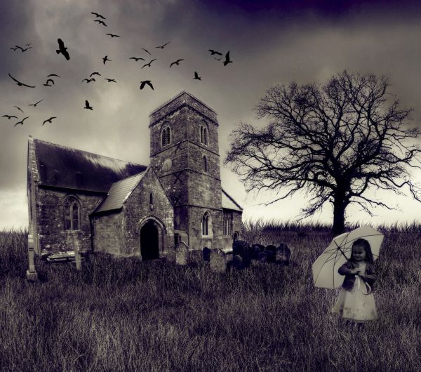
Credits to:
Obsidian Dawn - http://redheadstock.deviantart.com/
happeningstock - http://happeningstock.deviantart.com/
jensstockcollection - http://jensstockcollection.deviantart.com/
crazykitty82stock - http://crazykitty82stock.deviantart.com/
theflickerees-stock - http://theflickerees-stock.deviantart.com/ (5 years and 3672 days ago)
Try to remove the floating dots...
done..thanks CMYK..hadn't noticed that
It's not a place for a little child to play... 
maybe he's not a child!!! O.o
Good image.
good job
I like the mood very much...
Wow what a Gothic image you've created. Well done!!! 
Howdie stranger!
If you want to rate this picture or participate in this contest, just:
LOGIN HERE or REGISTER FOR FREE
Nice blend, good idea!
Actually it got away... Very creative idea!
gonna see a lot more of this in the gulf.. sigh (great job!!)
Howdie stranger!
If you want to rate this picture or participate in this contest, just:
LOGIN HERE or REGISTER FOR FREE