Photoshop Pictures: Away (page 9)


results 41 - 45 of 54

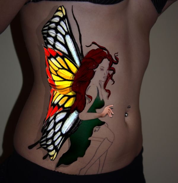
Fly Away - created by Keiley22


Fly Away
Favs: 0SBS: n/aHi-resRank: 20/26Score: 53.5% (0)8085 views

Im hoping this is ok... my eyes are closing and I really need feedback as I can't seem to do any more.

Help would be lovely with this contest, I tried really hard to make my hair look a bit more real and the dress.
I played with shadowing, help there if needed :)


Thanks to
Demordian@sxc.hu
Amukherjee@sxc.hu
Lucy-stock@DA for the tattoo image

To the mods, I will send private email to photographer of hands as my name on sxc is as the one on here :) (5 years and 3583 days ago)

3 Sources:

avatar Clinge
Clinge says:

Maybe a little bit of shadow under the hand. It looks a bit flat now

avatar jawshoewhah
jawshoewhah [banned] says:

It would look more realistic if the tips of the wings had shadows too. I know that the original pic but it doesn't look right.

author says:

no worries... thanks guys I will add shadow to those two parts right now

EDIT: Have played with the image a bit more hope it is improved. Changed her hair as well.

avatar loopyluv
loopyluv says:

Good work, maybe just fade the shadow a bit, or add a blur to it... GL

author says:

thanks loopyluv

Lightened shadowing and added a bit more blur

Howdie stranger!
If you want to rate this picture or participate in this contest, just:

LOGIN HERE or REGISTER FOR FREE


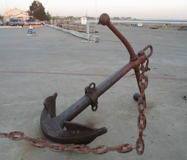
Anchors Away! - created by Chuck


Anchors Away!
Favs: 0SBS: 6Hi-resRank: 9/26Score: 50.9% (0)4322 views

Thank You darinmarshall for use of this picture under creative commons (5 years and 3590 days ago)

1 Source:

avatar CMYK46
CMYK46 says:

Desaturate chain, add shadow. Also, light sources are opposite...

avatar RayTedwell

What CMYK means id that the chain is too bright for the image, also there is some stark light/dark on the chain, whick doesnt match the other pic. A couple of other things i'd add, the chain would fall straight down, not at an angle, and a very feint shadow would stop the 'floating' look

author says:

CMYK46-is this what you were saying as far as how chain should have looked? There was no shadow in original do you think it needs it?

avatar ponti55
ponti55 says:

Definitely add a shadow, look at the one that the anchor casts on the bottom left, and use that as reference for the position and opacity of the shadow.

author says:

Ok Here is one with chain hanging straight down with some shadowing guys

avatar swordfish
swordfish says:

cool....

avatar akshaysvilla

the chain is left free so it cant get that stiff right angle as its showin..to make it realistic try to show the chain let falling down freely..otherwise evrything nice..

author says:

Thanks I had it at different angles before does this look better I put rust on the chin to blend in also

avatar akshaysvilla

lookin much better now

avatar teor2008
teor2008 says:

Good idea, but execution - so-so...

avatar chakra1985

very nice

avatar Suky04
Suky04 says:

good idea!

Howdie stranger!
If you want to rate this picture or participate in this contest, just:

LOGIN HERE or REGISTER FOR FREE


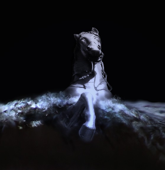
washed away - created by spygirl1978


washed away
Favs: 3SBS: 9Hi-resRank: 2/26Score: 58.2% (47)11077 views

sources used:

Waves by ~stock1-2-3 at deviantart.com: http://stock1-2-3.deviantart.com/art/Waves-32692074

and

"Stormy Seas II" brushes by *midnightstouch at deviantart.com: http://midnightstouch.deviantart.com/art/Stormy-Seas-II-42634095 (5 years and 3606 days ago)

2 Sources:

no avatar

Have you ever read the poem "The Bronze Horseman" by Alexander Pushkin? This kinda reminds me of it.

avatar Suky04
Suky04 says:

I like it! transmits a feeling of fight and hope.

avatar annabat
annabat [banned] says:

Hi res would be nice.

avatar Clinge
Clinge says:

Nice work gl

avatar gewoontjeerd

Nice! I like how you used light in this picture.

avatar nowastedmoments

Very nice detail. I'm diggin' how well the water crashes up on the horse. Love the cool color scheme. I wouldn't have thought to concentrate solely on the horse, but it was a great choice.

avatar Brandon
Brandon says:

you all read to many poems Looks good!

no avatar
marina08 says:

It's great! looks like a 3D painting.

avatar CMYK46
CMYK46 says:

Really nice work! My only nitpick is the water would be lighter on the right, to match the light source.

avatar jawshoewhah
jawshoewhah [banned] says:

It seems the top of the head could hve been better edged but it's hard to tell in low res. CMYK is right, ya know?

avatar chakra1985

beautiful image

no avatar

Very nice work........G/L Author.

avatar billyboy
billyboy says:

Very, very good. With a High Resolution this could be also one of my fav entry. Good luck, excellent job

avatar Lelaina
Lelaina says:

Congrats for your second place, Spygirl!

avatar demi
demi says:

Congrats

Howdie stranger!
If you want to rate this picture or participate in this contest, just:

LOGIN HERE or REGISTER FOR FREE


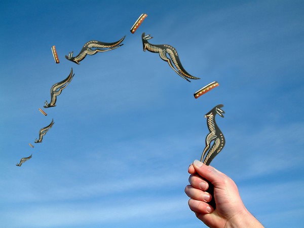
far away - created by roon


far away
Favs: 0SBS: 3Hi-resRank: 5/26Score: 55.8% (15)16742 views

(5 years and 3620 days ago)

no avatar
JKSinger says:

very interesting g.l

avatar ponti55
ponti55 says:

High marks for creativity!

Howdie stranger!
If you want to rate this picture or participate in this contest, just:

LOGIN HERE or REGISTER FOR FREE


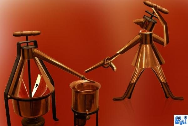
Go away.. No need your service - created by shaiju1974


Go away.. No need your service
Favs: 0SBS: 9Hi-resRank: 10/26Score: 54.6% (0)5151 views

I have used one outside source of apple. Thanks to
http://www.sxc.hu/photo/1227126

Author;Oscarsol (5 years and 3653 days ago)

1 Source:

avatar jawshoewhah
jawshoewhah [banned] says:

Clever but the reflection doesn't touch on the right foot. It also doesn't touch on the leg on the far left image. I think there should be more reflection.

no avatar

i like the apple through the glass. this is a fun image author GL

Howdie stranger!
If you want to rate this picture or participate in this contest, just:

LOGIN HERE or REGISTER FOR FREE