(5 years and 3146 days ago)
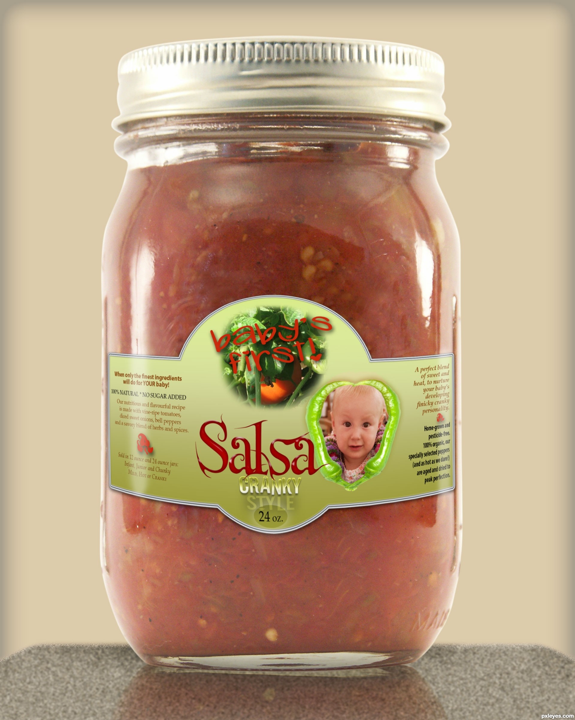
Please see sbs - tomato photo is from my own fall garden last year. Background made with texture, noise & blur for countertop with perspective, color and inner glow for back 'wall'. (5 years and 3153 days ago)
very cute entry (the label curve and blend is brilliant).. (Because of my eyes.. do you think an white Outer glow (instead of drop shadow) or a light white stroke might make the words "Baby's First" stand out more?.. (could just be my eyes..)IMHO
GREAT GARDEN!!!
Incredible entry! good LUCK
Yes, thank you, Ernie, that probably would have helped with the definition a bit. But it's all merged now and curved, with the white streaks of 'light' on the sides...and I'm outta time! 
I didn't see the "baby's first," but saw the "Granny Style," and thought, "It's salsa made from babies?" LOL!
The bottom edge of the label curves up around the jar just a wee bit too much, as if it was put on crooked, but otherwise, this is very well done, especially the light refraction!
well i like your entry author
very realistic work
best luck
That's CRANKY, MossyB! lol - and yes, the label looks a little off to me, too, it was tricky as this is kind of a round-corner squarish kind of jar - and it was very late at night when I completed this, after looking at a computer all day. I did use guide lines for the warping, so they're evenly curved, though. Thank you for your comment - yours, too, kushpatel.
hahahahahahahahaha...great humor and neat work...gl author
I will take one please for my baby!  Well done author!
congrats and a woo hoo!
Howdie stranger!
If you want to rate this picture or participate in this contest, just:
LOGIN HERE or REGISTER FOR FREE
(5 years and 3163 days ago)
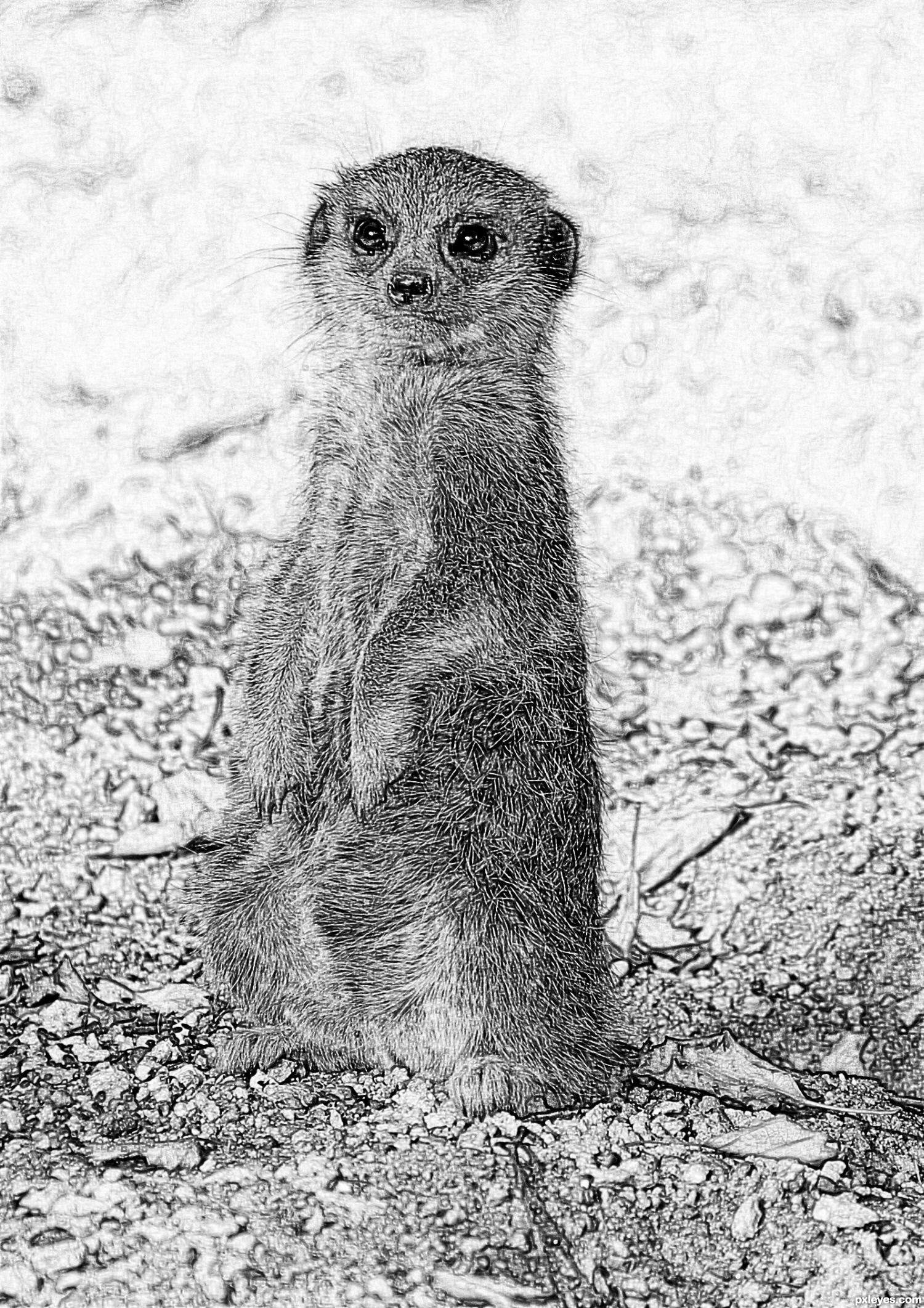
Very cute, but it would look better in B&W - the colors detract from the meercat, which is the focal point.
Thank you very much for the suggestion - that really helps - I'll change it
Much better!
Howdie stranger!
If you want to rate this picture or participate in this contest, just:
LOGIN HERE or REGISTER FOR FREE
(5 years and 3166 days ago)
Nice effect... you could describe the process a bit, like.. overlay + displacement map..for people wanting to learn new stuff.
Hey thanks greymval,and yeah I will do the SBS soon..
no problem.
nice work gl
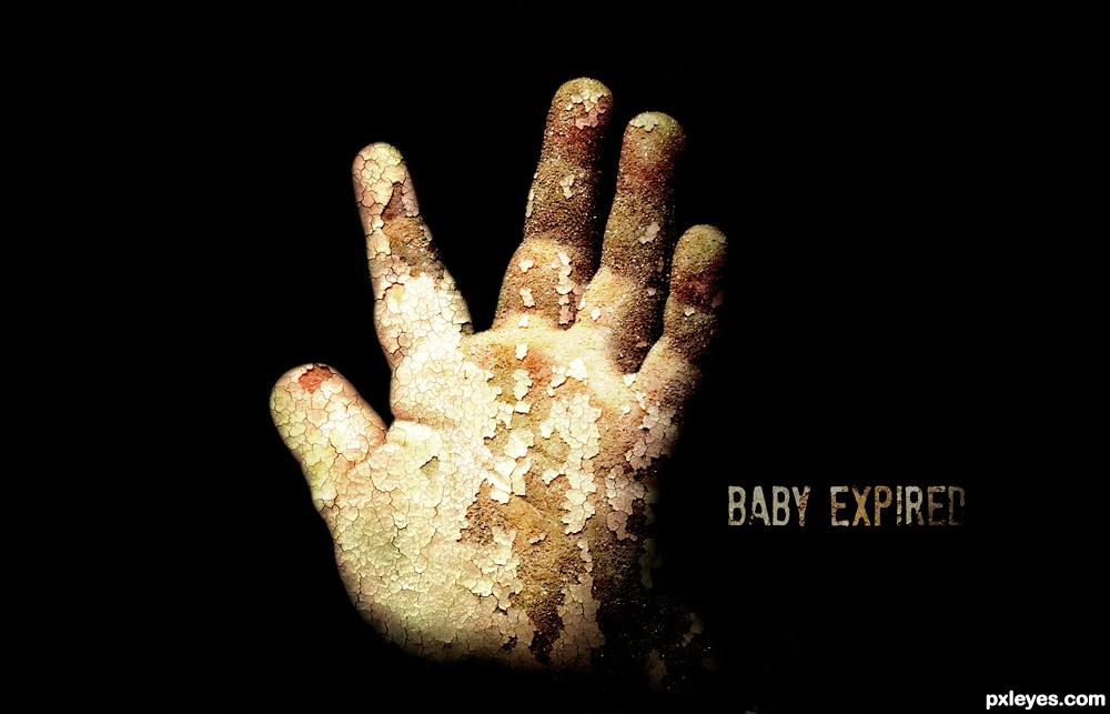
Great entry, maybe you can take 5 minutes extra on it and remove the white pixels at the bottom of the hand? It's a final touch but will improve the image IMHO
Howdie stranger!
If you want to rate this picture or participate in this contest, just:
LOGIN HERE or REGISTER FOR FREE
(5 years and 3167 days ago)
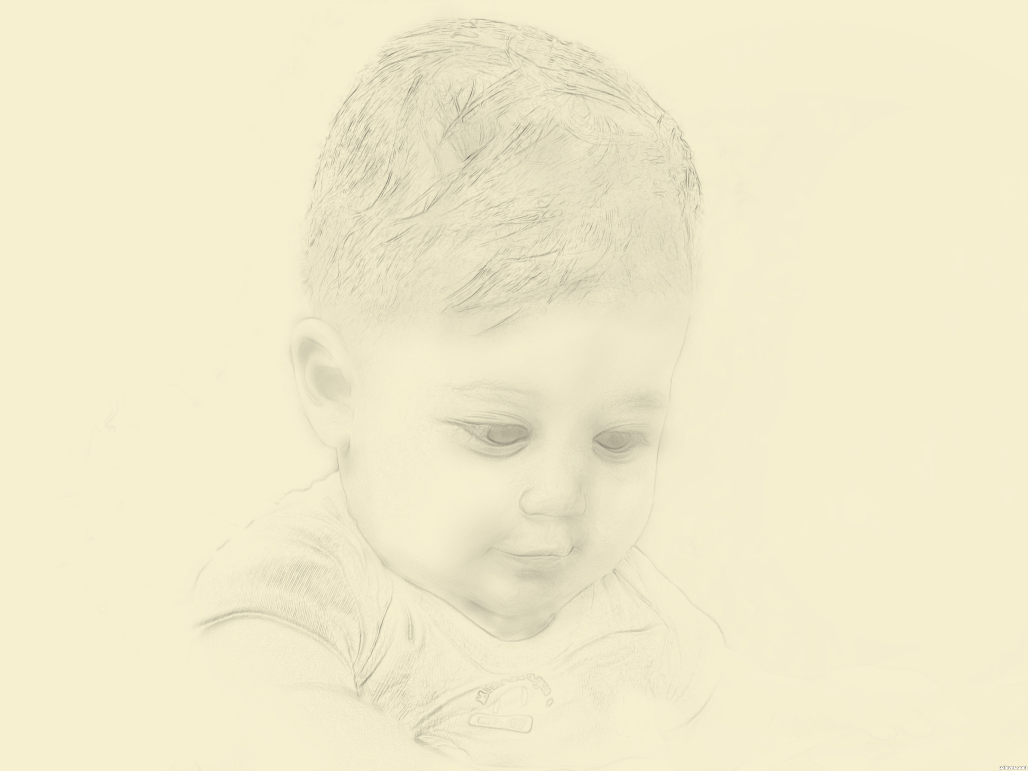
This came out VERY realistic. I don't care for the yellow paper background, I'd lighten it to a pale cream, but an excellent effect, nonetheless!
EDIT: Much more subtle now!
i didn't like the background either so i changed it, will see.........
thx moss
This is adorable! Really looks like the pencil portraits I used to do. Nice work, author.
thank you pearlie
Very sketchy except for the very dark lines (face outline and shoulders)
thanks DanL ,got that fixed, hopefully looks better now
Howdie stranger!
If you want to rate this picture or participate in this contest, just:
LOGIN HERE or REGISTER FOR FREE
Photography and photoshop contests
We are a community of people with
a passion for photography, graphics and art in general.
Every day new photoshop
and photography contests are posted to compete in. We also have one weekly drawing contest
and one weekly 3D contest!
Participation is 100% free!
Just
register and get
started!
Good luck!
© 2015 Pxleyes.com. All rights reserved.


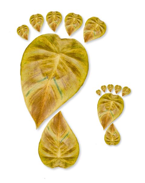
nice and looking cute
lovely work
Howdie stranger!
If you want to rate this picture or participate in this contest, just:
LOGIN HERE or REGISTER FOR FREE