(5 years and 3337 days ago)

(5 years and 3337 days ago)
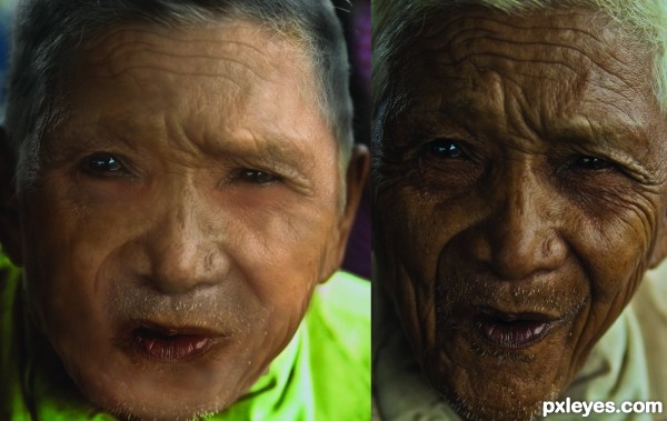
okay, I don't want to come off rude, but there is a lot to this that needs to be fixed. The absolute first thing you need to fix is the color! :O I know Michael Jackson went from black to uhhhh wanting to look white, and people get darker from tanning and such. BUT this guy went from one spectrum to the other! I would start over by keeping the color the same but taking out the wrinkles by possibly cloning in small portions.
I guess the color is much relevant now..thanks for the advice 
I really like how you fixed much of the blurriness to this...it looks A LOT better as far as that goes. The color is better but it is still so much different than the original.
good attempt shows u are trying and learning ...I have found googling areas I need, help ....and will find u great tutorials
Howdie stranger!
If you want to rate this picture or participate in this contest, just:
LOGIN HERE or REGISTER FOR FREE

(5 years and 3343 days ago)
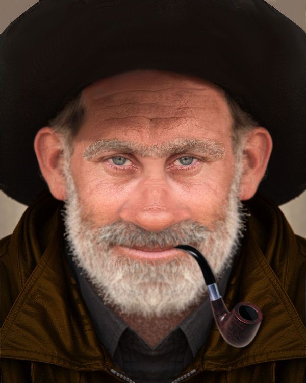
Could do with some shadow for the pipe. See where your coming from thou... Great look..GL
Not as good as the original face.
Thanks layerstack I took care of it 
CMYK46 If you look he's a little more on larger side also Can't you see the stress in his face and eyes ......lol Thanks for comment
Nose is too narrow, eyes are too close together.
CMYK46 that's the whole purpose. Good job author.
Just finished looking at the Photog Steriograph entries, and he looked like a Cyclops at first... lol.
It's Sourdough Jack back from the dead! I like it, GL Author
Thanks All ....I have to agree with CMYK46 I had to laugh So with that here is a a bigger snozola and far as the eyes go Just make believe he is staring at you
Howdie stranger!
If you want to rate this picture or participate in this contest, just:
LOGIN HERE or REGISTER FOR FREE

Spec Thanks to Cobalt123 for use of this picture found on flickr photo sharing.com (5 years and 3373 days ago)
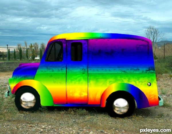
Now THAT's a rainbow LOL, great job author 
Howdie stranger!
If you want to rate this picture or participate in this contest, just:
LOGIN HERE or REGISTER FOR FREE

thanks very much to vanstock and Valentinepsycho at deviantART (5 years and 3400 days ago)
Very nice! Perfect!
nice work author...gl
Howdie stranger!
If you want to rate this picture or participate in this contest, just:
LOGIN HERE or REGISTER FOR FREE
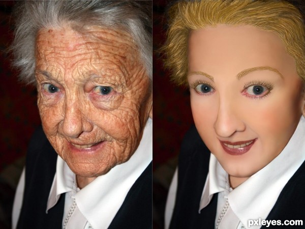
I would put some texture/pores into her skin.
Yes I agree! And for some reason I would like someone to change clothes and/or generation look of the picture, but this one is right on theme!
 Maybe even a photoAlbum theme!?
Edit: I would love to see a: 70's, 80's, and then like 2011 look?
I agree it would be better with some skin pores. SO many effects help you learn how to smooth skin texture, but I've yet to find a decent one to add back pores (without using another source, which is verboten for this contest...). The Healing Brush tool allows you to retain some skin texture, but it totally trashes the skin tones, leaving a horrid, mottled effect.
I like the idea of a "progressive" effect through the decades. Maybe that will be a future contest!
Its a very good effort, however there would be more shaping shadows in the face as well as the texture of the skin.
Shadows to define the mouth - for instance:- the curve below the bottom lip and dimples under the nose that shape the top lip. As one ages the muscles soften and drop the fine edges of a structure and if there are false teeth they push the top lip out and straighten it. The Older face actually has higher cheek bones than you have given credit for and there would be deeper hollows over and a slight shadow under the eyes . Cartilage grows all of ones life so the nose may well have been shorter and slightly turned up at the end.
Good work. I will come back and vote later.
what about trying to take a small portion of one of the less wrinkled parts of her face (maybe nose) and use that as a pattern for some texture in her face? Or just painstakingly put millions of tiny dots on her face for pores. lol
U did good work author but she looks more like wax figure...try to add some skin texture here to achieve more natural look...best of luck
You did a great job... just need to make it a lil more realistic,,and since we could not use other skin it was hard
She looks like a porcelain doll - you just went too far with it, author, tho you have the right idea. The trick is to leave some pores there, and soften her skin overall. Nice lip shape, tho.
Howdie stranger!
If you want to rate this picture or participate in this contest, just:
LOGIN HERE or REGISTER FOR FREE