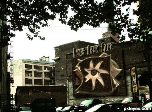
Scanned image of a baggie of coffee grounds (fresh) Chock full of Nuts...My Picture of a back alley in Seattle, basic PS WORK, My picture of an eyeball (5 years and 3336 days ago)
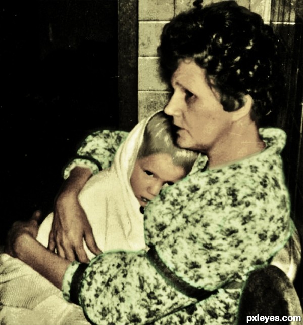
me and my mom, 40 some years ago, the photo is so tiny yet her heart is so big (5 years and 3352 days ago)
very nice work author and very effective final result...GL
i like the colouring in this image, goes well with your title.
Nice one author. Like the photo. 
*sigh* what an awesome photo.
i love when i look through the old photo albums and find pictures like this. completely captures the essence of the time. and what a heartfelt choice of pictures to use.
the way the photo looks, it kinda reminds me of old school polaroid pictures. i can almost feel the crinkle of the aged white backing on the print. Good Luck to you!
OMG, I love this, author! It looks so authentic, as if it started out in color and has faded over the years - unlike your love for her. I'm a little fa-klempt.  Well done!
Howdie stranger!
If you want to rate this picture or participate in this contest, just:
LOGIN HERE or REGISTER FOR FREE
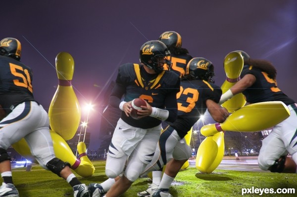
Thanks Wikipedia (5 years and 3355 days ago)
Great idea...GL author! 
Agrees with the eggman 

Very nice; better with Auburn helmets on pins. 
OMG, this image is full of energy. Like it. GL 
wauw totally agree with locale .. it's so energetic !!
keep up the good work  !!
!!
GL
nice job .gl
Great work author...Its fantastic how long haired player tackle the pin...very cool and super funny...well done
hahah you did exactly what i was thinking.. although i was gonna use the steelers :O)
WOW!!! 
Really nice idea! Only suggestion would be to add more depth to the image. The buildings are sharper than the source of players. Good luck!
Thank you for the comments.
Howdie stranger!
If you want to rate this picture or participate in this contest, just:
LOGIN HERE or REGISTER FOR FREE
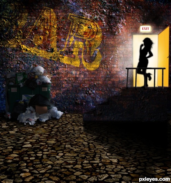
Thanks slartibartfast,cohdra,katagaci, soundfromwayout (5 years and 3362 days ago)
great work! 
Good idea & composition...GL, author! 
very nice job 
That's hot
very very nice work author...love the mood so much...best of luck
Congrats author...great entry...
Thank you to everyone
Howdie stranger!
If you want to rate this picture or participate in this contest, just:
LOGIN HERE or REGISTER FOR FREE
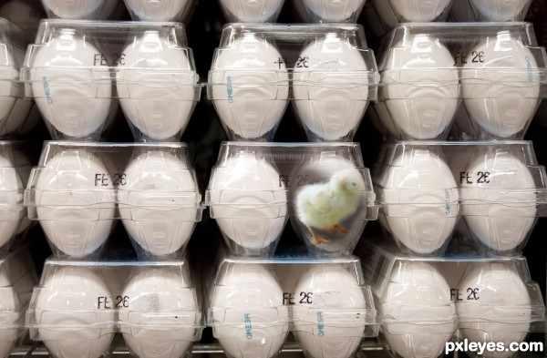
(5 years and 3371 days ago)
Get him out he's going to suffocate! :O
minimal work but very smart and so effective...well done author
Howdie stranger!
If you want to rate this picture or participate in this contest, just:
LOGIN HERE or REGISTER FOR FREE
hahahahahaha...unique idea author...gl
That is interesting, well done! I have one suggestion though, for the bevel highlights on your overlapped shapes on the wall, try using a different blend mode or colour so that the highlights don't look so whitish. At the moment they look like they're kind of floating on the wall. Same goes for the main cafe text. Good luck !
Awesome SBS, but the coffee grounds are so dark, they are very hard to make out, and the tree leaves look black.
That was the idea MAD, I wanted it to look like it's a 3D floating sculpture (letters and all).. and MossyB, if your monitor is on the wrong tilt it's very dark.. but the High Res you can see the coffee quite clearly, (the original back alley picture is very dark as well and the leaves were very black to begin with.. )

thanks for the help, I'm glad you like it
Very nice signage. I wish it was a little easier to see. Graphically very well done. Good luck!
Clever concept and great scan idea.
Eye can relate!
Howdie stranger!
If you want to rate this picture or participate in this contest, just:
LOGIN HERE or REGISTER FOR FREE