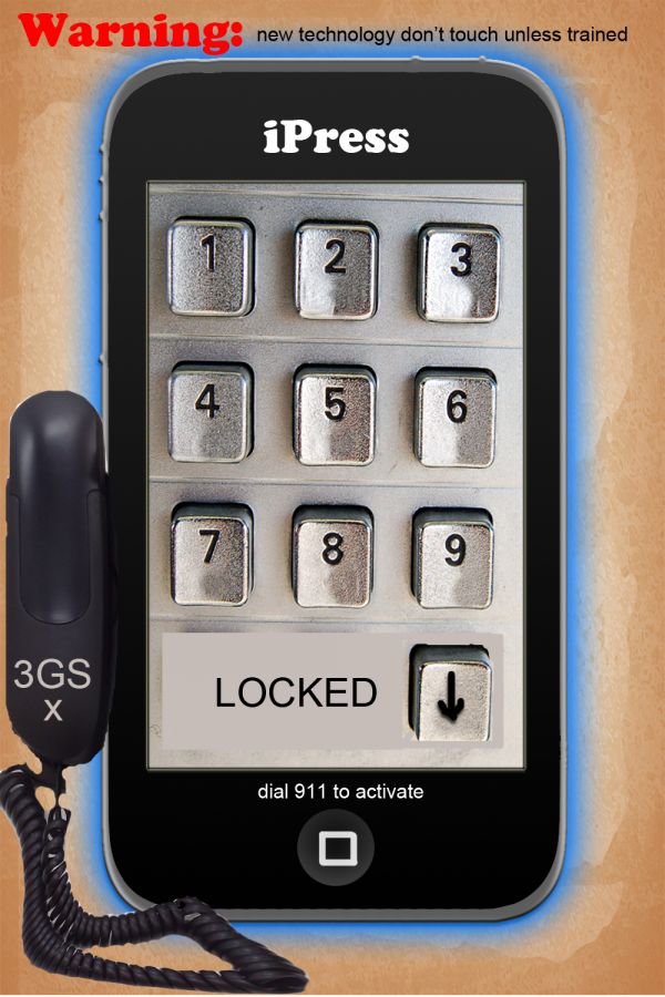
brand new tech design :) (5 years and 3681 days ago)
- 1: Background Image
- 2: Phone,
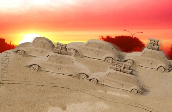
steps-
1-complete the car tyres
2-duplicate the car 5 times
3-transform the cars to give different look
4-make the track from original image
5-apply motion blur to cars
6-place background image
7-use hue/saturation (5 years and 3699 days ago)
good one!
For me it seems more like a traffic jam on vacation days... 
Changing the background and making a real finish line and adding a crowd watching would improve your scores.. 
Good one....
Congrats! 
Howdie stranger!
If you want to rate this picture or participate in this contest, just:
LOGIN HERE or REGISTER FOR FREE

(5 years and 3727 days ago)
Nice image  GL
GL
Great!!!!!!!!!!!
nice effect and choice of scenery too
Thanks for your comments and its great when comment are also great
Extreme light, very beautiful. Kinda looks like james and the glowing blue giant peach. Nice work 
thank you for this great comment
a fabulous creation! I love the blue glow!
Howdie stranger!
If you want to rate this picture or participate in this contest, just:
LOGIN HERE or REGISTER FOR FREE
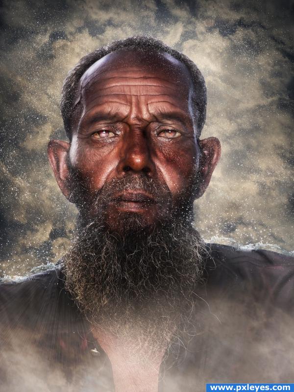
OK, I'm a HUGE Bob Marley fan. So, while I was working on this Bob was playing in the background--hence the name. Also, I was inspired by a tutorial I read a few months ago--see the link below. Stock is from photorack and Stock.xchng. (5 years and 3917 days ago)
Really nice looking effect - good job!
very pretty effect
Water droplets are too small...kinda looks like dandruff or something...and there would be more in front of the face and shirt.
really cool
I love this one! So ethereal. Good work. Checked the tut and will use it........thanks
excellent use of that tutorial! nice choice and good result 
So etherial. The effect is wonderful. And I absolutely love the eyes!!
Beautiful look
Howdie stranger!
If you want to rate this picture or participate in this contest, just:
LOGIN HERE or REGISTER FOR FREE
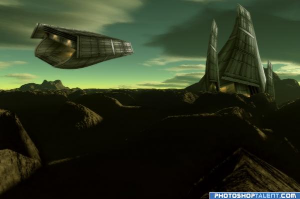
I created the alien landscape using the famous "Terragen" software. The ship and alien outpost were created using the blue container image. No other images were used.
(5 years and 3959 days ago)
cool!
very nice. but seeing as how you didnt do very much it doesnt feel so original. good job on ship and w/e that thing is. 
Can't use the background Image... find CC images. read the site rules and guidlines etc  the site you took the bacground from says "he creators of the images retain all rights to their images"
Nice idea good luck!
Annabat I created the image. "The creators of the images retain all rights to their images". I did not take the background image from the site, please read the discription and sbs. Background image was created using the software.
good sbs, nice entry, i'd like to know where to get terragen!
I already posted the website. Check under sources used for this entry. Thanks 
Here is the URL just in case you can't find it.
http://www.planetside.co.uk/content/view/15/27/
If you created it in another software you also have to have and sbs for that part as well. You have to sbs for all parts of the image.
It is impossible to give the sbs for that software. You will understand once you use it. I would have to provide over a hundred steps in the sbs. I will try my best to put the important parts in step 26. Thanks
nice
wow! great color scheme. good work
wow author looks like you're great with this software!!!! You rock!!!
Thanks

GR8 work.....
Pretty cool image. Maybe some more contrast for the background to fit better with the spase ship and station. Good luck!
nice 
This is very good entry !!! I do like it very much 
 great SBS too
Update: Contrast fixed
very creative
Cool sci-fi scene nice Terragen work super stuff!
Nice work. Great rendering from terragen.
This is very *VERY* nice! Well done!!!! 

 !
!
congrats
Congratulations for 1st
Congrats!
Congrats! Way to go! Great entry!
Congratulations.
Congrats!
Thanks everybody 
Howdie stranger!
If you want to rate this picture or participate in this contest, just:
LOGIN HERE or REGISTER FOR FREE
really nice idea,,you should upgrade the chord.do a little scaling on dial..good luck
It's a funny idea but maybe skew the dial pad so it's more level. GL!
It's really a creative idea, but needs to straighten the dial pad and a better chop on the phone.
Thanks for your supportive comments people thanks for tips but i deleted the PSD file don't wanna start over will take too long. but i'll try better next time and thanks again
One advice: don't delete the psd file while the contest is running... sometimes (or many times) is necessary to fix the work. Ok?
I can see that as a problem. I've done it myself. Just always try to keep the PSD file. Personally, I don't see that it would be a hard fix, even if you did delete the PSD file. Suggestion: Select keybad using Rectangular marquee, hit Ctrl/T, right click and select skew, then skew into a more square position, resize to cover up if necessary. Really, not a hard fix.
Nice job.....Good Luck to you!
Howdie stranger!
If you want to rate this picture or participate in this contest, just:
LOGIN HERE or REGISTER FOR FREE