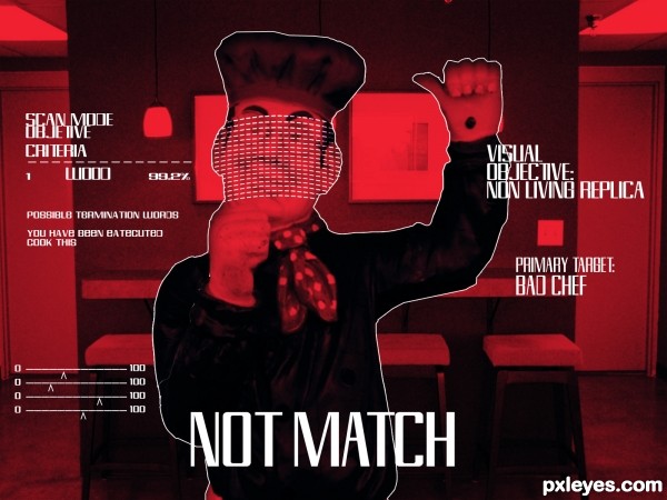
Sent to the pass terminated a famous bad chef (5 years and 2932 days ago)
- 1: JewelsStock
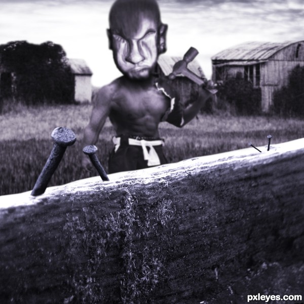
Every bad nail will not go unfinished! (5 years and 3000 days ago)
Howdie stranger!
If you want to rate this picture or participate in this contest, just:
LOGIN HERE or REGISTER FOR FREE
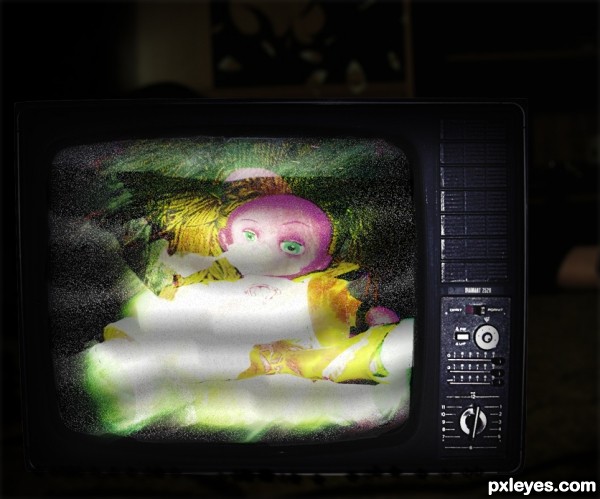
I used light effects and blending layers. Copy and paste it so many times..
Thanx to http://browse.deviantart.com/resources/?qh=§ion=&q=old+screen#/d19ash8 (5 years and 3000 days ago)
I paste wrong the tv link :http://ro-stock.deviantart.com/art/Vintage-TV-76086188
Howdie stranger!
If you want to rate this picture or participate in this contest, just:
LOGIN HERE or REGISTER FOR FREE
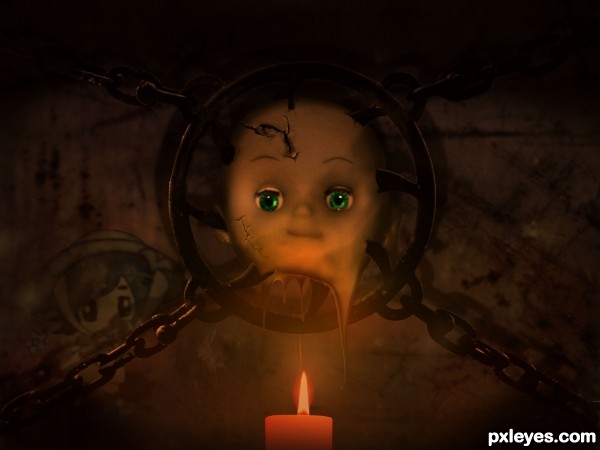
(5 years and 3002 days ago)
hehehe.. how icky LOL great job 
IMO I think this need a bit more contrast. Great idea. Good luck author!
This is super cool idea author, and very nice execution...best of luck
gratz on your third place! 
Howdie stranger!
If you want to rate this picture or participate in this contest, just:
LOGIN HERE or REGISTER FOR FREE
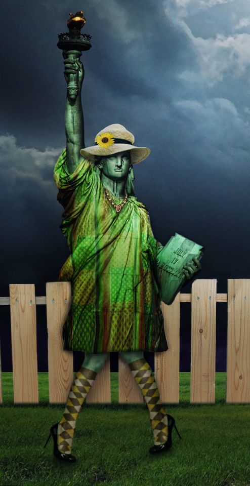
Uuuhhh..its gonna rain! and I just got my dress stuck on the fence..oh god..
HELP!!!!..
Last link..
Grass / Thanks: Alfi007
http://www.sxc.hu/photo/1363650 (5 years and 3056 days ago)
Disappointed there is no high res version!
According to the placement of the feet, her dress would be nowhere near the fence.
I aggree with cmyk here.
I guess her distance from the fence in regards to the description statement is what is "so strange" about this entry...
Thanks MossyB..you got it!
Eladine and Cmyk thats the whole point...
"so strange"..
Thanks for commenting
Howdie stranger!
If you want to rate this picture or participate in this contest, just:
LOGIN HERE or REGISTER FOR FREE
Creative idea. However, the small chef seems out of place with the size of the background and gets overwhelmed by the text. And why isn't the target symbol centered in the image if this is the view through the aiming scope of a weapon? The font for the text is cool except it doesn't fit the stereotypical Courier-type font I've come to expect computer-aided weaponry to 'talk' to the user in [based on the movies I've seen], but then you haven't used the classic (tired?) green night-goggle look either.
believe me ive seen all of t movies and its the font that fits with t2. I'd thank bout the chef size i gonna fix it. The scope is searching for a heart buts a wood replica. I gona think about thanx for comment!
The new bigger, clearly-foreground chef is more realistic to my mind. The grid-like thing over his face is inspired. I think putting that over all of the chef would hide the fact that he's not real. And bringing back the target symbol in the perfect middle of the image would provide a context for all the text. [The shooter (viewer) is still in the process of aiming so the crosshairs need not be perfectly on target.]
I love the "non living replica" part lol
I love the "non living replica" part lol
Howdie stranger!
If you want to rate this picture or participate in this contest, just:
LOGIN HERE or REGISTER FOR FREE